Lab 2: Working with U.S. Census Data
CRD 230 - Spatial Methods in Community Research
Professor Noli Brazil
January 18, 2023
In this guide you will learn how to work with data from the United States Census, the leading source for timely and relevant information about communities. You will also learn how to descriptively summarize non-spatial data. The objectives of the guide are as follows
- Learn how to download Census data using the Census API
- Learn how to download Census data from other sources
- Learn how to conduct Exploratory Data Analysis
- Learn how to access U.S. government data other than the Census
This lab guide follows closely and supplements the material presented in Chapters 1, 3, 5, 7, 8-10, 14 and 22 in the textbook R for Data Science (RDS).
Open up a R Markdown file
Rather than working directly from the R console, I recommended typing in lab code into an R Markdown and working from there. This will give you more practice and experience working in the R Markdown environment, which you will need to do for all of your assignments. Plus you can add your own comments to the code to ensure that you’re understanding what is being done. To open up an R Markdown file, select File, New File and R Markdown. Give a title (e.g. Lab 2) and your name and then click OK. Save the file in an appropriate folder on your hard drive. For a rundown on the use of R Markdown, see the assignment guidelines.
Installing packages
You’ll need to install the following packages in R. You only need to do this once, so if you’ve already installed these packages, skip the code. Also, don’t put the install.packages() in your R Markdown document. You only need to install once and never more. Copy and paste the code in your R Console.
install.packages(c("tidycensus",
                   "ipumsr",
                 "flextable",
                   "censusapi",
                 "lehdr",
                 "tidyUSDA"))
Loading packages
We will be using the tidyverse package in this lab. We already installed the package in Lab 1, so we don’t need to install it again. We need to load it and the packages we installed above using the function library(). Remember, install once, load every time. So when using a package, library() should always be at the top of your R Markdown.
library(tidyverse)
library(tidycensus)
library(ipumsr)
library(censusapi)
library(lehdr)
library(tidyUSDA)
library(flextable)
Downloading Census Data
One of the primary sources of data that we’ll be using in this class is the United States Decennial Census and the American Community Survey. There are two ways to bring Census data into R: Downloading it from an online source or using an API.
Note that we will gather 2016-2020 ACS data from all sources. Census boundaries changed in 2020, which means that 2016-2020 data will not completely merge with ACS data before 2020. So make sure you merge 2020 data only with 2020 data (but you can merge 2019 data with data between 2010-2019). This is especially important for tract data, with many new tracts created in 2020 and existing tracts experiencing dramatic changes in their boundaries between 2010 and 2020. See the impact of tract boundary changes between 2000 and 2010 here.
Downloading from an online source
The first way to obtain Census data is to download them directly from the web onto your hard drive. There are several websites where you can download Census data including Social Explorer and PolicyMap, which as UC Davis affiliates we have free access to, and the National Historical Geographic Information System (NHGIS), which are free for everyone. To save us time, I’ve uploaded PolicyMap (csv) and NHGIS (zip) files on Canvas (Files -> Week 2 -> Lab) for you to use in this lab. Save these files in the same folder where your Lab 2 R Markdown file resides. The PolicyMap file contains median household income for California counties. The NHGIS file contains residents by nativity status for California counties. Both data are from the 2016-20 American Community Survey. We will read these data into R a little later. To find out how to download data from PolicyMap and NHGIS, check out tutorials here and here.
Using the Census API
The other way to bring Census data into R is to use the Census Application Program Interface (API). An API allows for direct requests for data in machine-readable form. That is, rather than you having to navigate to some website, scroll around to find a dataset, download that dataset once you find it, save that data onto your hard drive, and then bring the data into R, you just tell R to retrieve data directly from the source using one or two lines of code.
In order to directly download data from the Census API, you need a key. You can sign up for a free key here, which you should have already done before the lab. Type your key in quotes using the census_api_key() command.
census_api_key("YOUR API KEY GOES HERE", install = TRUE)The option install = TRUE saves the API key in your R environment, which means you don’t have to run census_api_key() every single time. The function for downloading American Community Survey (ACS) Census data is get_acs(). The command for downloading decennial Census data is get_decennial(). Both functions come from the tidycensus package, which allows users to interface with the US Census Bureau’s decennial Census and American Community Survey APIs. Getting variables using the Census API requires knowing the variable ID - and there are thousands of variables (and thus thousands of IDs) across the different Census files. To rapidly search for variables, use the commands load_variables() and View(). Because we’ll be using the ACS in this guide, let’s check the variables in the most recent 5-year ACS (2016-2020) using the following commands.
v20 <- load_variables(2020, "acs5", cache = TRUE)
View(v20)
A window should have popped up showing you a record layout of the 2016-20 ACS. To search for specific data, select “Filter” located at the top left of this window and use the search boxes that pop up. For example, type in “Hispanic” in the box under “Label”. You should see near the top of the list the first set of variables we’ll want to download - race/ethnicity. Another way of finding variable names is to search them using Social Explorer. Click on the appropriate survey data year and then “American Community Survey Tables”, which will take you to a list of variables with their Census IDs.
Let’s extract race/ethnicity data and total population for California counties using the get_acs() command
ca <- get_acs(geography = "county",
              year = 2020,
              variables = c(tpopr = "B03002_001",
                            nhwhite = "B03002_003", nhblk = "B03002_004",
                            nhasn = "B03002_006", hisp = "B03002_012"),
              state = "CA",
              survey = "acs5",
              output = "wide")
In the above code, we specified the following arguments
geography: The level of geography we want the data in; in our case, the county. Other geographic options can be found here.year: The end year of the data (because we want 2016-2020, we use 2020).variables: The variables we want to bring in as specified in a vector you create using the functionc(). Note that we created variable names of our own (e.g. “nhwhite”) and we put the ACS IDs in quotes (“B03002_003”). Had we not done this, the variable names will come in as they are named in the ACS, which are not very descriptive.state: We can filter the counties to those in a specific state. Here it is “CA” for California. If we don’t specify this, we get all counties in the United States.survey: The specific Census survey were extracting data from. We want data from the 5-year American Community Survey, so we specify “acs5”. The ACS comes in 1- and 5-year varieties.
output: The argument tells R to return a wide dataset as opposed to a long dataset (see this vignette for more info).
Another useful option to set is cache_table = TRUE, so you don’t have to re-download after you’ve downloaded successfully the first time. Type in ? get_acs() to see the full list of options.
As you learned in Lab 1, whenever you bring in a dataset, the first thing you should always do is view it to get a sense of its structure and to make sure you got what you expected. One way of doing this is to use the glimpse() command
glimpse(ca)## Rows: 58
## Columns: 12
## $ GEOID <chr> "06001", "06003", "06007", "06011", "06013", "06017", "06019"…
## $ NAME <chr> "Alameda County, California", "Alpine County, California", "B…
## $ tpoprE <dbl> 1661584, 1159, 223344, 21491, 1147788, 190345, 990204, 136101…
## $ tpoprM <dbl> NA, 172, NA, NA, NA, NA, NA, NA, NA, NA, NA, NA, NA, NA, NA, …
## $ nhwhiteE <dbl> 508583, 595, 158924, 7482, 489135, 146919, 284169, 99861, 183…
## $ nhwhiteM <dbl> 886, 120, 309, 25, 1486, 262, 467, 430, 134, 1229, 198, 62, 1…
## $ nhblkE <dbl> 167316, 10, 3778, 263, 94463, 1439, 43660, 1314, 4317, 45312,…
## $ nhblkM <dbl> 1387, 23, 316, 61, 1509, 203, 1101, 224, 200, 1039, 434, 68, …
## $ nhasnE <dbl> 515105, 6, 10350, 160, 196904, 9023, 102986, 3829, 2375, 4159…
## $ nhasnM <dbl> 2453, 9, 507, 85, 2267, 470, 1291, 338, 193, 1214, 467, 62, 2…
## $ hispE <dbl> 369546, 183, 37585, 12840, 295791, 24773, 528293, 16228, 1528…
## $ hispM <dbl> NA, 111, NA, NA, NA, NA, NA, NA, NA, NA, NA, NA, NA, NA, NA, …You get a quick, compact summary of your tibble. You can also use the head() command, which shows you the first several rows of your data object (tail() will give you the last several rows).
head(ca)## # A tibble: 6 × 12
## GEOID NAME tpoprE tpoprM nhwhi…¹ nhwhi…² nhblkE nhblkM nhasnE nhasnM hispE
## <chr> <chr> <dbl> <dbl> <dbl> <dbl> <dbl> <dbl> <dbl> <dbl> <dbl>
## 1 06001 Alamed… 1.66e6 NA 508583 886 167316 1387 515105 2453 369546
## 2 06003 Alpine… 1.16e3 172 595 120 10 23 6 9 183
## 3 06007 Butte … 2.23e5 NA 158924 309 3778 316 10350 507 37585
## 4 06011 Colusa… 2.15e4 NA 7482 25 263 61 160 85 12840
## 5 06013 Contra… 1.15e6 NA 489135 1486 94463 1509 196904 2267 295791
## 6 06017 El Dor… 1.90e5 NA 146919 262 1439 203 9023 470 24773
## # … with 1 more variable: hispM <dbl>, and abbreviated variable names
## # ¹nhwhiteE, ²nhwhiteMThe tibble contains counties with their estimates for race/ethnicity. These variables end with the letter “E”. It also contains the margins of error for each estimate. These variables end with the letter “M”.
tidycensus is a game changer in being able to bring in Census data into R in a convenient, fast, efficient and tidy friendly way. We’ll be using this package in the next lab to bring in Census spatial data. And congratulations! You’ve just earned another badge. Fantastic!

Practice Question: What is the 2016-2020 ACS variable ID for median household income?
Reading in data
Getting data directly into R through an API is super cool and convenient, but you’ll have to download and read in most non-Census data without an API. We covered reading csv files into R in Lab 1. To get more practice bringing in files, let’s bring in the census data files from PolicyMap and NHGIS that we downloaded from Canvas, which are in .csv format.
PolicyMap
To read in a csv file, first make sure that R is pointed to the folder you saved your data into. Type in getwd() to find out the current directory and setwd("directory name") to set the directory to the folder containing the data. In my Mac OS computer, the file is located in the folder shown in the figure below.
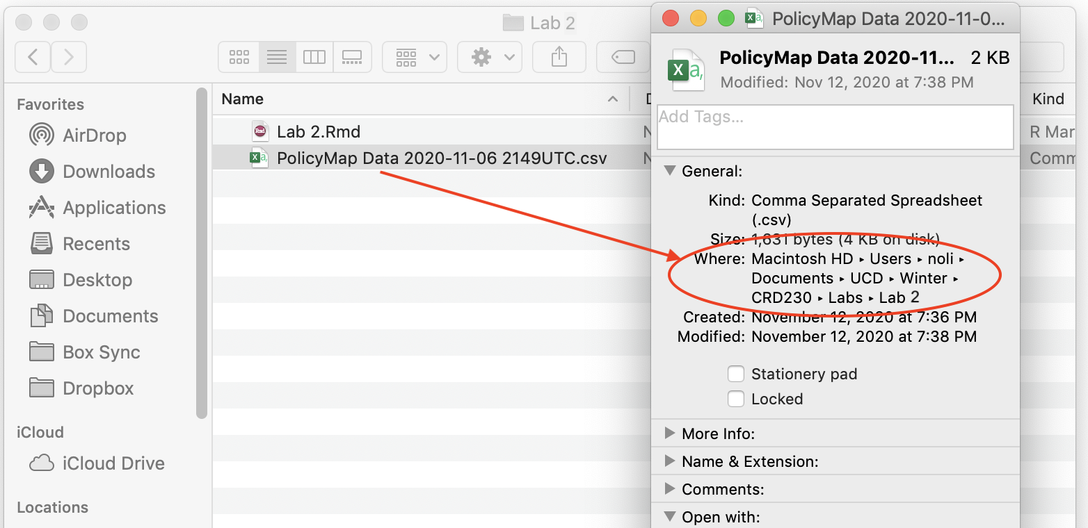
Directory path where your data reside
From a Mac laptop, I type in the following command to set the directory to the folder containing my data.
setwd("~/Documents/UCD/Winter/CRD230/Labs/Lab 2")For a Windows system, you can find the pathway of a file by right clicking on it and selecting Properties. You will find that instead of a forward slash like in a Mac, a windows pathway will be indicated by a single back slash \. R doesn’t like this because it thinks of a single back slash as an escape character. Use instead two back slashes \\
setwd("C:\\Users\\noli\\UCD\\Winter\\CRD230\\Labs\\Lab 2")or a forward slash /.
setwd("C:/Users/noli/UCD/Winter/CRD230/Labs/Lab 2")You can also manually set the working directory by clicking on Session -> Set Working Directory -> Choose Directory from the menu.
Once you’ve set your directory, use the function read_csv(), which is a part of the tidyverse package, and plug in the name of the file in quotes inside the parentheses. Make sure you include the .csv extension.
ca.pm <- read_csv("PolicyMap Data 2022-12-22 221416 UTC.csv", skip = 1)The option skip = 1 tells R to skip the first row of the file when bringing it in. This is done because there are two rows of column names. The first row contains the extended version, while the second is the abridged version. Above we keep the abridged version.
You should see a tibble ca.pm pop up in your Environment window (top right). What does our data set look like?
glimpse(ca.pm)## Rows: 58
## Columns: 10
## $ GeoID_Description <chr> "County", "County", "County", "County", "County", "C…
## $ GeoID_Name <chr> "Alameda", "Alpine", "Amador", "Butte", "Calaveras",…
## $ SitsinState <chr> "CA", "CA", "CA", "CA", "CA", "CA", "CA", "CA", "CA"…
## $ GeoID <chr> "06001", "06003", "06005", "06007", "06009", "06011"…
## $ GeoID_Formatted <chr> "=\"06001\"", "=\"06003\"", "=\"06005\"", "=\"06007\…
## $ mhhinc <dbl> 104888, 85750, 65187, 54972, 67054, 59427, 103997, 4…
## $ TimeFrame <chr> "2016-2020", "2016-2020", "2016-2020", "2016-2020", …
## $ GeoVintage <dbl> 2020, 2020, 2020, 2020, 2020, 2020, 2020, 2020, 2020…
## $ Source <chr> "Census", "Census", "Census", "Census", "Census", "C…
## $ Location <chr> "California (State)", "California (State)", "Califor…If you like viewing your data through an Excel style worksheet, type in View(ca.pm), and ca.pm should pop up in the top left window of your R Studio interface.
NHGIS
The other Census data file we downloaded are from the NHGIS, which is a very user friendly resource for downloading all sorts of community data. I highlight NHGIS here because the package ipumsr offers a neat and efficient way of bringing NHGIS data into R.
First, you want to save the name of the NHGIS zip file.
nhgis_csv_file <- "nhgis0167_csv.zip"All NHGIS downloads also contain metadata (i.e. a codebook). This is a valuable file as it lets you know what each variable in your file represents, among many other importance pieces of information. Read it in using the function read_ipums_codebook().
nhgis_ddi <- read_ipums_codebook(nhgis_csv_file)Finally, read in the data using the function read_nhgis()
ca.nhgis <- read_nhgis(
  data_file = nhgis_csv_file,
)
View the tibble and you’ll find not only the variable names, but also their descriptions! Neato.
View(ca.nhgis)Data Wrangling
We learned about the various data wrangling related functions from the tidyverse package in Lab 1. Let’s employ some of those functions to create a single county level dataset that joins the datasets we downloaded from the API, PolicyMap and NHGIS.
We are going to combine all three datasets using the county FIPS codes. In the Census API and PolicyMap, these are contained in the variables GEOID and GeoID, respectively. Let’s make sure they are in the same class.
class(ca.pm$GeoID)## [1] "character"class(ca$GEOID)## [1] "character"In the case of NHGIS, there is no county FIPS variable. We need to concatenate the variables STATEA and COUNTYA, which are the state and county FIPS codes, to create a unique county GEOID. To do this, use the function str_c() within mutate().
ca.nhgis <- mutate(ca.nhgis, GEOID = str_c(STATEA, COUNTYA))There are a number of other data wrangling tasks that need to be done in order to get to the final dataset. In Lab 1, we went through the tasks one by one. However, we can actually do these tasks in one single line of continuous code using the tidyverse pipe.
Piping
One of the important innovations from the tidyverse is the pipe operator %>%. You use the pipe operator when you want to combine multiple operations into one line of continuous code. Let’s create our final data object cacounty using our brand new friend the pipe.
cacounty <- ca %>%
      left_join(ca.pm, by = c("GEOID" = "GeoID")) %>%
      left_join(ca.nhgis, by = "GEOID") %>%
      mutate(pwhite = nhwhiteE/tpoprE, pasian = nhasnE/tpoprE,
              pblack = nhblkE/tpoprE, phisp = hispE/tpoprE,
             mhisp = case_when(phisp > 0.5 ~ "Majority",
                               TRUE ~ "Not Majority"),
             pfb = AM07E003/AM07E001) %>%
      rename(County = GeoID_Name) %>%
      select(GEOID, County, pwhite, pasian, pblack, phisp, mhisp, mhhinc, pfb)
Let’s break down what the pipe is doing here. First, you start out with your dataset ca. You “pipe” that into the command left_join(). Notice that you didn’t have to type in ca inside that command - %>% pipes that in for you. The command joins the data object ca.pm to ca. The result of this function gets piped into anotherleft_join(), which joins ca.nhgis. The result of this gets piped into the mutate() function, which creates the percent race/ethnicity (from the Census API), percent foreign born (from NHGIS), and majority Hispanic variables. This gets piped into the rename() function, which renames the ambiguous variable name GeoID_Name to the more descriptive name County. This then gets piped into the final function, select(), which keeps the necessary variables. Finally, the code saves the result into cacounty which we designated at the beginning with the arrow operator.
Piping makes code clearer, and simultaneously gets rid of the need to define any intermediate objects that you would have needed to keep track of while reading the code. PIPE, Pipe, and pipe whenever you can. Badge it!

Saving data
If you want to save your data frame or tibble as a csv file on your hard drive, use the command write_csv(). Before you save a file, make sure R is pointed to the appropriate folder on your hard drive by using the function getwd(). If it’s not pointed to the right folder, use the function setwd() to set the appropriate working directory.
write_csv(cacounty, "lab2_file.csv")The first argument is the name of the R object you want to save. The second argument is the name of the csv file in quotes. Make sure to add the .csv extension. The file is saved in your current working directory.
Exploratory Data Analysis
The functions above help us bring in and clean data. The next set of functions covered in this section will help us summarize the data. Data refer to pieces of information that describe a status or a measure of magnitude. A variable is a set of observations on a particular characteristic. The distribution of a variable is a listing showing all the possible values of the data for that variable and how often they occur. Exploratory Data Analysis (EDA) encompasses a set of methods (some would say a framework or perspective) for summarizing a variable’s distribution, and the relationship between the distributions of two or more variables. We will cover two general approaches to summarizing your data: descriptive statistics and visualization via graphs and charts.
Descriptive Statistics
When describing a distribution, your quantitative message is often best communicated by reducing data to a few summary numbers. These numbers are meant to summarize the “typical” value in the distribution (e.g., mean, median, mode) and the variation or “spread” in the distribution (e.g., minimum/maximum, interquartile range, standard deviation). These summary numbers are known as descriptive statistics.
We can use the function summarize() to get descriptive statistics of our data. For example, let’s calculate the mean household income in California counties. The first argument inside summarize() is the data object cacounty and the second argument is the function calculating the specific summary statistic, in this case mean().
cacounty %>%
  summarize(Mean = mean(mhhinc))
## # A tibble: 1 × 1
## Mean
## <dbl>
## 1 71109.The average county median household income is $71,109. If the variable mhhinc contained missing values, we would have gotten NA as a result. To omit missing values from the calculation, you need to add rm = TRUE to mean().
We can calculate more than one summary statistic within summarize(). What is the spread of the distribution? We can add to summarize() the function sd() to calculate the standard deviation.
cacounty %>%
  summarize(Mean = mean(mhhinc), SD = sd(mhhinc))
## # A tibble: 1 × 2
## Mean SD
## <dbl> <dbl>
## 1 71109. 21360.Does the average income differ by California region? First, let’s create a new variable region designating each county as Bay Area, Southern California, Central Valley, Capital Region and the Rest of California using the case_when() function within the mutate() function.
cacounty <- cacounty %>%
    mutate(region = case_when(County == "Sonoma" | County == "Napa" |
                              County == "Solano" | County == "Marin" |
                              County == "Contra Costa" | County == "San Francisco" |
                              County == "San Mateo" | County == "Alameda" |
                              County == "Santa Clara" ~ "Bay Area",
                              County == "Imperial" | County == "Los Angeles" |
                              County == "Orange" | County == "Riverside" |
                              County == "San Diego" | County == "San Bernardino" |
                              County == "Ventura" ~ "Southern California",
                              County == "Fresno" | County == "Madera" |
                              County == "Mariposa" | County == "Merced" |
                              County == "Tulare" |
                              County == "Kings" ~ "Central Valley",
                              County == "Alpine" | County == "Colusa" |
                              County == "El Dorado" | County == "Glenn" |
                              County == "Placer" | County == "Sacramento" |
                              County == "Sutter" | County == "Yolo" |
                              County == "Yuba" ~ "Capital Region",
                              TRUE ~ "Rest"))
Next, we need to pair summarize() with the function group_by(). The function group_by() tells R to run subsequent functions on the data object by a group characteristic (such as gender, educational attainment, or in this case, region). We’ll need to use our new best friend %>% to accomplish this task
cacounty %>%
  group_by(region) %>%
  summarize(Mean = mean(mhhinc))
## # A tibble: 5 × 2
## region Mean
## <chr> <dbl>
## 1 Bay Area 107967
## 2 Capital Region 71289.
## 3 Central Valley 56736.
## 4 Rest 61126.
## 5 Southern California 74319.The first pipe sends cacounty into the function group_by(), which tells R to group cacounty by the variable region.
How do you know the tibble is grouped? Because it tells you
cacounty %>%
group_by(region) 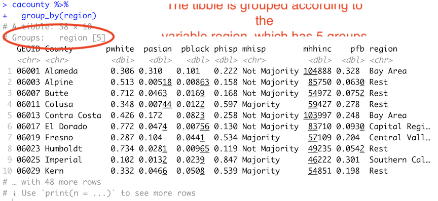
The second pipe takes this grouped dataset and sends it into the summarize() command, which calculates the mean income (by region, because the dataset is grouped by region).
To get the mean, median and standard deviation of median income, its correlation with percent Hispanic, and give column labels for the variables in the resulting summary table, we type in
cacounty %>%
  group_by(region) %>%
  summarize(Mean = mean(mhhinc),
            Median = median(mhhinc),
            SD = sd(mhhinc),
            Correlation = cor(mhhinc, phisp))
## # A tibble: 5 × 5
## region Mean Median SD Correlation
## <chr> <dbl> <dbl> <dbl> <dbl>
## 1 Bay Area 107967 104888 17803. -0.575
## 2 Capital Region 71289. 70684 14131. -0.792
## 3 Central Valley 56736. 56720. 4505. 0.505
## 4 Rest 61126. 57233 12347. 0.569
## 5 Southern California 74319. 71358 16224. -0.930The variable mhhinc is numeric. How do we summarize categorical variables? We usually summarize categorical variables by examining a frequency table. To get the percent of counties that have a majority Hispanic population mhisp, you’ll need to combine the functions group_by(), summarize() and mutate() using %>%.
cacounty %>%
  group_by(mhisp) %>%
  summarize(n = n()) %>%
  mutate(freq = n / sum(n))
## # A tibble: 2 × 3
## mhisp n freq
## <chr> <int> <dbl>
## 1 Majority 11 0.190
## 2 Not Majority 47 0.810The code group_by(mhisp) separates the counties by the categories of mhisp (Majority, Not Majority). We then used summarize() to count the number of counties that are Majority and Not Majority. The function to get a count is n(), and we saved this count in a variable named n. Next, we used mutate() on this table to get the proportion of counties by Majority Hispanic designation. The code sum(n) adds the values of n. We then divide the value of each n by this sum. That yields the final frequency table.
Instead of calculating descriptive statistics one at a time using summarize(), you can obtain a set of summary statistics for one or all the numeric variables in your dataset using the summary() function.
summary(cacounty)## GEOID County pwhite pasian
## Length:58 Length:58 Min. :0.1019 Min. :0.00000
## Class :character Class :character 1st Qu.:0.3448 1st Qu.:0.01891
## Mode :character Mode :character Median :0.5115 Median :0.04502
## Mean :0.5297 Mean :0.07488
## 3rd Qu.:0.7103 3rd Qu.:0.07884
## Max. :0.8837 Max. :0.37433
## pblack phisp mhisp mhhinc
## Min. :0.001035 Min. :0.0744 Length:58 Min. : 41780
## 1st Qu.:0.010887 1st Qu.:0.1534 Class :character 1st Qu.: 55312
## Median :0.018042 Median :0.2572 Mode :character Median : 65056
## Mean :0.029403 Mean :0.3095 Mean : 71109
## 3rd Qu.:0.032150 3rd Qu.:0.4495 3rd Qu.: 84406
## Max. :0.133282 Max. :0.8466 Max. :130890
## pfb region
## Min. :0.01932 Length:58
## 1st Qu.:0.07539 Class :character
## Median :0.18465 Mode :character
## Mean :0.16787
## 3rd Qu.:0.22321
## Max. :0.39725Tables for presentation
The output from the descriptive statistics we’ve ran so far is not presentation ready. For example, taking a screenshot of the following results table produces unnecessary information that is confusing and messy.
cacounty %>%
  group_by(region) %>%
  summarize(Mean = mean(mhhinc),
            Median = median(mhhinc),
            SD = sd(mhhinc),
            Correlation = cor(mhhinc, phisp))
## # A tibble: 5 × 5
## region Mean Median SD Correlation
## <chr> <dbl> <dbl> <dbl> <dbl>
## 1 Bay Area 107967 104888 17803. -0.575
## 2 Capital Region 71289. 70684 14131. -0.792
## 3 Central Valley 56736. 56720. 4505. 0.505
## 4 Rest 61126. 57233 12347. 0.569
## 5 Southern California 74319. 71358 16224. -0.930Furthermore, you would like to show a table, say, in a Story Map that does not require you to take a screenshot or copying and pasting into Excel, but instead can be produced via code, that way it can be fixed if there is an issue, and is reproducible.
One way of producing presentation tables in R is through the flextable package. First, you will need to save the tibble or data frame of results into an object. For example, let’s save the above results into an object named region.summary
region.summary <- cacounty %>%
  group_by(region) %>%
  summarize(Mean = mean(mhhinc),
            Median = median(mhhinc),
            SD = sd(mhhinc),
            Correlation = cor(mhhinc, phisp))
You then input the object into the function flextable(). Save it into an object called my_table
my_table <- flextable(region.summary)You should see a relatively clean table pop up either in your console or Viewer window.
What kind of object is my_table?
class(my_table)## [1] "flextable"After doing this, we can progressively pipe the my_table object through more flextable formatting functions. For example, you can change the column header names using the function set_header_labels() and center the header names using the function align()
my_table <- my_table %>%
          set_header_labels(
            region = "Region",
            Mean = "Mean",
            Median = "Median",
            SD = "Standard Deviation",
            Correlation = "Correlation") %>%
  align(align = "center")

my_tableRegion | Mean | Median | Standard Deviation | Correlation |
|---|---|---|---|---|
Bay Area | 107,967.00 | 104,888.0 | 17,802.552 | -0.5747089 |
Capital Region | 71,289.11 | 70,684.0 | 14,131.455 | -0.7923603 |
Central Valley | 56,735.50 | 56,719.5 | 4,504.901 | 0.5048182 |
Rest | 61,125.78 | 57,233.0 | 12,347.209 | 0.5686099 |
Southern California | 74,319.29 | 71,358.0 | 16,223.511 | -0.9298418 |
There are a slew of options for formatting your table, including adding footnotes, borders, shade and other features. Check out this useful tutorial for an explanation of some of these features.
Once you’re done formatting your table, you can then export it to Word, PowerPoint or HTML or as an image (PNG) files. To do this, use one of the following functions: save_as_docx(), save_as_pptx(), save_as_image(), and save_as_html(). Use the save_as_image() function to save your table as an image.
save_as_image(my_table, path = "reg_income.png")You first put in the table my_table, and set the file name with the png extension. Check your working directory. You should see the file reg_income.png.
Data Visualization
Another way of summarizing variables and their relationships is through graphs and charts. The main package for R graphing is ggplot2 which is a part of the tidyverse package. The graphing function is ggplot() and it takes on the basic template
ggplot(data = <DATA>) +
      <GEOM_FUNCTION>(mapping = aes(x, y)) +
<OPTIONS>()ggplot()is the base function where you specify your dataset using thedata = <DATA>argument.You then need to build on this base by using the plus operator
+and<GEOM_FUNCTION>()where<GEOM_FUNCTION>()is a uniquegeomfunction indicating the type of graph you want to plot. Each unique function has its unique set of mapping arguments which you specify using themapping = aes()argument. Charts and graphs have an x-axis, y-axis, or both. Check this ggplot cheat sheet for all possible geoms.<OPTIONS>()are a set of functions you can specify to change the look of the graph, for example relabeling the axes or adding a title.
The basic idea is that a ggplot graphic layers geometric objects (circles, lines, etc), themes, and scales on top of data.
You first start out with the base layer. It represents the empty ggplot layer defined by the ggplot() function.
cacounty %>%
  ggplot()
We get an empty plot. We haven’t told ggplot() what type of geometric object(s) we want to plot, nor how the variables should be mapped to the geometric objects, so we just have a blank plot. We have geoms to paint the blank canvas.
From here, we add a “geom” layer to the ggplot object. Layers are added to ggplot objects using +, instead of %>%, since you are not explicitly piping an object into each subsequent layer, but adding layers on top of one another. Each geom is associated with a specific type of graph.
Let’s go through some of the more common and popular graphs for visualizing your data.
Histogram
A typical visual for summarizing a single numeric variable is a histogram. To create a histogram, use geom_histogram() for <GEOM_FUNCTION()>. Let’s create a histogram of median household income. Note that we don’t need to specify the y= here because we are plotting only one variable. We pipe in the object cacounty into ggplot() to establish the base layer. We then use geom_histogram() to add the data layer on top of the base.
cacounty %>%
  ggplot() +
  geom_histogram(mapping = aes(x=mhhinc))
## `stat_bin()` using `bins = 30`. Pick better value with `binwidth`.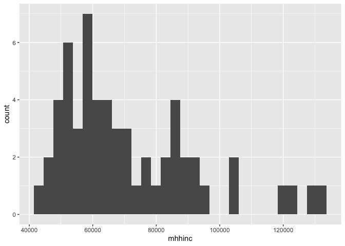
We can continue to add layers to the plot. For example, we use the argument xlab("Median household income") to label the x-axis as “Median household income”.
cacounty %>%
  ggplot() +
  geom_histogram(mapping = aes(x=mhhinc)) +
  xlab("Median household income")
## `stat_bin()` using `bins = 30`. Pick better value with `binwidth`.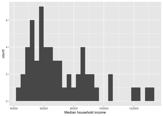
Note the message produced with the plot. It tells us that we can use the bins = argument to change the number of bins used to produce the histogram. You can increase the number of bins to make the bins narrower and thus get a finer grain of detail. Or you can decrease the number of bins to get a broader visual summary of the shape of the variable’s distribution. Compare bins = 10 to bins = 50.
Boxplot
We can use a boxplot to visually summarize the distribution of a single numeric variable or the relationship between a categorical and numeric variable. Use geom_boxplot() for <GEOM_FUNCTION()> to create a boxplot. Let’s examine median household income. Note that a boxplot uses y= rather than x= to specify where mhhinc goes. We also provide a descriptive y-axis label using the ylab() function.
cacounty %>%
  ggplot() +
    geom_boxplot(mapping = aes(y = mhhinc)) +
    ylab("Median household income")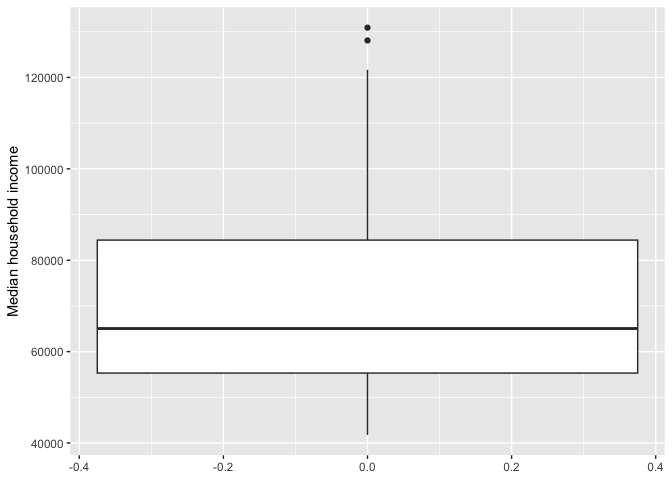
Let’s examine the distribution of median income by mhisp. Because we are examining the association between two variables, we need to specify x and y variables in aes() (we also specify both x- and y-axis labels).
cacounty %>%
  ggplot() +
    geom_boxplot(mapping = aes(x = mhisp, y = mhhinc)) +
    xlab("Majority Hispanic") +
    ylab("Median household income")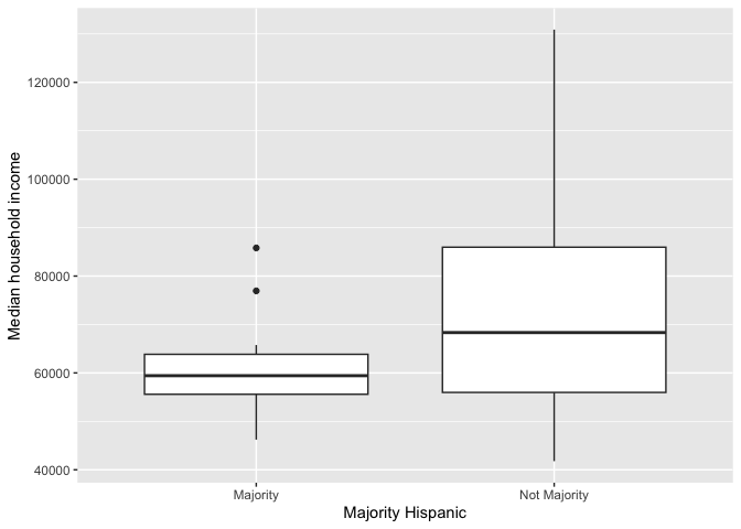
The top and bottom of a boxplot represent the 75th and 25th percentiles, respectively. The line in the middle of the box is the 50th percentile. Points outside the whiskers represent outliers. Outliers are defined as having values that are either larger than the 75th percentile plus 1.5 times the IQR or smaller than the 25th percentile minus 1.5 times the IQR.
The boxplot is for all counties combined. Use the facet_wrap() function to separate by region. Notice the tilde ~ before the variable region inside facet_wrap().
cacounty %>%
  ggplot() +
    geom_boxplot(mapping = aes(x = mhisp, y = mhhinc)) +
    xlab("Majority Hispanic") +
    ylab("Median household income") +
facet_wrap(~region) 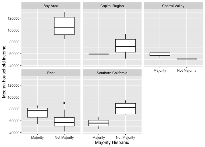
Bar chart
The primary purpose of a bar chart is to illustrate and compare the values for a categorical variable. Bar charts show either the number or frequency of each category. To create a bar chart, use geom_bar() for <GEOM_FUNCTION>(). Let’s show a bar chart of median household income by region. We’ll borrow from code above that generated a tibble of mean household income by region, and pipe that into ggplot()
cacounty %>%
  group_by(region) %>%
  summarize(Mean = mean(mhhinc)) %>%
  ggplot(aes(x=region, y = Mean)) +
  geom_bar(stat = "Identity") +
  xlab("Region") +
  ylab("Average household income")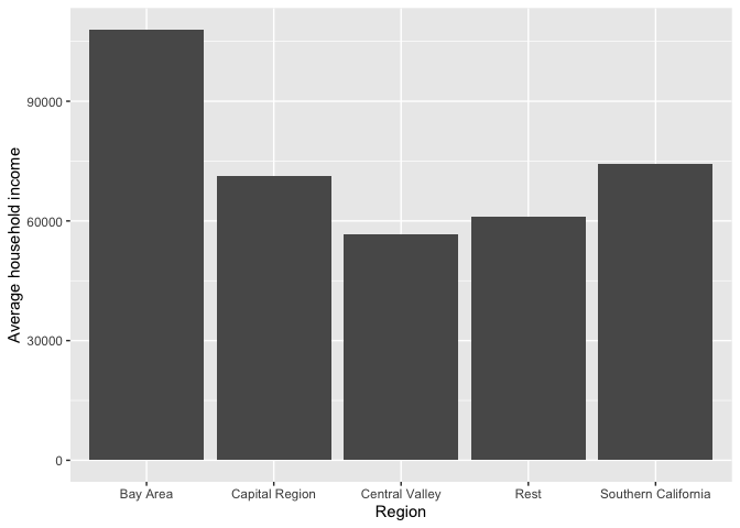
Right now the bars are ordered based on the region names. We can order the bars in descending order based on household income by using the reorder() function. Notice the negative sign in front of Mean to order by descending order.
cacounty %>%
  group_by(region) %>%
  summarize(Mean = mean(mhhinc)) %>%
  ggplot(aes(x=reorder(region, -Mean), y = Mean)) +
  geom_bar(stat = "Identity") +
  xlab("Region") +
  ylab("Average household income")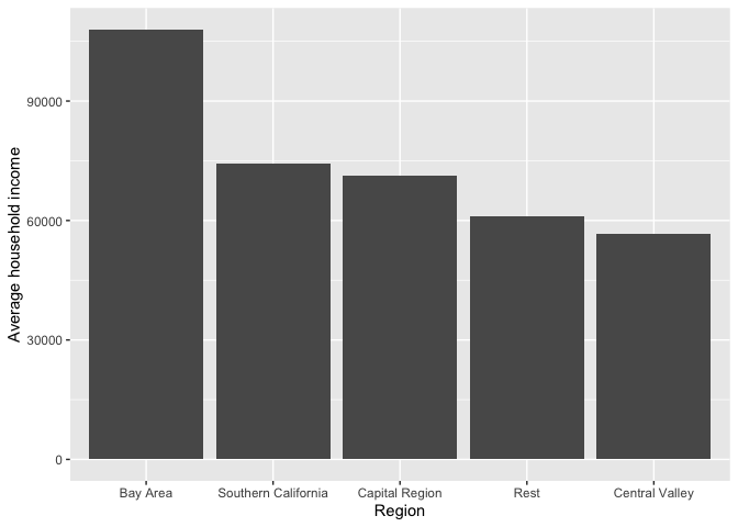
We can flip the axes using the function coord_flip().
cacounty %>%
  group_by(region) %>%
  summarize(Mean = mean(mhhinc)) %>%
  ggplot(aes(x=reorder(region, -Mean), y = Mean)) +
  geom_bar(stat = "Identity") +
  xlab("Region") +
  ylab("Average household income") +
  coord_flip()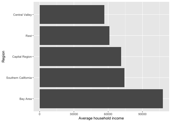
ggplot() is a powerful function, and you can make a lot of visually captivating graphs. We have just scratched the surface of its functions and features. You can also make your graphs really “pretty” and professional looking by altering graphing features, including colors, labels, titles and axes. For a list of ggplot() functions that alter various features of a graph, check out Chapter 28 in RDS.
Practice Exercise: Create a scatterplot of median household income and percent Hispanic.
Practice Exercise: Add geom_line() to the plot you made in the exercise above. What does the result show you? Does it makes sense to connect the observations with geom_line() in this case? Do the lines help us understand the connections between the observations better?
Here’s your ggplot2 badge. Wear it with pride, friends!
Other US government datasets
To this point, the lab has focused on the US Census and the American Community Survey. However, many more US government datasets are available to researchers, some from the US Census Bureau and others from different US government agencies. This section covers a series of R packages to help researchers access some of these resources.
censusAPI
Unlike tidycensus, which only focuses on a select number of datasets, the package censusapi can be widely applied to the hundreds of possible datasets the Census Bureau makes available. censusapi requires some knowledge of how to structure Census Bureau API requests to work; however this makes the package more flexible than tidycensus and may be preferable for users who want to submit highly customized queries to the decennial Census or ACS APIs.
censusapi uses the same Census API key as tidycensus. If this environment variable is set in a user’s .Renviron file, which you did when you used install = TRUE, functions in censusapi will pick up the key without having to supply it directly. If you get an error stating that you need to add your Census key to your .REnviron, follow the instructions here.
censusapi’s core function is getCensus(). The example below makes a request to the Economic Census API, getting data on employment and payroll for NAICS code 72 (accommodation and food services businesses) in counties in California in 2017.
ca_econ17 <- getCensus(
  name = "ecnbasic",
  vintage = 2017,
  vars = c("EMP", "PAYANN", "GEO_ID"),
  region = "county:*",
  regionin = "state:06",
  NAICS2017 = 72
)
Take a look at the dataset
glimpse(ca_econ17)## Rows: 58
## Columns: 6
## $ state <chr> "06", "06", "06", "06", "06", "06", "06", "06", "06", "06", …
## $ county <chr> "047", "033", "043", "049", "115", "013", "027", "035", "099…
## $ EMP <chr> "5365", "1535", "986", "108", "1066", "34165", "1412", "679"…
## $ PAYANN <chr> "81522", "30697", "25906", "2571", "19242", "681514", "30657…
## $ GEO_ID <chr> "0500000US06047", "0500000US06033", "0500000US06043", "05000…
## $ NAICS2017 <chr> "72", "72", "72", "72", "72", "72", "72", "72", "72", "72", …The variable EMP provides the employment count, and PAYANN (in $1,000) provides the annual payroll.
A fuller description of what censusAPI offers can be found on its official website.
lehdr
Another very useful package for working with Census Bureau data is the lehdr R package, which accesses the Longitudinal and Employer-Household Dynamics (LEHD) Origin-Destination Employment Statistics (LODES) data. LODES is not available from the Census API, meriting an alternative package and approach. LODES includes synthetic estimates of residential, workplace, and residential-workplace links at the Census block level, allowing for highly detailed geographic analysis of jobs and commuter patterns over time.
The core function implemented in lehdr is grab_lodes(), which downloads a LODES file of a specified lodes_type (either rac for residential, wac for workplace, or od for origin-destination) for a given state and year. While the raw LODES data are available at the Census block level, the agg_geo parameter offers a convenient way to roll up estimates to higher levels of aggregation. For origin-destination data, the state_part = "main" argument below captures within-state commuters; use state_part = "aux" to get commuters from out-of-state. The optional argument use_cache = TRUE stores downloaded LODES data in a cache directory on the user’s computer; this is recommended to avoid having to re-download data for future analyses.
Let’s grab a dataset that contains 2018 tract-to-tract commute flows broken down by a variety of characteristics in Nevada, referenced in the LODES documentation.
nv_lodes_od <- grab_lodes(
  state = "nv",
  year = 2018,
  lodes_type = "od",
  agg_geo = "tract",
  state_part = "main",
  use_cache = TRUE
)glimpse(nv_lodes_od)## Rows: 160,705
## Columns: 14
## $ year <dbl> 2018, 2018, 2018, 2018, 2018, 2018, 2018, 2018, 2018, 2018, 20…
## $ state <chr> "NV", "NV", "NV", "NV", "NV", "NV", "NV", "NV", "NV", "NV", "N…
## $ w_tract <chr> "32001950100", "32001950100", "32001950100", "32001950100", "3…
## $ h_tract <chr> "32001950100", "32001950301", "32001950302", "32001950400", "3…
## $ S000 <dbl> 97, 84, 151, 1, 29, 204, 183, 1, 1, 1, 2, 1, 1, 1, 2, 1, 2, 1,…
## $ SA01 <dbl> 7, 14, 25, 0, 4, 7, 8, 0, 0, 0, 0, 0, 0, 0, 0, 0, 0, 0, 0, 0, …
## $ SA02 <dbl> 51, 44, 81, 0, 7, 117, 97, 1, 0, 1, 1, 0, 0, 0, 1, 1, 2, 1, 0,…
## $ SA03 <dbl> 39, 26, 45, 1, 18, 80, 78, 0, 1, 0, 1, 1, 1, 1, 1, 0, 0, 0, 1,…
## $ SE01 <dbl> 19, 3, 6, 0, 6, 8, 17, 0, 0, 0, 0, 0, 1, 0, 0, 0, 0, 0, 0, 0, …
## $ SE02 <dbl> 24, 22, 35, 0, 4, 28, 27, 0, 0, 0, 2, 0, 0, 0, 0, 0, 0, 0, 0, …
## $ SE03 <dbl> 54, 59, 110, 1, 19, 168, 139, 1, 1, 1, 0, 1, 0, 1, 2, 1, 2, 1,…
## $ SI01 <dbl> 44, 35, 49, 1, 16, 80, 76, 0, 0, 0, 0, 0, 1, 0, 0, 0, 0, 0, 0,…
## $ SI02 <dbl> 34, 38, 72, 0, 10, 112, 74, 0, 0, 0, 0, 0, 0, 0, 0, 0, 0, 0, 0…
## $ SI03 <dbl> 19, 11, 30, 0, 3, 12, 33, 1, 1, 1, 2, 1, 0, 1, 2, 1, 2, 1, 1, …lehdr can be used for a variety of purposes including transportation and economic development planning. For example, Tesla opened up the Tahoe Reno Industrial Center in 2016 (i.e., the Nevada Gigafactory) with promises of hiring local residents. The workflow below illustrates how to use LODES data to understand the origins of commuters to the Gigafactory (represented by its Census tract 32029970200) near Reno, Nevada. Commuters from LODES will be normalized by the total population age 18 and up, acquired from tidycensus for 2018 Census tracts in nearby counties. The dataset tesla_commuters will include an estimate of the number of Tesla-area commuters per 1000 adults in that Census tract.
nv_adults <- get_acs(
  geography = "tract",
  variables = "S0101_C01_026",
  state = "NV",
  year = 2018,
)

tesla <- filter(nv_lodes_od, w_tract == "32029970200")

tesla_commuters <- nv_adults %>%
  left_join(tesla, by = c("GEOID" = "h_tract")) %>%
  mutate(ms_per_1000 = 1000 * (S000 / estimate))
The tibble tesla_commuters provides the number of commuters to Tesla’s Nevada Gigafactory per 1,000 population (ms_per_100) in each census tract across Nevada in 2018.
tidyUSDA
Agriculture can be a difficult sector on which to collect statistics, as it is not available in many data sources such as LODES. Fortunately, dedicated statistics on US agriculture can be acquired with the tidyUSDA package. You’ll need to get an API key at https://quickstats.nass.usda.gov/api and use that to request data from the USDA QuickStats API.
Let’s see which California counties produce have the most acres devoted to peaches. The core function implemented is getQuickstat(). To use it effectively, it is helpful to construct a query first at https://quickstats.nass.usda.gov/ and see what options are available, then bring those options as arguments into R.
CA_asp <- getQuickstat(
  key = "ENTER YOUR KEY HERE",
  program = "CENSUS",
  data_item = "PEACHES - ACRES BEARING",
  sector = "CROPS",
  commodity = "PEACHES",
  category = "AREA BEARING",
  domain = "TOTAL",
  geographic_level = "COUNTY",
  state = "CALIFORNIA",
  year = "2017"
)
Take a look at the data
glimpse(CA_asp)## Rows: 49
## Columns: 39
## $ county_name <chr> "HUMBOLDT", "MENDOCINO", "SHASTA", "SISKIYOU", "…
## $ country_name <chr> "UNITED STATES", "UNITED STATES", "UNITED STATES…
## $ country_code <chr> "9000", "9000", "9000", "9000", "9000", "9000", …
## $ util_practice_desc <chr> "ALL UTILIZATION PRACTICES", "ALL UTILIZATION PR…
## $ short_desc <chr> "PEACHES - ACRES BEARING", "PEACHES - ACRES BEAR…
## $ freq_desc <chr> "ANNUAL", "ANNUAL", "ANNUAL", "ANNUAL", "ANNUAL"…
## $ zip_5 <chr> "", "", "", "", "", "", "", "", "", "", "", "", …
## $ source_desc <chr> "CENSUS", "CENSUS", "CENSUS", "CENSUS", "CENSUS"…
## $ prodn_practice_desc <chr> "ALL PRODUCTION PRACTICES", "ALL PRODUCTION PRAC…
## $ Value <dbl> 18, 6, 10, NA, NA, NA, NA, 3, NA, 8, 2, 12, NA, …
## $ congr_district_code <chr> "", "", "", "", "", "", "", "", "", "", "", "", …
## $ load_time <chr> "2018-02-01 00:00:00.000", "2018-02-01 00:00:00.…
## $ week_ending <chr> "", "", "", "", "", "", "", "", "", "", "", "", …
## $ region_desc <chr> "", "", "", "", "", "", "", "", "", "", "", "", …
## $ `CV (%)` <chr> "16.2", "16.2", "16.2", "(D)", "(D)", "(D)", "(D…
## $ watershed_desc <chr> "", "", "", "", "", "", "", "", "", "", "", "", …
## $ class_desc <chr> "ALL CLASSES", "ALL CLASSES", "ALL CLASSES", "AL…
## $ domain_desc <chr> "TOTAL", "TOTAL", "TOTAL", "TOTAL", "TOTAL", "TO…
## $ domaincat_desc <chr> "NOT SPECIFIED", "NOT SPECIFIED", "NOT SPECIFIED…
## $ asd_desc <chr> "NORTHERN COAST", "NORTHERN COAST", "SISKIYOU-SH…
## $ year <int> 2017, 2017, 2017, 2017, 2017, 2017, 2017, 2017, …
## $ statisticcat_desc <chr> "AREA BEARING", "AREA BEARING", "AREA BEARING", …
## $ county_ansi <chr> "023", "045", "089", "093", "105", "035", "013",…
## $ state_alpha <chr> "CA", "CA", "CA", "CA", "CA", "CA", "CA", "CA", …
## $ state_fips_code <chr> "06", "06", "06", "06", "06", "06", "06", "06", …
## $ commodity_desc <chr> "PEACHES", "PEACHES", "PEACHES", "PEACHES", "PEA…
## $ end_code <chr> "00", "00", "00", "00", "00", "00", "00", "00", …
## $ watershed_code <chr> "00000000", "00000000", "00000000", "00000000", …
## $ asd_code <chr> "10", "10", "20", "20", "20", "30", "40", "40", …
## $ unit_desc <chr> "ACRES", "ACRES", "ACRES", "ACRES", "ACRES", "AC…
## $ group_desc <chr> "FRUIT & TREE NUTS", "FRUIT & TREE NUTS", "FRUIT…
## $ begin_code <chr> "00", "00", "00", "00", "00", "00", "00", "00", …
## $ sector_desc <chr> "CROPS", "CROPS", "CROPS", "CROPS", "CROPS", "CR…
## $ state_name <chr> "CALIFORNIA", "CALIFORNIA", "CALIFORNIA", "CALIF…
## $ county_code <chr> "023", "045", "089", "093", "105", "035", "013",…
## $ reference_period_desc <chr> "YEAR", "YEAR", "YEAR", "YEAR", "YEAR", "YEAR", …
## $ agg_level_desc <chr> "COUNTY", "COUNTY", "COUNTY", "COUNTY", "COUNTY"…
## $ state_ansi <chr> "06", "06", "06", "06", "06", "06", "06", "06", …
## $ location_desc <chr> "CALIFORNIA, NORTHERN COAST, HUMBOLDT", "CALIFOR…Use the EDA techniques above to summarize the data
CA_asp %>%
  select(county_name, Value) %>%
  arrange(desc(Value))
## county_name Value
## 1 FRESNO 14698
## 2 TULARE 7009
## 3 SUTTER 3730
## 4 MERCED 2662
## 5 STANISLAUS 2658
## 6 YUBA 1855
## 7 SAN JOAQUIN 1560
## 8 BUTTE 1485
## 9 KINGS 1159
## 10 MADERA 880
## 11 KERN 428
## 12 YOLO 336
## 13 PLACER 135
## 14 LOS ANGELES 108
## 15 EL DORADO 85
## 16 SOLANO 74
## 17 NEVADA 21
## 18 RIVERSIDE 20
## 19 HUMBOLDT 18
## 20 SONOMA 17
## 21 SAN DIEGO 17
## 22 SAN LUIS OBISPO 12
## 23 SHASTA 10
## 24 NAPA 8
## 25 SANTA BARBARA 7
## 26 MENDOCINO 6
## 27 AMADOR 6
## 28 SANTA CRUZ 4
## 29 SACRAMENTO 4
## 30 VENTURA 4
## 31 LAKE 3
## 32 SAN BENITO 2
## 33 CALAVERAS 1
## 34 MARIPOSA 1
## 35 SISKIYOU NA
## 36 TRINITY NA
## 37 LASSEN NA
## 38 CONTRA COSTA NA
## 39 MONTEREY NA
## 40 SAN MATEO NA
## 41 SANTA CLARA NA
## 42 COLUSA NA
## 43 GLENN NA
## 44 TEHAMA NA
## 45 ALPINE NA
## 46 INYO NA
## 47 TUOLUMNE NA
## 48 ORANGE NA
## 49 SAN BERNARDINO NAFresno, the home of California peaches! And a bar chart (removing the missing value NAs).
CA_asp %>%
  filter(is.na(Value) == FALSE) %>%
  ggplot(aes(x=reorder(county_name, Value), y = Value)) +
  geom_bar(stat = "Identity") +
  xlab("County") +
  ylab("Total acres bearing") +
  theme_bw() +
  coord_flip()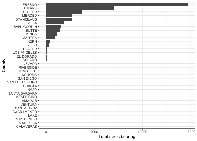
The Census and other U.S. government agencies offer a bevy of other data products at various levels of aggregation. This also includes individual level data, also known as microdata. In many cases, microdata reflect responses to surveys that are de-identified and anonymized, then prepared in datasets that include rich detail about survey responses. US Census microdata are available for both the decennial Census and the ACS; these datasets, named the Public Use Microdata Series (PUMS), allow for detailed cross-tabulations not available in aggregated data. For information on the ecosystem of Census and Government related R packages, check out Kyle Walker’s indispensable book on using R to access census data. If you are interested in accessing Census data outside of the United States, check out his Chapter 12.

This work is licensed under a Creative Commons Attribution-NonCommercial 4.0 International License.
Website created and maintained by Noli Brazil