Lab 3: Spatial Data in R
CRD 230 - Spatial Methods in Community Research
Professor Noli Brazil
January 25, 2023
In this guide you will acquire the skills needed to process and present spatial data in R. The objectives of the guide are as follows
- Understand how spatial data are processed in R.
- Learn spatial operations on polygon shapefile data.
- Learn how to use areal interpolation to attach census data to non census boundaries.
- Learn how to make a map.
This lab guide follows closely and supplements the material presented in Chapters 1, 2.1-2.3, 4.2, and 9 in the textbook Geocomputation with R (GWR) and the Spatial Data class handout.
Installing and loading packages
You’ll need to install the following packages in R. You only need to do this once, so if you’ve already installed these packages, skip the code. Also, don’t put these install.packages() in your R Markdown document. Copy and paste the code in the R Console. We’ll talk about what functions these packages provide as their relevant functions come up in the guide.
install.packages(c("rmapshaper",
                   "tigris",
                   "sf",
                   "tmap",
                   "areal",
                   "leaflet",
                   "RColorBrewer",
                   "raster",
                   "rasterVis"))
You’ll need to load the following packages. Unlike installing, you will always need to load packages whenever you start a new R session. You’ll always need to use library() in your R Markdown file.
library(tidyverse)
library(tidycensus)
library(sf)
library(tigris)
library(rmapshaper)
library(tmap)
library(areal)
library(leaflet)
library(raster)
library(rasterVis)
library(RColorBrewer)
Spatial data in R
There are two main packages for dealing with vector spatial data in R: sp and sf.
- sp has been around since 2005, and thus has a rich ecosystem of tools built on top of it. However, it uses a rather complex data structure, which can make it challenging to use.
- sf is newer (first released in 2016!) so it doesn’t have such a rich ecosystem. However, it’s much easier to use and fits in very naturally with the tidyverse. The trend is shifting towards the use of sf as the primary spatial package.
Processing spatial data is very similar to nonspatial data thanks to the package sf, which is tidy friendly. The non-tidy package sp is still used quite a bit, and you’ll be relying on this package to do more complicated spatial analyses in future labs. However, because R spatial is trending towards sf, we will use it over sp whenever possible.
sf stands for simple features. The Simple Features standard defines a simple feature as a representation of a real world object by a point or points that may or may not be connected by straight line segments to form lines or polygons. A feature is thought of as a thing, or an object in the real world, such as a building or a tree. A county can be a feature. As can a city and a neighborhood. Features have a geometry describing where on Earth the features are located, and they have attributes, which describe other properties. Think back to Lab 2 - we were working with counties. The difference between what we were doing last week and what we will be doing in this lab is that counties in Lab 2 had attributes (e.g. percent Hispanic, total population), but they did not have geometries. This is what separates nonspatial and spatial data in R.
The main package for handling raster data in R is raster (although the terra package will likely replace it soon. Both have many of the same features, but terra offers several improvements to raster. See more here). The raster package has functions for creating, reading, manipulating, and writing raster data. It is built around a number of classes of which the RasterLayer, RasterBrick, and RasterStack classes are the most important. When discussing methods that can operate on all three of these objects, they are referred to as Raster* objects.
Bringing in spatial data
Vector data
We’ll be primarily working with object (or vector) data in shapefile format in this class. Shapefiles are not the only type of spatial data, but they are the most commonly used. Let’s be clear here: sf objects are R specific and shapefiles are a general format of spatial data. This is like tibbles are R specific and csv files are a general format of non spatial data.
We will be working a lot with Census geographies in this class. Part of this is due to their convenience, but also because social science research and many applications in the field use and rely on Census geographies for spatial analysis. There are two major packages for bringing in Census geographic boundary shapefiles into R: tidycensus and tigris. These packages allow users to directly download and use TIGER Line shapefiles from the Census Bureau. If you need a reminder of the major Census geographies, review Handout 1.
tidycensus
In Lab 2, we worked with the tidycensus package and the Census API to bring in Census data into R. We can use the same commands to bring in Census geography. If you haven’t already, make sure to sign up for and install your Census API key. If you could not install your API key, you’ll need to use census_api_key() to activate it.
census_api_key("YOUR API KEY GOES HERE", install = TRUE)Use the get_acs() command to bring in California tract-level race/ethnicity counts, total population, and total number of households. How did I find the variable IDs? Check Lab 2. Since we want tracts, we’ll use the geography = "tract" argument.
ca.tracts <- get_acs(geography = "tract",
              year = 2018,
              variables = c(tpopr = "B03002_001",
                            nhwhite = "B03002_003", nhblk = "B03002_004",
                            nhasn = "B03002_006", hisp = "B03002_012"),
              state = "CA",
              output = "wide",
              survey = "acs5",
              geometry = TRUE,
              cb = FALSE)
The only difference between the code above and what we used in Lab 2 is we have one additional argument added to the get_acs() command: geometry = TRUE. This tells R to bring in the spatial features associated with the geography you specified in the command, in the above case California tracts. Remember, you can set cache_table = TRUE so that you don’t have to re-download after you’ve downloaded successfully the first time. This is important because you might be downloading a really large file, or may encounter Census FTP issues when trying to collect data.
Lets take a look at our data.
ca.tracts## Simple feature collection with 8057 features and 12 fields
## Geometry type: MULTIPOLYGON
## Dimension: XY
## Bounding box: xmin: -124.482 ymin: 32.52883 xmax: -114.1312 ymax: 42.0095
## Geodetic CRS: NAD83
## First 10 features:
## GEOID NAME tpoprE
## 1 06037137504 Census Tract 1375.04, Los Angeles County, California 2073
## 2 06037138000 Census Tract 1380, Los Angeles County, California 4673
## 3 06037139200 Census Tract 1392, Los Angeles County, California 5840
## 4 06067002300 Census Tract 23, Sacramento County, California 3342
## 5 06067002400 Census Tract 24, Sacramento County, California 4685
## 6 06037143200 Census Tract 1432, Los Angeles County, California 4210
## 7 06037143300 Census Tract 1433, Los Angeles County, California 6730
## 8 06037201301 Census Tract 2013.01, Los Angeles County, California 4069
## 9 06037201302 Census Tract 2013.02, Los Angeles County, California 4287
## 10 06037201401 Census Tract 2014.01, Los Angeles County, California 4814
## tpoprM nhwhiteE nhwhiteM nhblkE nhblkM nhasnE nhasnM hispE hispM
## 1 256 1890 217 19 19 33 36 64 60
## 2 248 3407 264 325 211 333 110 393 112
## 3 518 3426 426 153 164 840 353 1330 360
## 4 176 2201 198 55 33 178 72 666 178
## 5 374 3620 321 135 94 227 83 440 115
## 6 456 2740 392 375 292 260 164 539 248
## 7 483 4277 460 477 350 471 140 1270 236
## 8 382 187 104 8 11 461 223 3410 304
## 9 334 867 183 257 143 1746 307 1148 205
## 10 457 329 136 37 34 309 128 3953 420
## geometry
## 1 MULTIPOLYGON (((-118.5812 3...
## 2 MULTIPOLYGON (((-118.6057 3...
## 3 MULTIPOLYGON (((-118.5308 3...
## 4 MULTIPOLYGON (((-121.5022 3...
## 5 MULTIPOLYGON (((-121.5097 3...
## 6 MULTIPOLYGON (((-118.379 34...
## 7 MULTIPOLYGON (((-118.3965 3...
## 8 MULTIPOLYGON (((-118.193 34...
## 9 MULTIPOLYGON (((-118.1903 3...
## 10 MULTIPOLYGON (((-118.1938 3...The object looks much like a basic tibble, but with a few differences.
- You’ll find that the description of the object now indicates that it is a simple feature collection with 8,057 features (tracts in California) with 12 fields (attributes or columns of data).
- The
Geometry Typeindicates that the spatial data are inMULTIPOLYGONform (as opposed to points or lines, the other basic vector data forms).
Bounding boxindicates the spatial extent of the features (from left to right, for example, California tracts go from a longitude of -121.5099 to -118.3631).
Geodetic CRSis related to the coordinate reference system, which we’ll touch on in next week’s lab.
- The final difference is that the data frame contains the column geometry. This column (a list-column) contains the geometry for each observation.
At its most basic, an sf object is a collection of simple features that includes attributes and geometries in the form of a data frame. In other words, it is a data frame (or tibble) with rows of features, columns of attributes, and a special column always named geometry that contains the spatial aspects of the features.
If you want to peek behind the curtain and learn more about the nitty gritty details about simple features, check out the official sf vignette.
tigris package
Another package that allows us to bring in census geographic boundaries is tigris. Here is a list of all the boundaries you can download through this package. Let’s use the function core_based_statistical_areas() to bring in boundaries for all metropolitan and micropolitan areas in the United States.
cb <- core_based_statistical_areas(year = 2018, cb = FALSE)The cb = FALSE argument tells R to download the TIGER/Line shapefiles as opposed to the default Census Bureau’s cartographic boundary shapefiles. The argument year=2018 tells R to bring in the boundaries for that year (census geographies can change from year to year). When using the multi-year ACS, best to use the end year of the period. In the get_acs() command above we used year=2018, so also use year=2018 in the core_based_statistical_areas() command.
We then use filter() to keep the Sacramento metropolitan area. In order to do this, we can use the function grepl() within the filter() function.
sac.metro <- filter(cb, grepl("Sacramento", NAME))The function grepl() tells the command filter() to find features (rows) with the value “Sacramento” somewhere in their value for the variable NAME. This is useful when we don’t know the exact name of an area (the full name of the Sacramento metro area is “Sacramento–Roseville–Arden-Arcade, CA”).
Let’s also bring in the boundaries for Sacramento city. Use the places() function to get all places in California.
pl <- places(state = "CA", year = 2018, cb = FALSE)Remember to keep the year consistent across all geographic levels (year = 2018). Then use filter() to keep Sacramento.
sac.city <- filter(pl, NAME == "Sacramento")I use NAME == here instead of grepl() because I already know the full name of Sacramento and I didn’t want to include West Sacramento. Note that unlike the tidycensus package, tigris does not allow you to attach attribute data (e.g. percent Hispanic, total population, etc.) to geometric features. However, you get a badge for learning about the package. Hooray!

Reading from your hard drive
Directly reading spatial files using an API is great, but doesn’t exist for many spatial data sources. You’ll often have to download a spatial data set, save it onto your hard drive and read it into R. The function for reading spatial files is st_read(). I zipped up and uploaded onto GitHub a folder containing files for this lab. Set your working directory to an appropriate folder and use the following code to download and unzip the file. It’s also on Canvas if you are having difficulty downloading it from GitHub (Week 3 - Lab).
setwd("insert your pathway here")
download.file(url = "https://raw.githubusercontent.com/crd230/data/master/spatiallab.zip", destfile = "spatiallab.zip")
unzip(zipfile = "spatiallab.zip")
Don’t worry if you don’t understand these commands - they are more for you to simply copy and paste so that you can download files that I zipped up and uploaded onto GitHub. You can look at the help documentation for each function if you are curious. If you are having problems reading in the data, you may need to add method = "curl" to download.file(), which may also require you to install the package RCurl.
You should see the shapefiles Council_Districts.shp, Rivers.shp, Parks.shp, and EV_Chargers.shp in the folder you specified in setwd(). These files contain Sacramento Council Districts polygons, Sacramento river polylines, Sacramento parks polygons, and Sacramento Electric Vehicle Charging Locations points, respectively. There are three other files, ca_med_inc_2018.csv, nlcd_classes.csv and sac_county_lc.tif. We’ll bring those files in later.
Bring in the shapefiles using the function st_read(). You’ll need to add the .shp extension so that the function knows it’s reading in a shapefile.
cdist <- st_read("Council_Districts.shp", stringsAsFactors = FALSE)
parks <- st_read("Parks.shp", stringsAsFactors = FALSE)
rivers <- st_read("Rivers.shp", stringsAsFactors = FALSE)
evcharge <- st_read("EV_Chargers.shp", stringsAsFactors = FALSE)
The argument stringsAsFactors = FALSE tells R to keep any variables that look like a character as a character and not a factor. Look at cdist
head(cdist)## Simple feature collection with 6 features and 5 fields
## Geometry type: MULTIPOLYGON
## Dimension: XY
## Bounding box: xmin: -121.5592 ymin: 38.44879 xmax: -121.3628 ymax: 38.66999
## Geodetic CRS: WGS 84
## OBJECTID DISTNUM NAME Shape__Are Shape__Len
## 1 1 7 Rick Jennings II 0.002850069 0.4196103
## 2 2 4 Steve Hansen 0.002764893 0.4277325
## 3 3 2 Allen Warren 0.004130511 0.3907921
## 4 4 3 Jeff Harris 0.004188627 0.3715728
## 5 5 6 Eric Guerra 0.004222881 0.4589053
## 6 6 5 Jay Schenirer 0.002948265 0.4487165
## geometry
## 1 MULTIPOLYGON (((-121.5029 3...
## 2 MULTIPOLYGON (((-121.5467 3...
## 3 MULTIPOLYGON (((-121.42 38....
## 4 MULTIPOLYGON (((-121.4213 3...
## 5 MULTIPOLYGON (((-121.4161 3...
## 6 MULTIPOLYGON (((-121.4497 3...The output gives us pertinent information regarding the spatial file, including the type (MULTIPOLYGON), the extent or bounding box, the coordinate reference system, and the 6 variables. Click on cdist in your environment window. You’ll find that a window pops up in the top left portion of your interface. An sf object looks and feels like a regular data frame. The only difference is there is a geometry column. This column “spatializes” the dataset, or lets R know where each feature is geographically located on the Earth’s surface.
You can bring in other types of spatial data files other than shapefiles. See a list of these file types here.
Raster data
Raster datasets are simply an array of pixels/cells organized into rows and columns (or a grid) where each cell contains a value representing information, such as temperature, soil type, land use, water level. Raster maps usually represent continuous phenomena such as elevation, temperature, population density or spectral data. Discrete features such as soil or land-cover classes can also be represented in the raster data model. Rasters are aerial photographs, imagery from satellites, google street view images. Few things to note.
- Raster datasets are always rectangular (rows x col) similar to matrices. Irregular boundaries are created by using NAs.
- Rasters have to contain values of the same type (int, float, boolean) throughout the raster, just like matrices and unlike data frames.
- The size of the raster depends on the resolution and the extent of the raster. As such many rasters are large and often cannot be held in memory completely.
The workhorse package for working with rasters in R is raster and terra packages by Robert Hijmans. terra is better and faster in many instances, but is newer and does not have all the functionality and support associated with raster.
Typically you will bring in a raster dataset directly from a file. These files come in many different forms, typically .tif, .img, and .grd.
We’ll bring in the files sac_county_lc.tif and nlcd_classes.csv. The first file contains USGS land cover (for example, Low Intensity Developed, Deciduous Forest) for Sacramento county based on classes defined by the National Land Cover Dataset. The second file contains the descriptions of the land cover classes.
We use the function raster() to bring in data into raster form.
ca.lc <- raster("sac_county_lc.tif")The raster contains categorical data (land cover classes). We use the ratify() function to recognize ca.lc as a categorical raster.
ca.lc <- ratify(ca.lc)Let’s call up ca.lc.
ca.lc## class : RasterLayer
## dimensions : 2489, 3454, 8597006 (nrow, ncol, ncell)
## resolution : 0.0003329159, 0.0003329159 (x, y)
## extent : -122.0696, -120.9197, 38.00433, 38.83296 (xmin, xmax, ymin, ymax)
## crs : +proj=longlat +datum=NAD83 +no_defs
## source : sac_county_lc.tif
## names : layer
## values : 11, 95 (min, max)
## attributes :
## ID
## from: 11
## to : 95We find out that the object class is a RasterLayer. A RasterLayer object represents single-layer (variable) raster data. A RasterLayer object always stores a number of fundamental parameters that describe it. These include the number of columns and rows, the spatial extent, and the Coordinate Reference System (CRS).
In addition, a RasterLayer can store information about the file in which the raster cell values are stored (if there is such a file). At the bottom we see the Raster Attribute Table (RAT(m)). Think of the RAT as a data frame containing values of variables for each cell in your raster grid. Here, we find one attribute, ID. Sometimes rasters can be categorical (nominal or ordinal values), however, they are stored as numbers for convenience just as factors in regular R. This is the case with land cover in sac_county_lc.tif, where the integers 11 to 95 are associated with land cover classses. For example a land cover raster might have a value 21 representing Developed Open Space or 95 representing Emergent Wetlands.
The raster can be visualized as a static plot using the basic plot() function
plot(ca.lc)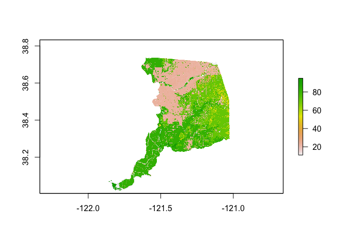
Remember, the classes are treated as integers when in fact they are categorical. So the numbers as mapped don’t make a lot of sense. In order to connect the integer values to their categorical classes, the raster object will need to have a corresponding look-up table. We’ll use the file nlcd_classes.csv to attach the names of land cover values into the raster in the next section.
Data Wrangling
There is a lot of stuff behind the curtain of how R handles spatial data as simple features, but the main takeaway is that sf objects are data frames. This means you can use many of the tidyverse functions we’ve learned in the past couple labs to manipulate sf objects, including the pipe %>% operator. For example, let’s do the following data wrangling tasks on ca.tracts.
- Keep necessary variables
- Break up the column NAME into separate tract, county and state variables
We do all of this in one line of continuous code using the pipe operator %>%
ca.tracts <- ca.tracts %>%
              dplyr::select(GEOID, NAME, tpoprE, nhwhiteE, nhblkE, nhasnE, hispE) %>%
              separate(NAME, c("Tract", "County", "State"), sep = ", ")
Another important data wrangling operation is to join attribute data to an sf object. For example, let’s say you wanted to add tract level median household income, which is located in the file ca_med_inc_2018.csv. Read the file in.
ca.inc <- read_csv("ca_med_inc_2018.csv")Remember, an sf object is a data frame, so we can use left_join(), which we covered in Lab 1, to join the files ca.inc and ca.tracts
ca.tracts <- ca.tracts %>%
  left_join(ca.inc, by = "GEOID")

#take a look to make sure the join worked
glimpse(ca.tracts)
Note that we can’t use left_join() to join the attribute tables of two sf files. You will need to either make one of them not spatial by using the st_drop_geometry() function or use the st_join() function.
We use the function tm_shape() from the tmap package to map the data. We’ll go into more detail on how to use tm_shape() for mapping later in this guide, so for now just type in
tm_shape(ca.tracts) +
  tm_polygons()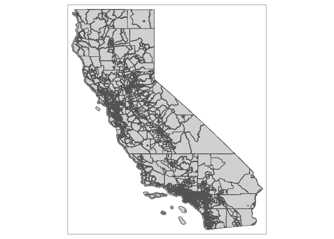
Practice Exercise: Map tracts just in Yolo County
The plot of Sacramento county land cover from last section was not so illustrative since we were mapping land cover integer IDs as opposed to their class names. We need to use the file nlcd_classes.csv to attach the names of land cover values into the raster. Let’s first bring in the file.
nlcd_class <- read_csv("nlcd_classes.csv")

#take a look at the data
glimpse(nlcd_class)
## Rows: 20
## Columns: 4
## $ ID <dbl> 11, 12, 21, 22, 23, 24, 31, 41, 42, 43, 51, 52, 71, 72, 73…
## $ Class <chr> "Open Water", "Perennial Ice/Snow", "Developed, Open Space…
## $ Color <chr> "#5475A8", "#FFFFFF", "#E8D1D1", "#E29E8C", "#ff0000", "#B…
## $ Description <chr> "Areas of open water, generally with less than 25% cover o…Next, we have to create the Raster Attribute Table, which assigns the categories to the IDs. First, we grab the land cover class IDs using levels(), and join the class names to them.
rat <- levels(ca.lc)[[1]] %>%
        left_join(nlcd_class, by = "ID")
Next, we establish the RAT with both the IDs and land cover classes
levels(ca.lc) <- rat

ca.lc
## class : RasterLayer
## dimensions : 2489, 3454, 8597006 (nrow, ncol, ncell)
## resolution : 0.0003329159, 0.0003329159 (x, y)
## extent : -122.0696, -120.9197, 38.00433, 38.83296 (xmin, xmax, ymin, ymax)
## crs : +proj=longlat +datum=NAD83 +no_defs
## source : sac_county_lc.tif
## names : layer
## values : 11, 95 (min, max)
## attributes :
## ID Class Color
## from: 11 Open Water #5475A8
## to : 95 Emergent Herbaceous Wetlands #64B3D5
## Description
## Areas of open water, generally with less than 25% cover of vegetation or soil.
## Areas where perennial herbaceous vegetation accounts for greater than 80% of vegetative cover and the soil or substrate is periodically saturated with or covered with water.We now have the variables Class, Color and Description in the attribute table.
The NLCD has a standardized legend with specific colors that correspond to land cover classes. We want to visualize Sacramento County land cover in a manner consistent with other NLCD maps by using this color scheme. These standard colors are stored in the variable Color. We create a vector of these colors nlcdcol. We then use the function levelplot() from the package rasterVis to plot the categorical raster.
nlcdcol <- levels(ca.lc)[[1]]$Color

levelplot(ca.lc, att="Class", ylab=NULL, xlab=NULL,
          scales=list(y=list(draw=FALSE), x=list(draw=FALSE)),
          col.regions=nlcdcol, main="2019 Land Cover in Sacramento County")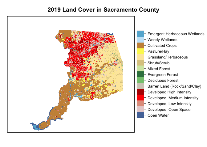
Pretty.
Spatial Data Wrangling
There is Data Wrangling and then there is Spatial Data Wrangling. Cue dangerous sounding music. Well, it’s not that dangerous or scary. Spatial Data Wrangling involves cleaning or altering your data set based on the geographic location of features. The sf package offers a suite of functions unique to wrangling spatial data. Most of these functions start out with the prefix st_. To see all of the functions, type in
methods(class = "sf")We won’t go through all of these functions as the list is quite extensive. You can take a look at Chapters 4-6 of GWR to see some examples of these functions. We’ll also go through spatial wrangling specific to points in Lab 4. But, we’ll go through a few relevant spatial operations for this class below. The function we will be primarily using is st_join().
Intersect
A common spatial data wrangling issue is to subset a set of spatial objects based on their location relative to another spatial object. In our case, we want to keep California tracts that are in the Sacramento metro area. We can do this using the st_join() function. We’ll need to specify a type of join. Let’s first try join = st_intersects
sac.metro.tracts.int <- st_join(ca.tracts, sac.metro,
                                join = st_intersects, left=FALSE)
The above code tells R to identify the polygons in ca.tracts that intersect with the polygon sac.metro. We indicate we want a polygon intersection by specifying join = st_intersects. The option left=FALSE tells R to eliminate the polygons from ca.tracts that do not intersect (make it TRUE and see what happens). Plotting our tracts, we get
tm_shape(sac.metro.tracts.int) +
  tm_polygons(col = "blue") +
tm_shape(sac.metro) +
  tm_borders(col = "red")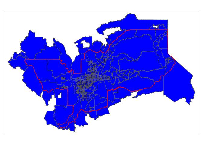
Practice Exercise: The opposite of st_intersects is st_disjoint. If two geometries are disjoint, they do not intersect, and vice-versa. Replace join = st_intersects with join = st_disjoint and see what you get.
Within
Do you see an issue with the tracts sac.metro.tracts.int? Using join = st_intersects returns all tracts that intersect sac.metro, which include those that touch the metro’s boundary. No bueno. We can instead use the argument join = st_within to return tracts that are completely within the metro.
sac.metro.tracts.w <- st_join(ca.tracts, sac.metro, join = st_within, left=FALSE)

tm_shape(sac.metro.tracts.w) +
  tm_polygons(col = "blue") +
tm_shape(sac.metro) +
  tm_borders(col = "red")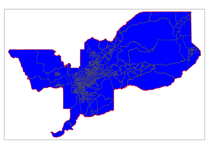
Now it works! Huzzah!
If you look at the at sac.metro.tracts.w’s attribute table, you’ll see it includes all the variables from both ca.tracts and sac.metro. We don’t need these variables, so use select() to eliminate them. You’ll also notice that if variables from two data sets share the same name, R will keep both and attach a .x and .y to the end. For example, GEOID was found in both ca.tracts and sac.metro, so R named one GEOID.x and the other that was merged in was named GEOID.y.
names(sac.metro.tracts.w)## [1] "GEOID.x" "Tract" "County" "State" "tpoprE" "nhwhiteE"
## [7] "nhblkE" "nhasnE" "hispE" "medinc" "CSAFP" "CBSAFP"
## [13] "GEOID.y" "NAME" "NAMELSAD" "LSAD" "MEMI" "MTFCC"
## [19] "ALAND" "AWATER" "INTPTLAT" "INTPTLON" "geometry"Keep the necessary variables and rename GEOID.x back to GEOID.
sac.metro.tracts.w <- sac.metro.tracts.w %>%
      dplyr::select(GEOID.x:tpoprE) %>%
      rename(GEOID = "GEOID.x")
Clipping
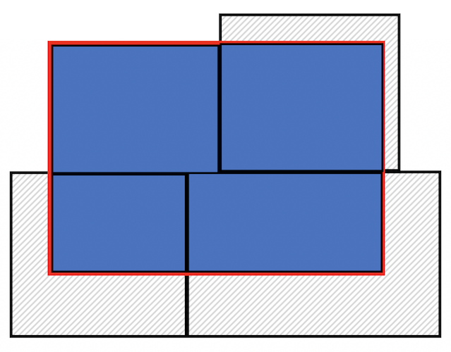
Census tracts neatly fall within a metropolitan area’s boundary, as it does for counties and states. In other words, tracts don’t spill over. But, it does spill over for cities (remember the census geography hierarchy diagram from Handout 1). The left diagram in the figure below is an example of a metro area in red and tracts in black - all the tracts fall neatly into the metro boundary. In contrast, the right diagram is an example of a city - one tract falls neatly inside (top left), but the other three spill out.
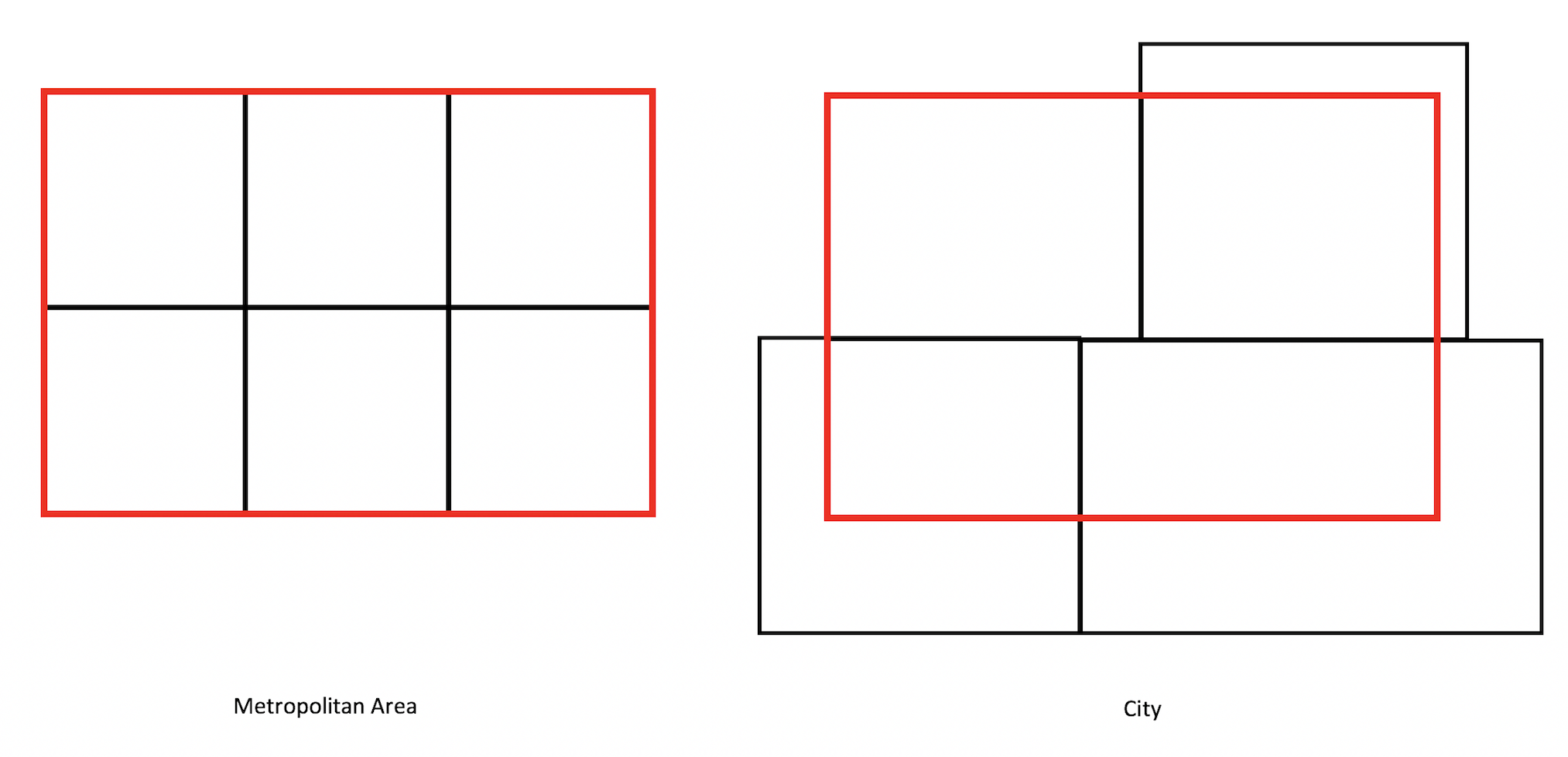
Tracts falling in (Metro) and out (City) of boundaries
If we use st_join() with st_within for Sacramento city, we’ll produce the following plot
sac.city.tracts.w = st_join(ca.tracts, sac.city, join = st_within, left=FALSE)

tm_shape(sac.city.tracts.w) +
  tm_polygons(col = "blue") +
tm_shape(sac.city) +
  tm_borders(col = "red")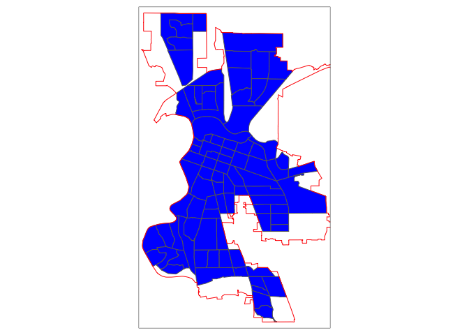
Can you guess what is going on here?
The blue polygons are the tracts we kept. You’ll notice that the city is empty around some of the edges of its boundary. In these cases, only portions of census tracts are within the boundary. st_within keeps tracts only if they are completely within the boundary.
You can designate tracts as being a part of a city if it’s only within the boundaries. But, there are other ways. One way is to clip the portion of the tract that is inside the boundary. Clipping keeps just the portion of the tract inside the city boundary and discards the rest of the tract. We use the function ms_clip() which is in the rmapshaper package. In the code below, target = ca.tracts tells R to cut out ca.tracts using the sac.city boundaries, which we specify in the clip = argument.
sac.city.tracts.c <- ms_clip(target = ca.tracts, clip = sac.city, remove_slivers = TRUE)

tm_shape(sac.city.tracts.c) +
  tm_polygons(col = "blue") +
tm_shape(sac.city) +
  tm_borders(col = "red")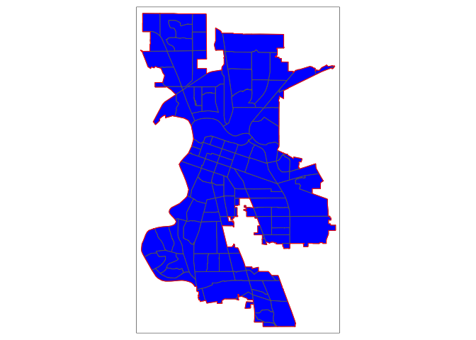
Now, the city is filled in with tracts. To be clear what a clip is doing, the figure below shows a clip of the city example shown in the conceptual figure above. One tract is not clipped because it falls completely within the city (the top left tract). But, the other three are clipped - the portions that are within the boundary are kept (in blue), and the rest (with hash marks) are discarded from the map. Basically, clipping keeps any tract that is either within or crosses the city boundary, clipping out the portion of the tract that is outside of the boundary. Note that the data attributes that remain in the sf object containing the clipped tract represent the entire tract.
Because spatial data are not always precise, when you clip you’ll sometimes get unwanted sliver polygons. The argument remove_slivers = TRUE removes these slivers.
Clipping tracts
The function st_overlaps is the opposite of st_within. Replace join = st_within with join = st_overlaps to see what this spatial operation produces. Play around with the other st_ options and see what you get (type in ? st_join to find all the options).
Keeping tracts within boundaries that overlap using the clipping method is just one approach. For example, we can keep tracts whose boundaries are either within or overlaps the city’s boundaries using the following code. Do you think this approach is appropriate? Why or why not?
sac.city.tracts.o <- st_join(ca.tracts, sac.city,
                                join = st_overlaps, left=FALSE)

sac.city.tracts.w.o <- rbind(sac.city.tracts.w, sac.city.tracts.o)

tm_shape(sac.city.tracts.w.o) +
     tm_polygons(col = "blue") +
     tm_shape(sac.city) +
     tm_borders(col = "red")
Areal Interpolation
The traditional measure of neighborhoods in the United States is the census tract. However, other non-Census boundary definitions exist. Examples include school attendance boundaries, electoral boundaries, and police districts. More often than not, these boundaries won’t have demographic information attached to them. Moreover, census tracts (or blocks) are not completely nested inside, so you can’t just simply add them up. The problem is we want to attach resident characteristics derived from the census to these non-traditional boundaries. A similar issue is when boundary changes occur over time, such as when the Census adjusts tract boundaries to account for population changes. In this case, in order to make comparisons over time, you will need to adjust the boundaries so they are consistent over time (for example, putting 2000 tract boundaries in 2010 boundaries). Areal interpolation is a common method for dealing with these issues. Areal interpolation refers to the allocation of data from one set of zones to a second overlapping set of zones that may or may not perfectly align spatially. In cases of mis-alignment, some type of weighting scheme needs to be specified to determine how to allocate partial data in areas of overlap.
There are two common types of areal interpolation - Area-weighted and Population-weighted
Area-weighted Interpolation
Area-weighted Interpolation uses the area of overlap of geometries as the interpolation weights. An intersection is computed between the origin geometries and the target geometries. Weights are then computed as the proportion of the overall origin area comprised by the intersection.
Let’s use Sacramento Council Districts, the main local governing body in the city, as an example. There are eight districts in Sacramento and tracts do not neatly nest within these districts. Some tracts overlap two or more districts. The goal is to estimate the total population, the population by race/ethnicity, and median household income in each council district. We already downloaded and brought into R a council district shapefile. Map it.
tm_shape(cdist) +
  tm_polygons()
In order to proceed, we need to have the ca.tracts and cdist data sets in the same Coordinate Reference System (CRS). Don’t worry yet about what this means - we will cover it in the next lab. If you are curious, I uploaded a pdf - Coordinate_Reference_Systems.pdf - in the Other Resources folder on Canvas in case you want to jump ahead and find out what a CRS is. Briefly, a CRS refers to the way in which spatial data that represent the earth’s surface (which is round and three dimensional) are flattened so that you can “Draw” them on a 2-dimensional surface (like a map). In other words, a CRS is a coordinate-based local, regional or global system used to locate geographical entities. We’re going to use UTM Zone 10/NAD83 as the CRS for ca.tracts and cdist. To change the CRS of spatial data (known as reprojecting), use the st_transform() function.
ca.tracts <- st_transform(ca.tracts, crs = "+proj=utm +zone=10 +datum=NAD83 +ellps=GRS80")
cdist <- st_transform(cdist, crs = "+proj=utm +zone=10 +datum=NAD83 +ellps=GRS80")
Note that the only spaces allowed when specifying the crs is in between each argument. For example, there should be no space in between + and datum or datum and = or = and NAD83. They should be all together. On the other hand, there should be a space between NAD83 and +ellps=GRS80.
Area-weighted interpolation matches census tract data to districts using the following general steps:
Determine which variables need to be interpolated extensively or intensively. Extensive interpolation involves interpolating count variables such as total population. Intensive interpolation involves interpolating variables that cannot be summed, for example, a percentage, mean, rate or density value. Where possible, interpolate numerator and denominator counts, and then calculate the percentage or rate after. For example, interpolate the number of black and total residents not percent black. In our example, median household income would count as an intensive type of variable. Rather than summing as in extensive interpolation, the intensive interpolation process will use an average when doing the aggregation.
Calculate the proportion of the tract that is within a district. This is your areal interpolation weight.
- If tract 1’s area is 1,000 and half of the tract is in district 1 and the other half is in district 2, then tract 1-district 1 and tract 1-district 2 have weights of 0.5.
Multiply the count characteristics by the areal interpolation weight.
- If tract 1’s total black population is 1,000, you would multiply 1,000 by 0.5. You are allocating 500 of tract 1’s black population to district 1 and the other 500 to district 2.
Sum up each tract’s contribution to the district to get the areal weighted estimated count for that district.
- If district 1 also contains tract 2, and tract 2’s total black population is 500 and its areal weight is 0.25, then the black population from tract 2 that is allocated to district 1 is 500 x 0.25 = 125. District 1’s total black population is then 500 + 125 = 625.
- For intensive interpolation, rather than the sum, you will take the average.
Rather than doing all of this manually, we can use the function aw_interpolate() which is a part of the areal package. We want to extensively interpolate population by total and race/ethnicity, and intensively interpolate median household income.
cdist.aw <- aw_interpolate(cdist, tid = DISTNUM, source = ca.tracts, sid = GEOID,
                           weight = "total", output = "sf",
                           intensive = "medinc",
                           extensive = c("hispE", "nhasnE", "nhblkE",
                                         "nhwhiteE", "tpoprE"))
The first argument is the sf object you want to interpolate to, in our case cdist. tid is the unique ID variable in cdist. source = is the sf object with that data to be interpolated to cdist, in our case ca.tracts. sid is the unique ID variable in ca.tracts. The argument weight = characterizes the nature of the data, the relationship between the source and target features, and thus how the areal weight is calculated. The total approach to calculating weights assumes that, if a source feature is only covered by 99.88% of the target features, only 99.88% of the source target’s data should be allocated to target features in the interpolation. The other option is the sum approach, which assumes that 100% of the source data should be divided among the target features. The argument output = "sf" tells R that we want the resulting interpolated object to be an sf object. Finally, intensive and extensive identify the variables in ca.tracts that we want to intensively and extensively interpolate, respectively.
Take a glimpse of the object
glimpse(cdist.aw)## Rows: 8
## Columns: 12
## $ OBJECTID <dbl> 1, 2, 3, 4, 5, 6, 7, 8
## $ DISTNUM <chr> "7", "4", "2", "3", "6", "5", "1", "8"
## $ NAME <chr> "Rick Jennings II", "Steve Hansen", "Allen Warren", "Jeff H…
## $ Shape__Are <dbl> 0.002850069, 0.002764893, 0.004130511, 0.004188627, 0.00422…
## $ Shape__Len <dbl> 0.4196103, 0.4277325, 0.3907921, 0.3715728, 0.4589053, 0.44…
## $ hispE <dbl> 14111.705, 10730.944, 27954.577, 23869.833, 16287.832, 1918…
## $ nhasnE <dbl> 16554.416, 6917.570, 9168.789, 6234.508, 10875.142, 9742.48…
## $ nhblkE <dbl> 8791.089, 5285.856, 8990.566, 7572.709, 3649.360, 7825.006,…
## $ nhwhiteE <dbl> 15337.102, 30342.779, 17383.538, 28893.572, 21167.755, 2053…
## $ tpoprE <dbl> 60116.67, 57048.93, 68109.49, 71115.92, 55879.94, 60436.50,…
## $ medinc <dbl> 68692.26, 68834.70, 42055.97, 57417.65, 49175.13, 55849.82,…
## $ geometry <MULTIPOLYGON [m]> MULTIPOLYGON (((630603.9 42..., MULTIPOLYGON (((626555.1 42…We’ve got counts at the council district level. To calculate the proportions of race/ethnicity, use the mutate() function
cdist.aw <- cdist.aw %>%
            mutate(phisp = hispE/tpoprE, pasian = nhasnE/tpoprE,
                   pblack = nhblkE/tpoprE, pwhite = nhwhiteE/tpoprE)
Let’s map proportion Hispanic.
tm_shape(cdist.aw) +
  tm_polygons(col = "phisp", style = "quantile")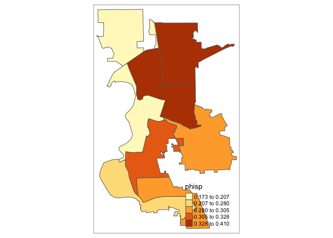
We’re done! Go ahead, click it.

Population-weighted Interpolation
Areal-weighted interpolation assumes attributes are constant or uniform over areas of x. This assumption that proportionally larger areas also have proportionally more people is often incorrect with respect to the geography of human settlements, and can be a source of error when using this method. An alternative method, population-weighted interpolation, can represent an improvement. As opposed to using area-based weights, population-weighted techniques estimate the populations of the intersections between origin and destination, then use those values for interpolation weights.
This method is implemented in tidycensus with the interpolate_pw() function. The method requires a third dataset to be used as weights, and optionally a weight column to determine the relative influence of each feature in the weights dataset. For many purposes, tidycensus users will want to use Census blocks as the weights dataset, since it is the lowest level of geography with total population at a national scale. 2020 Census blocks acquired with the tigris package have the added benefit of POP20 and HU20 columns in the dataset that represent population and housing unit counts, respectively, either one of which could be used to weight each block. In the case presented here, we will need to use get_decennial() to grab the 2010 block population data.
sac_blocks <- get_decennial(geography = "block",
              year = 2010,
              variables = c(tpop = "P001001"),
              state = "CA",
              county = "Sacramento",
              output = "wide",
              geometry = TRUE,
              cb = FALSE)

#transform into the same CRS as ca.tracts and cdist
sac_blocks <- st_transform(sac_blocks, crs = "+proj=utm +zone=10 +datum=NAD83 +ellps=GRS80")
We will then create separate objects containing the variables needed to intensively and extensively interpolate.
#extensive
ca.tracts.ext <- ca.tracts %>%
  dplyr::select(hispE, nhasnE, nhblkE, nhwhiteE, tpoprE)

#intensive
ca.tracts.int <- ca.tracts %>%
  dplyr::select(medinc)
Then use the function interpolate_pw() to interpolate.
#extensive
cdist.pw.ext <- interpolate_pw(
  ca.tracts.ext,
  cdist,
  to_id = "DISTNUM",
  extensive = TRUE,
  weights = sac_blocks,
  weight_column = "tpop"
)

#intensive
cdist.pw.int <- interpolate_pw(
  ca.tracts.int,
  cdist,
  to_id = "DISTNUM",
  extensive = FALSE,
  weights = sac_blocks,
  weight_column = "tpop"
)
Population-weighted interpolation implemented here uses a weighted block point approach to interpolation, where the input Census blocks are first converted to points, then joined to the origin/destination intersections to produce population weights. An illustration of this process is found below; the map shows the boundaries of a council district (in black) and a tract that intersects with the district (in dashed blue). The left-hand side map shows the area (in squared meters) of the tract area within and outside of the city boundary. The area within is twice as large as the area outside, so the area-based weight will be significantly larger than 0.5. The map on the right shows the block centroids located within the tract and their 2010 population sizes. The total population sizes are nearly equal within and outside the boundary, and therefore the population-based weight will be closer to 0.5.

Illustration of block points and population weights
The downside of population-weighted interpolation is the need for the third dataset containing the weights at a small geographic scale. If we use Census blocks, we only have data available only every 10 years (ACS does not provide block-level estimates).
Calculate the percentages from the extensively interpolated sums
cdist.pw.ext <- cdist.pw.ext %>%
            mutate(phisp = hispE/tpoprE, pasian = nhasnE/tpoprE,
                   pblack = nhblkE/tpoprE, pwhite = nhwhiteE/tpoprE)
Practice Exercise: Compare population-weighted and area-weighted interpolation estimates of council district racial/ethnic composition and median household income. Do they substantially differ?
Saving shapefiles
To save an sf object, we use the function st_write() and specify at least two arguments, the object and a file name in quotes with the file extension. You’ll also need to specify delete_layer = TRUE which overwrites the existing file if it already exists in your current working directory folder. Make sure you’ve set your directory to the folder you want your file to be saved in.
st_write(sac.city.tracts.c, "saccitytracts.shp", delete_layer = TRUE)You can save your sf object in a number of different data formats other than shp. We won’t be concerned too much with these other formats, but you can see a list of them here.
Mapping in R
There are several functions in R that can be used for mapping. We won’t go through all of them, but GWR outlines the range of mapping packages available in Table 9.1. We’ll go through three of them: ggplot, tmap and leaflet
ggplot
Because sf is tidy friendly, it is no surprise we can use the tidyverse plotting function ggplot() to make maps. We already received an introduction to ggplot() in Lab 2. Recall its basic structure:
ggplot(data = <DATA>) +
      <GEOM_FUNCTION>(mapping = aes(x, y)) +
      <OPTIONS>()
In mapping, geom_sf() is <GEOM_FUNCTION>(). Unlike with functions like geom_histogram() and geom_boxplot(), we don’t specify an x and y axis. Instead you use fill if you want to map a variable or color to just map boundaries.
Let’s use ggplot() to make a choropleth map. We need to specify a numeric variable in the fill = argument within geom_sf(). Here we map tract-level median household income in Sacramento.
ggplot(data = sac.city.tracts.c) +
  geom_sf(aes(fill = medinc))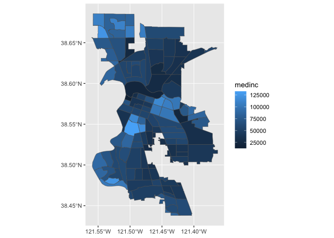
We can also specify a title (as well as subtitles and captions) using the labs() function.
ggplot(data = sac.city.tracts.c) +
  geom_sf(aes(fill = medinc)) +
labs(title = "Median Income Sacramento City Tracts") 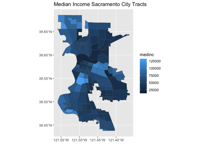
We can make further layout adjustments to the map. Don’t like a blue scale on the legend? You can change it using the scale_file_gradient() function. Let’s change it to a white to red gradient. We can also eliminate the gray tract border colors to make the fill color distinction clearer. We do this by specifying color = NA inside geom_sf(). We can also get rid of the gray background by specifying a basic black and white theme using theme_bw().
ggplot(data = sac.city.tracts.c) +
  geom_sf(aes(fill = medinc), color = NA) +
    scale_fill_gradient(low= "white", high = "red", na.value ="gray") +
    labs(title = "Median Income Sacramento City Tracts",
         caption = "Source: American Community Survey") +
  theme_bw()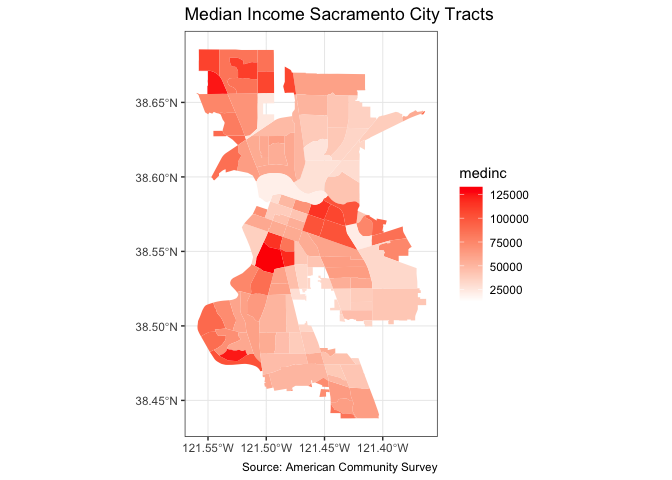
I also added a caption indicating the source of the data using the captions = parameter within labs().
You also use geom_sf() for mapping points (an example of a pin map as described in the handout). Color them black using fill = "black". Let’s map the location of EV chargers in Sacramento.
ggplot(data = evcharge) +
  geom_sf(fill = "black") +
  labs(title = "EV Charge Stations Sacramento City Tracts",
       caption = "Source: City of Sacramento") +
  theme_bw()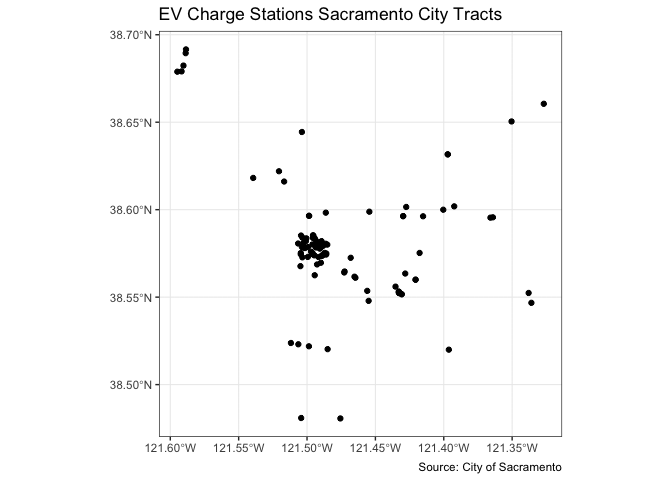
You can overlay the points over Sacramento tracts to give the locations some perspective. Here, you add two geom_sf() for the tracts and the EV charge stations.
ggplot() +
  geom_sf(data = sac.city.tracts.c) +
  geom_sf(data = evcharge, fill = "black") +
  labs(title = "EV Charge Stations Sacramento City Tracts",
       caption = "Source: City of Sacramento") +
  theme_bw()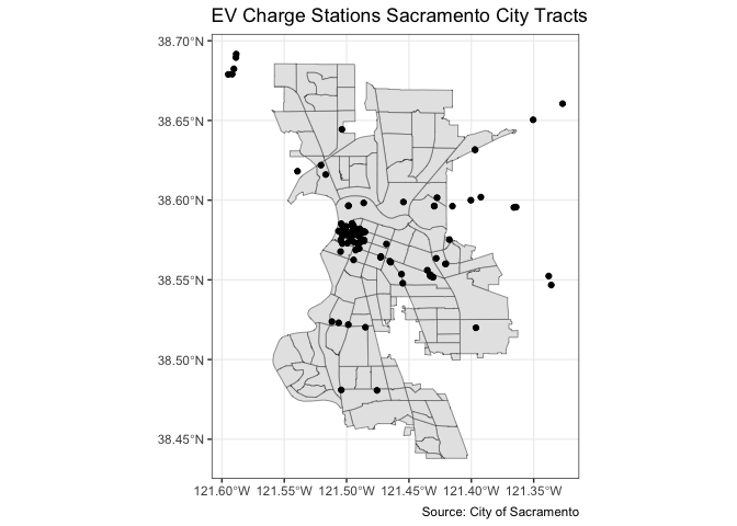
Note that data = moves out of ggplot() and into geom_sf() because we are mapping more than one spatial feature.
Practice Exercise: Map Sacramento rivers overlaid on top of Sacramento city tracts
tmap
Whether one uses the tmap or ggplot is a matter of taste, but I find that tmap has some benefits, so let’s focus on its mapping functions next.
tmap uses the same layered logic as ggplot. The initial command is tm_shape(), which specifies the geography to which the mapping is applied. You then build on tm_shape() by adding one or more elements such as tm_polygons() for polygons, tm_borders() for lines, and tm_dots() for points. All additional functions take on the form of tm_. Check the full list of tm_ elements here.
Choropleth map
Let’s make a static choropleth map of median household income in Sacramento city.
tm_shape(sac.city.tracts.c) +
  tm_polygons(col = "medinc", style = "quantile")
You first put the dataset sac.city.tracts.c inside tm_shape(). Because you are plotting polygons, you use tm_polygons() next. If you are plotting points, you will use tm_dots(). If you are plotting lines, you will use tm_lines(). The argument col = "medinc" tells R to shade (or color) the tracts by the variable medinc. The argument style = "quantile" tells R to break up the shading into quantiles, or equal groups of 5. I find that this is where tmap offers a distinct advantage over ggplot in that users have greater control over the legend and bin breaks. tmap allows users to specify algorithms to automatically create breaks with the style argument. You can also change the number of breaks by setting n=. The default is n=5. Rather than quintiles, you can show quartiles using n=4
tm_shape(sac.city.tracts.c) +
  tm_polygons(col = "medinc", style = "quantile",  n=4)
Check out this breakdown of the available classification styles in tmap.
You can overlay multiple features on one map. For example, we can add park polygons on top of city tracts, providing a visual association between parks and percent white. You will need to add two tm_shape() functions each for sac.city.tracts.c and parks.
tm_shape(sac.city.tracts.c) +
  tm_polygons(col = "medinc", style = "quantile", n=4) +
  tm_shape(parks) +
    tm_polygons(col = "green")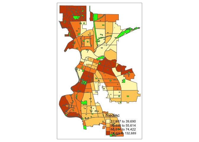
The tm_polygons() command is a wrapper around two other functions, tm_fill() and tm_borders(). tm_fill() controls the contents of the polygons (color, classification, etc.), while tm_borders() does the same for the polygon outlines.
For example, using the same shape (but no variable), we obtain the outlines of the neighborhoods from the tm_borders() command.
tm_shape(sac.city.tracts.c) +
  tm_borders()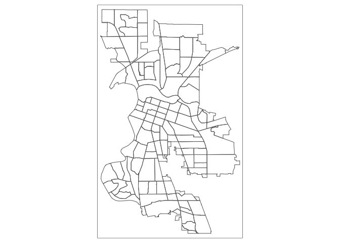
Similarly, we obtain a choropleth map without the polygon outlines when we just use the tm_fill() command.
tm_shape(sac.city.tracts.c) +
  tm_fill("medinc")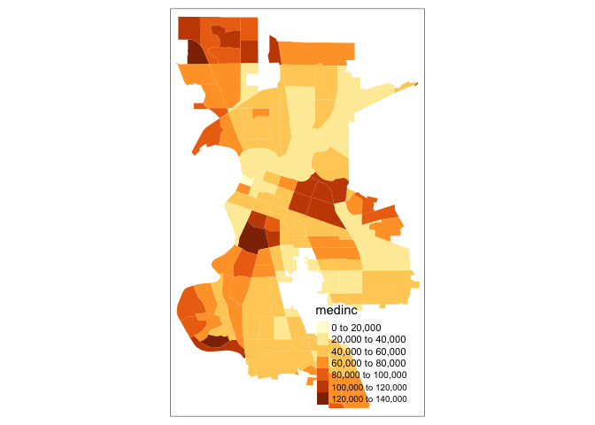
When we combine the two commands, we obtain the same map as with tm_polygons() (this illustrates how in R one can often obtain the same result in a number of different ways). Try this on your own.
Color Scheme
The argument palette = defines the color ranges associated with the bins and determined by the style arguments. Several built-in palettes are contained in tmap. For example, using palette = "Reds" would yield the following map for our example.
tm_shape(sac.city.tracts.c) +
tm_polygons(col = "medinc", style = "quantile",palette = "Reds") 
Under the hood, “Reds” refers to one of the color schemes supported by the RColorBrewer package (see below).
In addition to the built-in palettes, customized color ranges can be created by specifying a vector with the desired colors as anchors. This will create a spectrum of colors in the map that range between the colors specified in the vector. For instance, if we used c(“red”, “blue”), the color spectrum would move from red to purple, then to blue, with in between shades. In our example:
tm_shape(sac.city.tracts.c) +
tm_polygons(col = "medinc", style = "quantile",palette = c("red","blue")) 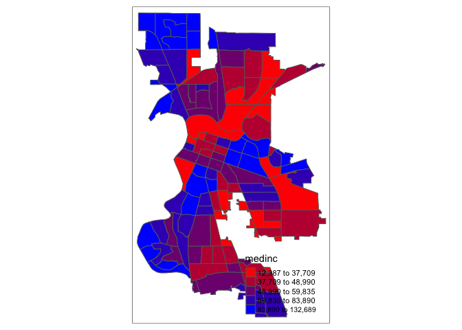
Not exactly a pretty picture. In order to capture a diverging scale, we insert “white” in between red and blue.
tm_shape(sac.city.tracts.c) +
tm_polygons(col = "medinc", style = "quantile",palette = c("red","white", "blue")) 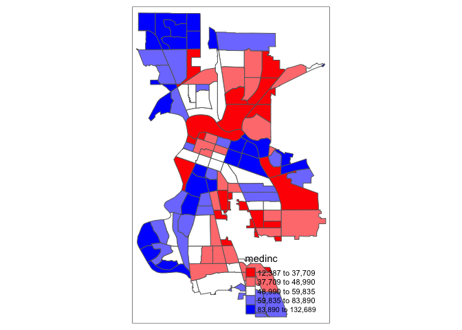
A preferred approach to select a color palette is to chose one of the schemes contained in the RColorBrewer package. These are based on the research of cartographer Cynthia Brewer (see the colorbrewer2 web site for details). ColorBrewer makes a distinction between sequential scales (for a scale that goes from low to high), diverging scales (to highlight how values differ from a central tendency), and qualitative scales (for categorical variables). For each scale, a series of single hue and multi-hue scales are suggested. In the RColorBrewer package, these are referred to by a name (e.g., the “Reds” palette we used above is an example). The full list is contained in the RColorBrewer documentation.
There are two very useful commands in this package. One sets a color palette by specifying its name and the number of desired categories. The result is a character vector with the hex codes of the corresponding colors.
For example, we select a sequential color scheme going from blue to green, as BuGn, by means of the command brewer.pal, with the number of categories (6) and the scheme as arguments. The resulting vector contains the HEX codes for the colors.
brewer.pal(6,"BuGn")## [1] "#EDF8FB" "#CCECE6" "#99D8C9" "#66C2A4" "#2CA25F" "#006D2C"Using this palette in our map yields the following result.
tm_shape(sac.city.tracts.c) +
tm_polygons(col = "medinc", style = "quantile",palette="BuGn") 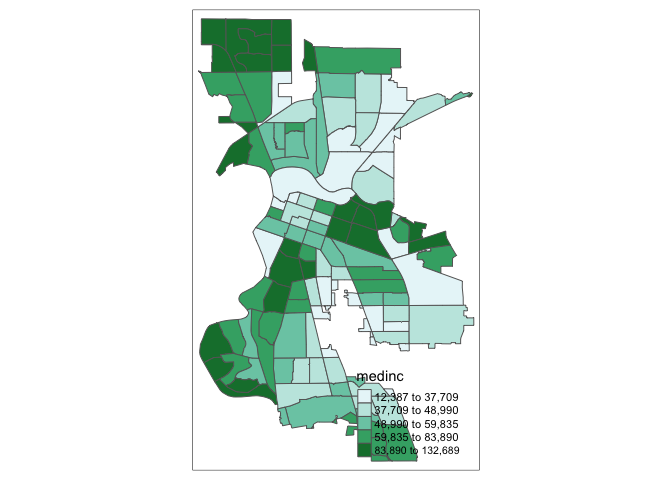
The command display.brewer.pal() allows us to explore different color schemes before applying them to a map. For example:
display.brewer.pal(6,"BuGn")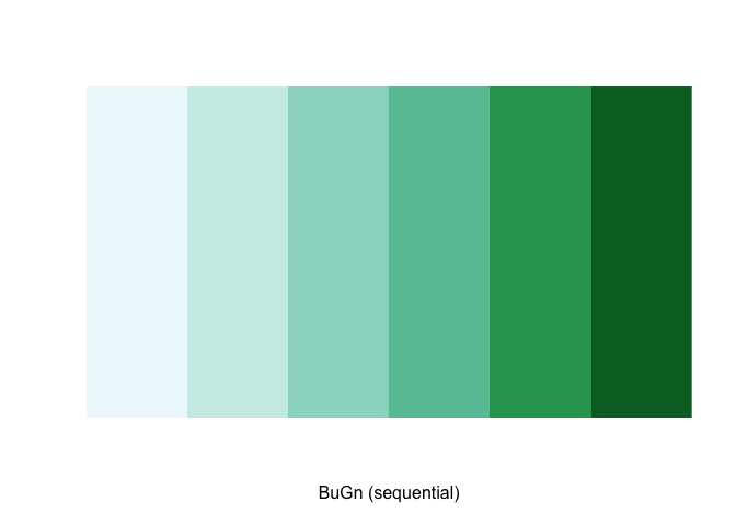
See Ch. 9.2.4 in GWR for a fuller discussion on color and other schemes you can specify.
Legend
There are many options to change the formatting of the legend. The automatic title for the legend is not that attractive, since it is simply the variable name. This can be customized by setting the title argument.
tm_shape(sac.city.tracts.c) +
  tm_polygons(col = "medinc", style = "quantile",palette = "Reds",
title = "Median Income") 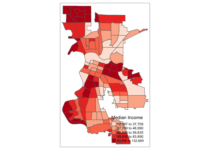
Another important aspect of the legend is its positioning. This is handled through the tm_layout() function. This function has a vast number of options, as detailed in the documentation. There are also specialized subsets of layout functions, focused on specific aspects of the map, such as tm_legend(), tm_style() and tm_format(). We illustrate the positioning of the legend.
The default is to position the legend inside the map. Often, this default solution is appropriate, but sometimes further control is needed. The legend.position argument to the tm_layout function moves the legend around the map, and it takes a vector of two string variables that determine both the horizontal position (“left”, “right”, or “center”) and the vertical position (“top”, “bottom”, or “center”).
For example, if we would want to move the legend to the upper-right position, we would use the following set of commands.
tm_shape(sac.city.tracts.c) +
  tm_polygons(col = "medinc", style = "quantile",palette = "Reds",
              title = "Median Income") +
  tm_layout(legend.position = c("right", "top"))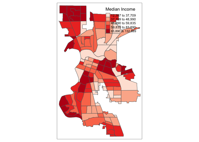
There is also the option to position the legend outside the frame of the map. This is accomplished by setting legend.outside to TRUE (the default is FALSE), and optionally also specify its position by means of legend.outside.position(). The latter can take the values “top”, “bottom”, “right”, and “left”.
For example, to position the legend outside and on the right, would be accomplished by the following commands.
tm_shape(sac.city.tracts.c) +
  tm_polygons(col = "medinc", style = "quantile",palette = "Reds",
              title = "Median Income") +
  tm_layout(legend.outside = TRUE, legend.outside.position = "right")
We can also customize the size of the legend, its alignment, font, etc. We refer to the documentation for specifics.
Title
Another functionality of the tm_layout() function is to set a title for the map, and specify its position, size, etc. For example, we can set the title, the title.size and the title.position as in the example below. We made the font size a bit smaller (0.8) in order not to overwhelm the map, and positioned it in the bottom right-hand corner.
tm_shape(sac.city.tracts.c) +
  tm_polygons(col = "medinc", style = "quantile",palette = "Reds",
              title = "Median Income") +
  tm_layout(title = "Median Income Sacramento tracts", title.size = 0.8,
            title.position = c("right","bottom"),
            legend.outside = TRUE, legend.outside.position = "right")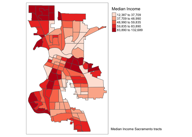
To have a title appear on top (or on the bottom) of the map, we need to set the main.title argument of the tm_layout() function, with the associated main.title.position, as illustrated below (with title.size set to 1.25 to have a larger font).
tm_shape(sac.city.tracts.c) +
  tm_polygons(col = "medinc", style = "quantile",palette = "Reds",
              title = "Median Income") +
  tm_layout(main.title = "Median Income Sacramento Tracts",
            main.title.size = 1.25, main.title.position="center",
            legend.outside = TRUE, legend.outside.position = "right")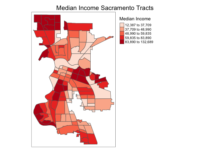
Scale bar and arrow
We need to add other key elements to the map. First, the scale bar, which you can add using the function tm_scale_bar()
tm_shape(sac.city.tracts.c, unit = "mi") +
  tm_polygons(col = "medinc", style = "quantile",palette = "Reds",
              title = "Median Income") +
  tm_scale_bar(breaks = c(0, 2, 4), text.size = 0.75, position = c("left", "bottom")) +
  tm_layout(main.title = "Median Income Sacramento tracts",
            main.title.size = 1.25, main.title.position="center",
            legend.outside = TRUE, legend.outside.position = "right")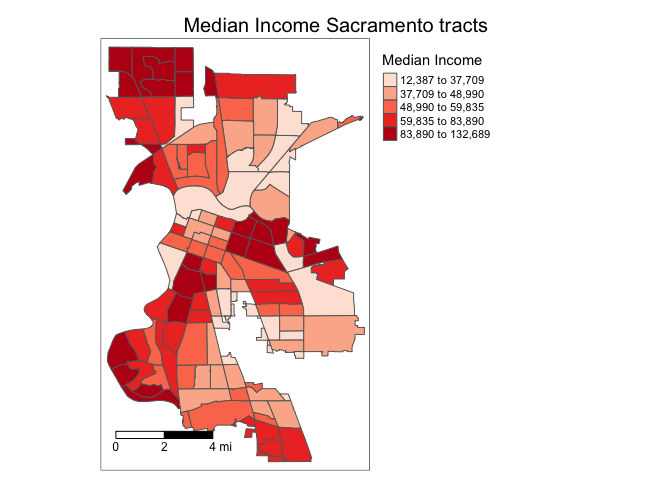
The argument breaks tells R the distances to break up and end the bar. The argument position places the scale bar on the bottom left part of the map. Note that the scale is in miles (were in America!). The default is in kilometers (the rest of the world!), but you can specify the units within tm_shape() using the argument unit. text.size scales the size of the bar smaller (below 1) or larger (above 1).
Next element is the north arrow, which we can add using the function tm_compass(). You can control for the type, size and location of the arrow within this function. I place a 4-star arrow on the top right of the map.
tm_shape(sac.city.tracts.c, unit = "mi") +
  tm_polygons(col = "medinc", style = "quantile",palette = "Reds",
              title = "Median Income") +
  tm_scale_bar(breaks = c(0, 2, 4), text.size = 0.75,
               position = c("left", "bottom")) +
  tm_compass(type = "4star", position = c("right", "top")) +
  tm_layout(main.title = "Median Income Sacramento tracts",
            main.title.size = 1.25, main.title.position="center",
            legend.outside = TRUE, legend.outside.position = "right")
We can also eliminate the frame around the map using the argument frame = FALSE.
sac.map <- tm_shape(sac.city.tracts.c, unit = "mi") +
  tm_polygons(col = "medinc", style = "quantile",palette = "Reds",
              title = "Median Income") +
  tm_scale_bar(breaks = c(0, 2, 4), text.size = 0.75, position = c("left", "bottom")) +
  tm_compass(type = "4star", position = c("right", "top")) +
  tm_layout(main.title = "Median Income Sacramento tracts",
            main.title.size = 1.25, frame = FALSE,
            main.title.position="center",
            legend.outside = TRUE, legend.outside.position = "right")

sac.map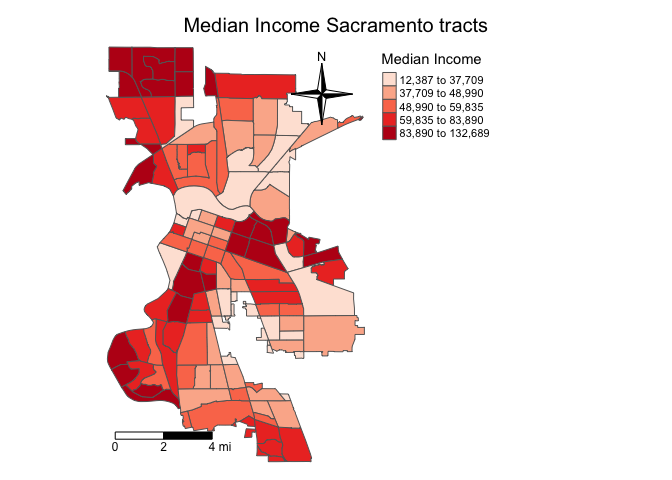
Note that I saved the map into an object called sac.map. R is an object-oriented program, so everything you make in R are objects that can be saved for future manipulation. This includes maps. And future manipulations of a saved map includes adding more tm_* functions to the saved object, such as sac.map + tm_layout(your changes here). Check the help documentation for tm_layout() to see the complete list of settings. Also see examples in Ch. 9.2.5 in GWR.
Practice Exercise: Map median household income for council districts adding the key map elements.
Dot map
We can create a dot or pin map using tm_dots(). Let’s create one for EV chargers in Sacramento.
tm_shape(sac.city.tracts.c) +
  tm_borders()  +
tm_shape(evcharge) +
  tm_dots(col = "red", title="Environmental Exposure Type") +
    tm_layout(main.title = "EV Charge Stations Sacramento",
            main.title.size = 1, main.title.position="center")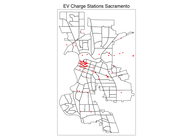
Overlay it on top of polygons shaded by median household income.
tm_shape(sac.city.tracts.c, unit = "mi") +
  tm_polygons(col = "medinc", style = "quantile",palette = "Reds",
              title = "Median Income") +
  tm_shape(evcharge) +
  tm_dots(col = "black") +
    tm_scale_bar(breaks = c(0, 1, 2), text.size = 1, position = c("left", "bottom")) +
      tm_compass(type = "4star", position = c("right", "bottom"))  +
  tm_layout(main.title = "EV Charge Stations Sacramento",
            main.title.size = 1.25, main.title.position="center",
            legend.outside = TRUE, legend.outside.position = "right",
            frame = FALSE)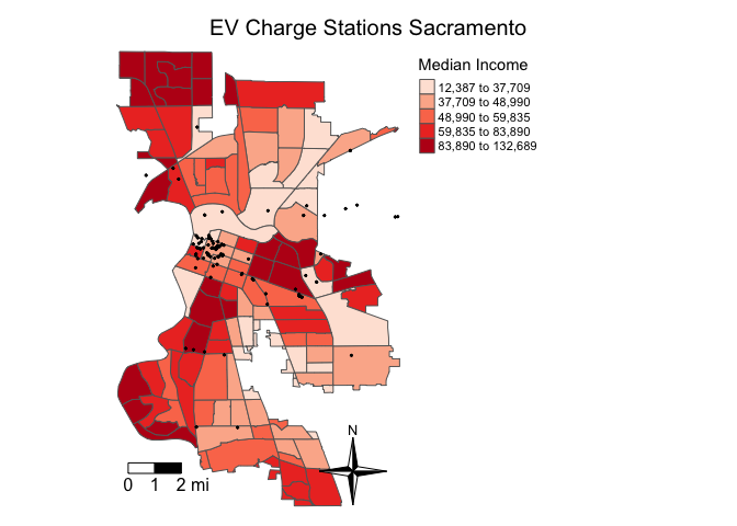
Interactive maps
So far we’ve created static maps. That is, maps that don’t “move”. But, we’re all likely used to Google or Bing maps - maps that we can move around, zoom in and out of, create pop ups and labels, and highlight/select regions.
To make your tmap object interactive, use the function tmap_mode() and type in “view” as an argument.
tmap_mode("view")Now that the interactive mode has been ‘turned on’, all maps produced with tm_shape() will launch.
sac.mapYou can zoom in and out and pan left, right, up and down. Besides interactivity, another important benefit of tmap_mode() is that it provides a basemap. The function of a basemap is to provide background detail necessary to orient the location of the map. In the static maps we produced above, Sacramento was sort of floating in white space. As you can see in the interactive map above we’ve added geographic context to the surrounding area.
The default basemap in tmap_mode() is CartoDB.Positron. You can change the basemap through the tm_basemap() function. For example, let’s change the basemap to an OpenStreetMap.
sac.map + tm_basemap("OpenStreetMap")For a complete list of basemaps with previews, see here. There are a lot of cool ones, so please test them out.
To switch back to plotting mode (noninteractive), type
tmap_mode("plot")leaflet
You can also make interactive maps in R using the package leaflet. It is used by many news organizations and tech websites to visualize geographic data (like this one). Similar to tmap, leaflet maps are built using layers. The first argument you need to include is leaflet(), which initializes a map widget. You then add layers to the map. To add census tracts, which are polygons, you use the addPolygons() function. Let’s map Sacramento city tracts.
leaflet() %>%
  addPolygons(data = sac.city.tracts.c,
              color = "gray",
              weight = 1,
              smoothFactor = 0.5,
              opacity = 1.0,
              fillOpacity = 0.5,
              highlightOptions = highlightOptions(color = "white",
                                                  weight = 2,
                                                  bringToFront = TRUE))
The first several arguments adjust the appearance of each polygon region (e.g. color, opacity, border thickness). highlightOptions emphasizes the currently moused-over polygon.
Unlike interactive tmap, there is no default basemap. To add a basemap, include the function addTiles() after leaflet()
leaflet() %>%
  addTiles() %>%
  addPolygons(data = sac.city.tracts.c,
              color = "gray",
              weight = 1,
              smoothFactor = 0.5,
              opacity = 1.0,
              fillOpacity = 0.5,
              highlightOptions = highlightOptions(color = "white",
                                                  weight = 2,
                                                  bringToFront = TRUE))
To create a choropleth map, adjust the color = argument within addPolygons(). Let’s map quintiles of median household income medinc using the colorQuantile() function.
leaflet() %>%
  addTiles() %>%
  addPolygons(data = sac.city.tracts.c,
              color = ~colorQuantile("Reds", medinc, n = 5)(medinc),
              weight = 1,
              smoothFactor = 0.5,
              opacity = 1.0,
              fillOpacity = 0.5,
              highlightOptions = highlightOptions(color = "white",
                                                  weight = 2,
                                                  bringToFront = TRUE))
We specify a red color scheme using the argument “Reds”, breaking up the variable medinc into quintiles n = 5.
We’ll circle back to leaflet in Week 5 when we will use the package to map spatial access. If you want to dive deeper before then, the official leaflet documentation provides handy walkthroughs for creating leaflet maps.
Saving maps
You can save your maps a couple of ways.
- On the plotting screen where the map is shown, click on Export and save it as either an image or pdf file.
- Use the function
tmap_save()
For option 2, we can save the map object sac.map as such
tmap_save(sac.map, "saccityinc.jpg")Specify the tmap object and a filename with an extension. It supports pdf, eps, svg, wmf, png, jpg, bmp and tiff. The default is png. Also make sure you’ve set your directory to the folder that you want your map to be saved in.
You’ve completed your introduction to sf. Whew! Badge? Yes, please, you earned it! Time to celebrate!


This work is licensed under a Creative Commons Attribution-NonCommercial 4.0 International License.
Website created and maintained by Noli Brazil