Lab 6: Measuring Vulnerability
CRD 230 - Spatial Methods in Community Research
Professor Noli Brazil
February 15, 2023
In this guide you will learn how to condense a suite of neighborhood variables into a single numeric index and a categorical classification using R. Both methods are often used within the context of vulnerability or opportunity mapping. The objectives of the guide are as follows
- Create a numeric index of opportunity
- Standardizing and averaging variables
- Principal Components Analysis
- Create a classification of neighborhood context
- K-means clustering
To achieve these objectives, we will be creating a pollution vulnerability index for neighborhoods in California’s capital region.
Load necessary packages
We’ll be introducing four new packages in this lab: factoextra, plotrix and plotly. Install these packages
install.packages(c("factoextra",
                   "plotrix",
                   "plotly"))
and load them with others we’ll be using in this lab.
library(tidyverse)
library(sf)
library(tigris)
library(VIM)
library(tmap)
library(corrr)
library(factoextra)
library(plotrix)
library(plotly)
Bring in the data
We’re going to use data from CalEnviroScreen (CES). The CES is a tool that helps identify California communities that are most affected by many sources of pollution, and where people are often especially vulnerable to pollution’s effects. It uses environmental, health, and socioeconomic information to produce scores for every census tract in the state. The scores are mapped so that different communities can be compared. An area with a high score is one that experiences a much higher pollution burden than areas with low scores. The tool was created by the Office of environmental Health Hazard Assessment and California Environmental Protection Agency to allocate resources towards disadvantaged communities.
I uploaded a zip file containing a shapefile of the CES data for all tracts in California on Canvas in the Week 6 Lab folder. The file can also be downloaded here. Unzip the folder and bring the file into R using st_read().
ces.data <- st_read("CES4 Final Shapefile.shp")

#check it out
glimpse(ces.data)
Detailed information on all of the variables used in the CES can be found on the CES website. You can view the record layout for the variables here.
We’re going to focus on creating an index for California’s Capital Region neighborhoods. Select tracts in counties that are considered to be in the Capital Region.
#keep tracts in the Capital region
ces.data <- ces.data  %>%
            filter(County == "Alpine" | County == "Colusa" |
                     County == "El Dorado" | County == "Glenn" |
                     County == "Sacramento" | County == "Sutter" |
                     County == "Yolo" | County == "Yuba")
Map to see we got what we intended.
tm_shape(ces.data) +
  tm_polygons()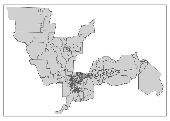
Standardize and Average
The CES is a composite of variables capturing pollution burden exposure and effects, and socioeconomic factors and sensitive populations. We will create an index of pollution burden using the following variables:
- Ozone concentrations in air
- PM2.5 concentrations in air
- Diesel particulate matter emissions
- Drinking water contaminants
- Children’s lead risk from housing
- Use of certain high-hazard, high-volatility pesticides
- Toxic releases from facilities
- Toxic cleanup sites
- Groundwater threats from leaking underground storage sites and cleanups
- Hazardous waste facilities and generators
- Impaired water bodies
- Solid waste sites and facilities
You should make all the variables point in the same direction reflecting their hypothesized contribution to the index, in this case pollution burden (i.e. greater values indicate greater pollution burden). This is already the case for the variables listed above. We’ll also need to check and deal with any tracts with missing values. CES indicates missingness not with NA, but with -999. You can read more about how the CES handles missing data on page 5 of their record layout linked above. For the purposes of this lab, we’ll just exclude those tracts. We want to filter out tracts that don’t have the value -999 in any of the pollution variables. We use the function if_all() within filter() to do this.
ces.data <- ces.data %>%
              filter(if_all(c(Ozone,PM2_5, DieselPM, Pesticide,
                              DrinkWat, Lead, Tox_Rel,Cleanup,
                              GWThreat, HazWaste, ImpWatBod, SolWaste),
                            ~ . != -999))
Next, select the variables from ces.data.
poll_exp <- ces.data %>%
  dplyr::select(Tract,Ozone,PM2_5, DieselPM, Pesticide, DrinkWat, Lead, Tox_Rel,
                Cleanup, GWThreat, HazWaste, ImpWatBod, SolWaste)
Let’s use the correlate() function from the corrr package to get a correlation matrix of these variables. The function only takes in numeric variables in regular data frames. We use select() to keep the appropriate variables and use st_drop_geometry() to take out the geometry (i.e. make it no longer spatial). Save the correlation matrix in the object poll_exp_cor.
poll_exp_cor <- poll_exp %>%
  dplyr::select(-Tract) %>%
  st_drop_geometry() %>%
  correlate()

poll_exp_cor
## # A tibble: 12 × 13
## term Ozone PM2_5 Diese…¹ Pestic…² DrinkWat Lead Tox_Rel Cleanup
## <chr> <dbl> <dbl> <dbl> <dbl> <dbl> <dbl> <dbl> <dbl>
## 1 Ozone NA -0.353 -0.263 -7.61e-2 -0.145 -3.16e-1 -0.0588 -0.0687
## 2 PM2_5 -0.353 NA 0.300 -4.90e-3 0.147 2.09e-1 0.129 0.129
## 3 Diesel… -0.263 0.300 NA -1.16e-1 0.0866 2.79e-1 0.0534 0.326
## 4 Pestic… -0.0761 -0.00490 -0.116 NA 0.184 6.93e-4 -0.0497 -0.0287
## 5 DrinkW… -0.145 0.147 0.0866 1.84e-1 NA 9.97e-2 -0.0696 -0.00648
## 6 Lead -0.316 0.209 0.279 6.93e-4 0.0997 NA 0.106 0.137
## 7 Tox_Rel -0.0588 0.129 0.0534 -4.97e-2 -0.0696 1.06e-1 NA 0.0475
## 8 Cleanup -0.0687 0.129 0.326 -2.87e-2 -0.00648 1.37e-1 0.0475 NA
## 9 GWThre… -0.0411 0.0235 0.127 1.35e-2 0.0499 1.03e-1 -0.0123 0.437
## 10 HazWas… -0.0755 0.0632 0.141 -1.38e-2 0.0610 6.82e-2 0.0163 0.493
## 11 ImpWat… -0.348 0.0192 0.183 2.23e-1 0.0445 2.49e-1 -0.0573 0.298
## 12 SolWas… -0.00631 -0.223 -0.0734 1.58e-1 0.0909 -9.46e-3 -0.0195 0.184
## # … with 4 more variables: GWThreat <dbl>, HazWaste <dbl>, ImpWatBod <dbl>,
## # SolWaste <dbl>, and abbreviated variable names ¹DieselPM, ²PesticideView the object poll_exp_cor to examine the full correlation matrix.
Guess what? You earned a badge! Wowza!

In order to combine variables into an index, we need to standardize them. We do this to get the variables onto the same scale. A common approach to standardizing a variable is to calculate its z-score. The z-score is a measure of distance from the mean, in this case the mean of all tracts in an area. So, after standardizing, the variables will have the same units, specifically units of standard deviations.
To standardize the variables, we can use a combination of the scale() function, which is a canned function that standardizes a variable, and mutate()’s hidden yet very powerful sister mutate_at(). Let’s create a new tibble called poll_exp.std that contains all variables standardized using the following code.
poll_exp.std <- poll_exp %>%
        mutate_at(~(scale(.) %>% as.vector(.)), .vars = vars(-c(Tract, geometry)))
Let’s break the above code down a bit so we’re all on the same page. The function mutate_at() tells R to run a function on all variables in the dataset. The first argument is the name of our function scale(). But, if you check the help documentation, scale() returns a matrix as opposed to a vector, so we send it to the function as.vector(). So, the ~ tells R that we are performing multiple functions on each variable, in this case scale() and as.vector() in that order (our trusted pipe tells the order). the argument .vars = vars(-c(Tract, geometry)) tells mutate_at() that R will execute scale() and as.vector() for all variables in poll_exp except Tract and geometry.
Take a peek at the data to see what we produced
glimpse(poll_exp.std)## Rows: 444
## Columns: 14
## $ Tract <dbl> 6011000500, 6011000200, 6011000400, 6011000300, 6011000100, …
## $ Ozone <dbl> -0.03825791, -0.93532630, -1.63257150, -1.38151920, -1.06347…
## $ PM2_5 <dbl> -0.088123795, -0.003655512, -2.666176031, -1.911733227, -0.8…
## $ DieselPM <dbl> -0.78461481, -0.74044056, -0.94824539, -0.89034510, -0.74906…
## $ Pesticide <dbl> 2.73401678, 3.00702240, 1.02220233, 1.05609718, 2.23077466, …
## $ DrinkWat <dbl> -0.74585951, -1.13059980, -0.74987562, -1.11299435, 0.968306…
## $ Lead <dbl> 1.62230617, 0.60914026, 0.38729962, 0.39492917, 0.47606931, …
## $ Tox_Rel <dbl> -0.309203930, -0.310180766, -0.309493570, -0.313046896, -0.1…
## $ Cleanup <dbl> 0.29732377, 1.01005326, -0.41540571, -0.13031392, 0.08350493…
## $ GWThreat <dbl> -0.09507610, 0.55316599, -0.28028813, 0.15628307, 0.22243023…
## $ HazWaste <dbl> -0.24842797, -0.19546690, -0.44968003, -0.19546690, -0.03658…
## $ ImpWatBod <dbl> 0.9471884, 1.7887125, 1.7887125, 1.7887125, 1.1575695, -0.94…
## $ SolWaste <dbl> 0.2265831, 1.1827997, 3.0062825, 1.1827997, 1.4051756, -0.37…
## $ geometry <MULTIPOLYGON [m]> MULTIPOLYGON (((-163049.3 1..., MULTIPOLYGON ((…The next step in the workflow is to create subdomain indices, which we won’t do here (CES has two subdomains under its pollution burden domain- environmental effects and environmental exposures). So, we now just take the average of the 12 variables to get our final index, which we name PolInd1.
poll_exp.std <- poll_exp.std %>%
  mutate(PolInd1 = (Ozone+PM2_5+DieselPM+Pesticide+DrinkWat+Lead+Tox_Rel+
                      Cleanup+GWThreat+HazWaste+ImpWatBod+SolWaste)/12)
Let’s save PolInd back into ces.data.
ces.data <- ces.data %>%
        left_join(dplyr::select(st_drop_geometry(poll_exp.std), Tract, PolInd1),
                  by = "Tract")
And use our friend ggplot() to map the index
ggplot(ces.data, aes(fill = PolInd1)) +
  geom_sf(color = NA) +
  theme_void() +
  scale_fill_viridis_c()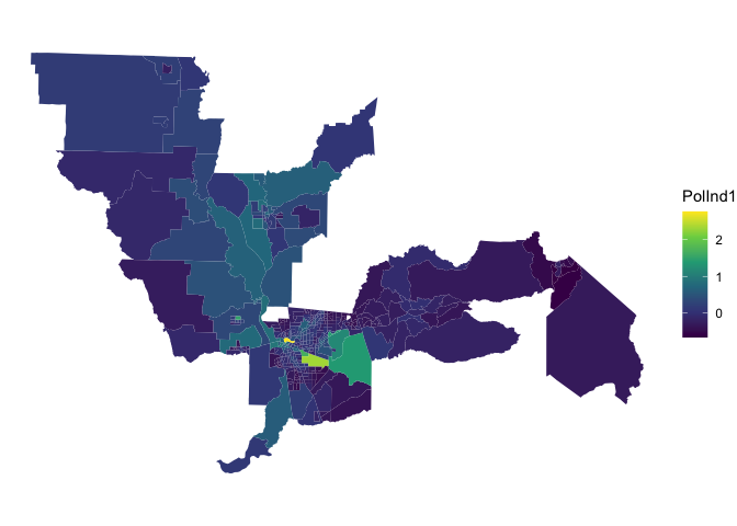
Lighter colors represent greater vulnerability.
Principal Components Analysis
Another method for creating an index is to use Principal Components Analysis (PCA). PCA is a “data reduction” method: it is used when researchers have a large number of variables that they want to represent with a smaller number of variables (called principal components). The idea behind this strategy is that researchers can represent their data using a linear combination of variables (i.e., a weighted average). The goal of the PCA algorithm is to identify these optimal weights.
To conduct a PCA in R, use the function prcomp(), which is a part of the package stats, a pre-installed package.
pcapolind<-prcomp(~Ozone+PM2_5+DieselPM+Pesticide+DrinkWat+Lead+Tox_Rel+
                    Cleanup+GWThreat+HazWaste+ImpWatBod+SolWaste,
                  center=T, scale=T, data=ces.data, na.action = na.exclude)
The first argument specifies the variables we want to include in the index, starting first with a tilde sign ~ then followed by each variable separated by a +. The arguments center=T and scale=T effectively standardize our variables. Always use z-scored variables when doing a PCA - scale is very important, as we want correlations going in, not covariances. And then data specifies the dataset. The argument na.action = na.exclude tells the function to exclude the observations with NA values, but retain them as NA when computing the scores (we did not need this here).
What is the object type of pcapolind?
class(pcapolind)## [1] "prcomp"Hmmmm, not something we’ve come across before. Let’s get a summary of this object.
summary(pcapolind)## Importance of components:
## PC1 PC2 PC3 PC4 PC5 PC6 PC7
## Standard deviation 1.6205 1.3635 1.1722 1.00863 1.00014 0.91254 0.87608
## Proportion of Variance 0.2188 0.1549 0.1145 0.08478 0.08336 0.06939 0.06396
## Cumulative Proportion 0.2188 0.3738 0.4883 0.57306 0.65642 0.72581 0.78977
## PC8 PC9 PC10 PC11 PC12
## Standard deviation 0.82458 0.79304 0.72144 0.64788 0.52314
## Proportion of Variance 0.05666 0.05241 0.04337 0.03498 0.02281
## Cumulative Proportion 0.84643 0.89884 0.94221 0.97719 1.00000You obtain 12 principal components (because we have 12 variables), which we call PC1-PC12. Each of these explains a percentage of the total variation in the dataset. That is to say: PC1 explains 21.9% of the total variance, which means that about one-fifth of the information in the dataset (12 variables) can be encapsulated by just that one Principal Component. PC2 explains 15.5% of the variance. So, by knowing the position of a sample in relation to just PC1 and PC2, you can explain about 37% of the variance. Squaring the top row of values (standard deviation) yields the eigenvalues.
But what does component 1 conceptually mean with respect to the variables we used in the PCA? To figure this out we have to look at its loadings. To see all of the loadings type in pcapolind$rotation. This displays the 12 components (one for each input variable) and the relative contribution to of each variable to the component (coefficients or loadings). Generally, the components are ordered from most to least important. One can assess the importance of each component based on how much of the variance in the data it explains. In this case, as noted above, the first component explains about 21.9% of the variance.
#the loadings of the first component
sort(pcapolind$rotation[,1])
Variables HazWaste, Cleanup, GWThreat, ImpWatBod, SolWaste, DieselPM, PM2_5, Lead, and DrinkWat all load negatively on the component. The variable that loads positively is Ozone concentration. Pesticide presence and Toxic releases appear to have little contribution to this component.
The factoextra package has a lot of useful PCA visualizations to help you interpret results. For example, use the function fviz_pca_var() to view the variable loadings plotted for PC 1 (on the x-axis) and PC 2 (on the y-axis).
fviz_pca_var(pcapolind, col.var="steelblue")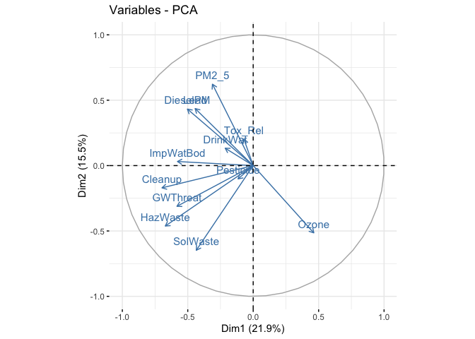
The visual gives you a sense of which variables load negatively or positively for the first two components.
Selecting Components
So how do we go about creating an index using the PCA results? The first thing you need to do is determine how many components you will use in creating the index. And as described in the Handout there are multiple approaches for doing this.
First, keep the number of components required to explain at least some minimum amount of the total variance. For example, if it is important to explain at least 80% of the variance, we would retain the first eight principal components, as we can see from the output of summary(pcapolind) that the first eight principal components explain around 84% of the variance (while the first seven components explain about 78%, so are not sufficient).
Second, we can look for the point at which the proportion of variance explained by each subsequent principal drops off. To do this, we fit a scree plot using the function fviz_eig() from the factoextra package.
fviz_eig(pcapolind) # prop of variance on y-axis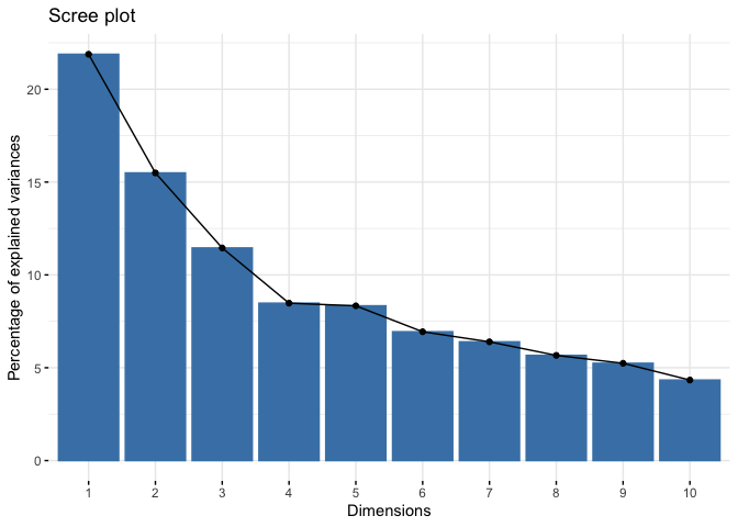
We are looking for an elbow - the place at which the slope suddenly flattens out. This is more art and eyeballing than science, but you can make the argument that the elbow is at 4, which means you retain the first three components.
Third, use Kaiser’s criterion: that we should only retain principal components for which the eigenvalue (or variance) is above 1. We can get the eigenvalues using the function get_eigenvalue().
get_eigenvalue(pcapolind)## eigenvalue variance.percent cumulative.variance.percent
## Dim.1 2.6260602 21.883835 21.88384
## Dim.2 1.8591827 15.493189 37.37702
## Dim.3 1.3741673 11.451395 48.82842
## Dim.4 1.0173308 8.477757 57.30618
## Dim.5 1.0002740 8.335616 65.64179
## Dim.6 0.8327303 6.939419 72.58121
## Dim.7 0.7675092 6.395910 78.97712
## Dim.8 0.6799277 5.666064 84.64318
## Dim.9 0.6289188 5.240990 89.88418
## Dim.10 0.5204790 4.337325 94.22150
## Dim.11 0.4197479 3.497899 97.71940
## Dim.12 0.2736722 2.280601 100.00000Here, we would keep the first five components.
So how many PCs should we use in the my_basket example? The frank answer is that there is no one best method for determining how many components to use. In this case, differing criteria suggest to retain 3 (scree plot criterion), 5 (eigenvalue criterion), and 8 (based on an 80% of variance explained requirement) components. The number you go with depends on your end objective and analytic workflow. You should test out different criterion, and see how sensitive your results are to the criterion used.
Let’s use the scree plot criterion to keep three components.
Single Index
Now that we’ve selected the number of components, what do we do with them to create an index? We can follow Cutter et al. (2003) by taking their average. Here, we simply attach equal weights (1/no. of components) to each component in their contribution to the overall index. To get the component scores for each tract (remember, the PCs are a linear combination of the variables), use the predict() function
#create separate data object containing just the pollution variables
ces.data.pred <- ces.data %>%
              dplyr::select(Ozone,PM2_5, DieselPM,
                            Pesticide, DrinkWat, Lead, Tox_Rel,
                            Cleanup, GWThreat, HazWaste, ImpWatBod, SolWaste) %>%
              st_drop_geometry()

#calculate component scores for each tract
pollind.components <- predict(pcapolind, ces.data.pred)
In the pollind.components object we have a score for each component for each tract. Let’s examine the correlation between the first 3 components and the variables.
#add the predicted PC scores to the original data set
ces.data <- ces.data %>%
            cbind(pollind.components)

pc_cor <- ces.data %>%
  st_drop_geometry() %>%
  dplyr::select(PC1:PC3, Ozone,PM2_5, DieselPM,
                            Pesticide, DrinkWat, Lead, Tox_Rel,
                            Cleanup, GWThreat, HazWaste, ImpWatBod, SolWaste) %>%
  correlate()

pc_cor
## # A tibble: 15 × 16
## term PC1 PC2 PC3 Ozone PM2_5 DieselPM Pesticide
## <chr> <dbl> <dbl> <dbl> <dbl> <dbl> <dbl> <dbl>
## 1 PC1 NA -5.03e-16 6.39e-16 0.463 -0.311 -0.503 -0.116
## 2 PC2 -5.03e-16 NA -5.33e-16 -0.514 0.623 0.432 -0.102
## 3 PC3 6.39e-16 -5.33e-16 NA 0.282 0.0905 0.270 -0.739
## 4 Ozone 4.63e- 1 -5.14e- 1 2.82e- 1 NA -0.353 -0.263 -0.0761
## 5 PM2_5 -3.11e- 1 6.23e- 1 9.05e- 2 -0.353 NA 0.300 -0.00490
## 6 DieselPM -5.03e- 1 4.32e- 1 2.70e- 1 -0.263 0.300 NA -0.116
## 7 Pesticide -1.16e- 1 -1.02e- 1 -7.39e- 1 -0.0761 -0.00490 -0.116 NA
## 8 DrinkWat -2.14e- 1 1.33e- 1 -4.90e- 1 -0.145 0.147 0.0866 0.184
## 9 Lead -4.44e- 1 4.36e- 1 -5.85e- 2 -0.316 0.209 0.279 0.000693
## 10 Tox_Rel -7.12e- 2 2.03e- 1 3.07e- 1 -0.0588 0.129 0.0534 -0.0497
## 11 Cleanup -6.97e- 1 -1.70e- 1 3.40e- 1 -0.0687 0.129 0.326 -0.0287
## 12 GWThreat -5.83e- 1 -3.11e- 1 1.70e- 1 -0.0411 0.0235 0.127 0.0135
## 13 HazWaste -6.72e- 1 -4.62e- 1 1.64e- 1 -0.0755 0.0632 0.141 -0.0138
## 14 ImpWatBod -5.79e- 1 3.13e- 2 -3.51e- 1 -0.348 0.0192 0.183 0.223
## 15 SolWaste -4.35e- 1 -6.48e- 1 -1.89e- 1 -0.00631 -0.223 -0.0734 0.158
## # … with 8 more variables: DrinkWat <dbl>, Lead <dbl>, Tox_Rel <dbl>,
## # Cleanup <dbl>, GWThreat <dbl>, HazWaste <dbl>, ImpWatBod <dbl>,
## # SolWaste <dbl>If a component tends to show high levels for low vulnerability (e.g., PM 2.5 is strongly negative), the corresponding factor scores are multiplied by –1. This is not entirely true for PC2 and PC3, but is the case for PC1, which is negatively correlated with all variables except Ozone. So, we’ll multiply this component by -1 before using it in the index.
We take the average of the first three components to create the index, then bring it into the ces.data file. Remember, we multiply PC1 by -1.
pollind.components <- pollind.components %>%
                    as_tibble() %>%
                    mutate(PolInd2 = (-PC1 + PC2 + PC3)/3) %>%
                    dplyr::select(PolInd2)

#add the PCA index back to the original data set
ces.data <- ces.data %>%
            cbind(pollind.components)
Alternatively, instead of equal weights, we can follow Kolak et al. (2020) and weight each PC by their proportional variance from the PCA, which we can obtain from summary(pcapolind).
What is the correlation between the index PolInd2, the original variables and the index created using the basic averaging approach PolInd1?
index_cor <- ces.data %>%
  st_drop_geometry() %>%
  dplyr::select(PolInd1, PolInd2, Ozone,PM2_5, DieselPM,
                            Pesticide, DrinkWat, Lead, Tox_Rel,
                            Cleanup, GWThreat, HazWaste, ImpWatBod, SolWaste) %>%
  correlate()

index_cor
## # A tibble: 14 × 15
## term PolInd1 PolInd2 Ozone PM2_5 Diese…¹ Pestic…² DrinkWat Lead
## <chr> <dbl> <dbl> <dbl> <dbl> <dbl> <dbl> <dbl> <dbl>
## 1 PolInd1 NA 0.539 -0.163 0.312 0.443 2.79e-1 0.334 4.17e-1
## 2 PolInd2 0.539 NA -0.463 0.603 0.711 -3.38e-1 -0.0192 5.14e-1
## 3 Ozone -0.163 -0.463 NA -0.353 -0.263 -7.61e-2 -0.145 -3.16e-1
## 4 PM2_5 0.312 0.603 -0.353 NA 0.300 -4.90e-3 0.147 2.09e-1
## 5 DieselPM 0.443 0.711 -0.263 0.300 NA -1.16e-1 0.0866 2.79e-1
## 6 Pestici… 0.279 -0.338 -0.0761 -0.00490 -0.116 NA 0.184 6.93e-4
## 7 DrinkWat 0.334 -0.0192 -0.145 0.147 0.0866 1.84e-1 NA 9.97e-2
## 8 Lead 0.417 0.514 -0.316 0.209 0.279 6.93e-4 0.0997 NA
## 9 Tox_Rel 0.235 0.311 -0.0588 0.129 0.0534 -4.97e-2 -0.0696 1.06e-1
## 10 Cleanup 0.638 0.535 -0.0687 0.129 0.326 -2.87e-2 -0.00648 1.37e-1
## 11 GWThreat 0.554 0.297 -0.0411 0.0235 0.127 1.35e-2 0.0499 1.03e-1
## 12 HazWaste 0.628 0.269 -0.0755 0.0632 0.141 -1.38e-2 0.0610 6.82e-2
## 13 ImpWatB… 0.477 0.235 -0.348 0.0192 0.183 2.23e-1 0.0445 2.49e-1
## 14 SolWaste 0.461 -0.165 -0.00631 -0.223 -0.0734 1.58e-1 0.0909 -9.46e-3
## # … with 6 more variables: Tox_Rel <dbl>, Cleanup <dbl>, GWThreat <dbl>,
## # HazWaste <dbl>, ImpWatBod <dbl>, SolWaste <dbl>, and abbreviated variable
## # names ¹DieselPM, ²PesticideThe correlation between PolInd1 and PolInd2 is moderate. Let’s map the PCA index. Lighter the color, the greater the pollution burden.
ggplot(ces.data, aes(fill = PolInd2)) +
  geom_sf(color = NA) +
  theme_void() +
  scale_fill_viridis_c()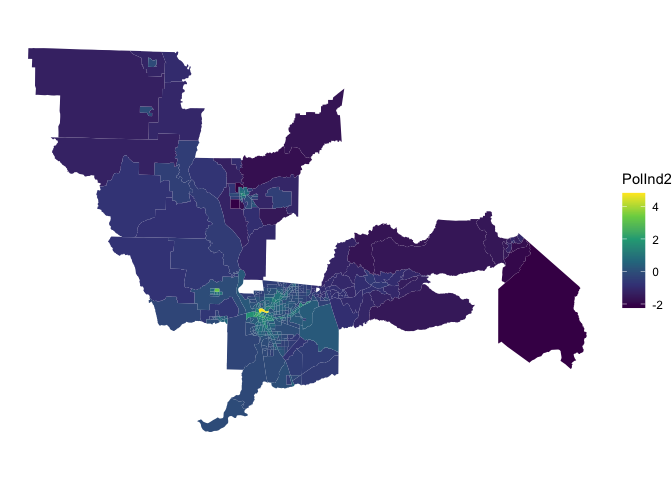
Compare the this map with the map of PolInd1 to examine whether some neighborhoods are more vulnerable according to one index compared to the other.
Multiple Indices
Instead of creating a single index, you can use PCA to make multiple indices. Here, the idea is to reduce the dimensionality of your dataset to not necessarily a single dimension, but to a much smaller set of domains that explain the majority of variance explained.
This is what Kolak et al. (2020) did in creating indices capturing multiple dimensions of the Social Determinants of Health (SDOH). Using the Kaiser criterion, they ended up with 4 principal components. Evaluating variables with PCA loadings of 0.3 and higher, the authors characterized these components as the Socioeconomic Advantage Index (PC1), Limited Mobility Index (PC2), Urban Core Opportunity Index (PC3), and Mixed Immigrant Cohesion and Accessibility Index (PC4). They conclude that their “analysis confirms that the use of intercorrelated indicators of SDOH likely introduces issues o endogeneity in analysis and may obfuscate the underlying phenomenon of socioeconomic advantage and overlook the further complexity of neighborhood patterns.”
Let’s go back to the variable loadings to see how each variable contributes to the principal components. First, the variable loading matrix (stored in the rotation element of the pca object) is converted to a tibble so we can view it easier.
pca_tibble <- pcapolind$rotation %>%
  as_tibble(rownames = "predictor")

pca_tibble
## # A tibble: 12 × 13
## predictor PC1 PC2 PC3 PC4 PC5 PC6 PC7 PC8
## <chr> <dbl> <dbl> <dbl> <dbl> <dbl> <dbl> <dbl> <dbl>
## 1 Ozone 0.286 -0.377 0.240 -0.0700 0.141 -0.252 -0.411 -0.247
## 2 PM2_5 -0.192 0.457 0.0772 -0.342 0.125 -0.245 0.405 0.253
## 3 DieselPM -0.310 0.317 0.231 0.0627 0.247 0.0259 -0.0624 -0.644
## 4 Pesticide -0.0713 -0.0748 -0.630 -0.0360 -0.184 -0.531 0.0149 -0.207
## 5 DrinkWat -0.132 0.0976 -0.418 -0.564 0.380 0.0772 -0.387 -0.0532
## 6 Lead -0.274 0.320 -0.0499 0.142 -0.197 0.385 -0.547 0.158
## 7 Tox_Rel -0.0439 0.149 0.262 -0.384 -0.768 -0.204 -0.187 -0.108
## 8 Cleanup -0.430 -0.125 0.290 0.0895 0.122 -0.333 -0.0329 -0.164
## 9 GWThreat -0.360 -0.228 0.145 0.0561 0.136 -0.321 -0.303 0.576
## 10 HazWaste -0.414 -0.339 0.140 -0.255 -0.00510 0.193 0.257 -0.0366
## 11 ImpWatBod -0.357 0.0230 -0.299 0.517 -0.159 -0.0680 0.0315 -0.0800
## 12 SolWaste -0.268 -0.475 -0.161 -0.209 -0.195 0.378 0.138 -0.108
## # … with 4 more variables: PC9 <dbl>, PC10 <dbl>, PC11 <dbl>, PC12 <dbl>Positive values for a given row mean that the original variable is positively loaded onto a given component, and negative values mean that the variable is negatively loaded. Larger values in each direction are of the most interest to us; values near 0 mean the variable is not meaningfully explained by a given component. To explore this further, we can visualize the first three components with ggplot()
pca_tibble %>%
  select(predictor:PC3) %>%
  pivot_longer(PC1:PC3, names_to = "component", values_to = "value") %>%
  ggplot(aes(x = value, y = predictor)) +
  geom_col(fill = "darkgreen", color = "darkgreen", alpha = 0.5) +
  facet_wrap(~component, nrow = 1) +
  labs(y = NULL, x = "Value") +
  theme_minimal()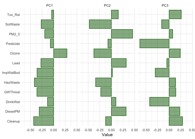
The bar chart helps us understand how the multiple variables represent latent environmental processes at play in the Capitol Region. Variables Cleanup, GWThreat, HazWaste, ImpWatBod, DieselPM and SolWaste have the largest (negative) loadings on PC 1. CES created a separate subdomain containing these variables known as Environmental Effects. However, Ozone has the largest and only positive loading with PC 1. This is because Ozone is negatively correlated with all the other pollution variables for neighborhoods in our sample. Make choropleth maps of Ozone and PM 2.5 to see where this may be happening in the region. The second CES subdomain contains the other variables, and is labelled Pollution Burden. None of the other PCs appear to represent this domain. The second PC seems to be places with high PM 2.5 and Diesel PM levels, but low Ozone (and a low SolWaste). PC3 are places with low Pesticide, drinking water contaminants, and impaired water bodies levels, but small to moderate positive levels of the other pollution characteristics. A lot of this is eye-balling; we could use Kolak et al., (2020) to establish lower than -0.3 or higher than 0.3 loadings as important variables when characterizing each component.
The CES, which does not use a PCA to construct its index, also includes measures of population characteristics capturing sensitive populations and socioeconomic factors. The sensitive populations dimension incorporates the variables asthma emergency department visits, cardiovascular disease (emergency department visits for heart attacks), and low birth-weight infants. The socioeconomic factors dimension uses educational attainment, housing-burdened low-income households, linguistic isolation, poverty, Unemployment. These two domains - sensitive populations and socioeconomic factors - and environmental effects and population burden make up the four subdomains of the overall CES index. If you include all of these variables in a PCA, do you see these 4 domains emerge from the first four components?
Geodemographic classification
Rather than numeric indices, geodemographic classification combines variables into neighborhood typologies. There is no single or correct method for building a geodemographic classification. Geodemographic classification is part science, part art. As such, some of the decisions you will make may be subjective. The key is that you as the modeler can defend your choices. Some of these choices can be defended via statistical algorithms. Others by drawing on your own understanding of the communities under study.
Let’s create a typology using the CES data. What are the steps?
Just like with indices, you need to standardize all your input variables. Note that unlike an index, you don’t need to point them in the same direction because we’re not creating a linear or continuous measure of vulnerability.
Determine how many types (or categories or clusters) are appropriate.
Use a statistical algorithm to classify neighborhoods based on the input variables
For 3, we will be using k-means clustering to create the classification.
K-means clustering
K-means clustering is the most commonly used algorithm for partitioning a given data set into a set of k clusters (i.e. k types), where k represents the number of groups pre-specified by the analyst. k-means, like other clustering algorithms, tries to classify observations into mutually exclusive groups (or clusters), such that observations within the same cluster are as similar as possible (i.e., high intra-class similarity), whereas observations from different clusters are as dissimilar as possible (i.e., low inter-class similarity). In k-means clustering, each cluster is represented by its center (i.e, centroid) which corresponds to the mean of the observation values assigned to the cluster.
While the exact methodology to produce a geodemographic classification system varies from implementation to implementation, the general process used involves dimension reduction applied to a high-dimensional input dataset of model features, followed by a clustering algorithm to partition observations into groups based on the derived dimensions. As we have already employed principal components analysis for dimension reduction on the CES dataset, we can re-use those components for this purpose. We’re going to be using the function kmeans() which is a part of the stats package in R. In order to use kmeans(), you’ll need to input a regular data frame containing just your numeric variables.
#drop geometry to make into a regular data frame
subset.data <-  ces.data %>%
              select(PC1:PC3) %>%
            st_drop_geometry()
Let’s run the kmeans() function using k = 6. The kmeans() function accepts a data set input - in this case subset.data.
centersspecifies the number of clusters k =6.iter.maxindicates the number of iterations you run the kmeans algorithm, which should be set to a large number to allow it to complete. This is the “Iterate” part discussed in the handout and lecture.nstarttellskmeans()to try that many random starts and keep the best. If a value ofnstartgreater than one is used, then K-means clustering will be performed using multiple random assignments in Step 1 of the algorithm described in Handout 5. According to James et al., (2013), with 25 to 50 random starts, you’ll generally find the overall best solution.
kmeans(subset.data, centers=6,nstart=25,iter.max = 1000000)The output of kmeans() is a list with several bits of information. The most important being:
- cluster: A vector of integers (from 1:k) indicating the cluster to which each point is allocated.
- centers: A matrix of cluster centers.
- totss: The total sum of squares.
- withinss: Vector of within-cluster sum of squares, one component per cluster.
- tot.withinss: Total within-cluster sum of squares, i.e. sum(withinss).
- betweenss: The between-cluster sum of squares, i.e. totss − tot.withinss.
- size: The number of points in each cluster.
Choosing the best k
You might be wondering why we chose 6 in the example above. Well, there was no reason, we just used 6 to illustrate the usage of kmeans(). It is up to the modeler to select k. How does one choose the appropriate k? In choosing k, keep these major aims of cluster analysis in mind.
- Each cluster should be homogeneous as possible
- Each cluster group should be distinct from the other groups
In addition, to each of these, we must also consider the compositions of the cluster groups. In other words, can we succinctly describe each cluster type?
One method for selecting the best k is to run k-means with different cluster frequency (k), and for each result, examine a statistic called the total within cluster sum of squares (wss). This is a measure of how well the cluster frequency fits the data. The total wss measures the compactness of the clustering by calculating the distance between the values of each tract in a cluster and the cluster’s centroid. We we want this value to be as small as possible. In other words, it helps us capture criteria 1 above. Another statistic that is often examined is the total between cluster sum of squares (bss). Here, you are calculating the distance between cluster centroids from the overall mean. To capture criteria 2, we would want the bss to be as large as possible.
These values are typically plotted across each k, with the purpose to identify an “elbow criterion” which is a visual indication of where an appropriate cluster frequency might be set. The elbow or kink indicates where the decrease in the wss (or increase in the bss) might be leveling off. This elbow criterion is trying to strike a balance of minimizing wss (or maximizing bss) but choosing a value of k that is reasonable.
We can use the following algorithm to define the optimal clusters:
- Compute the clustering algorithm for different values of k, varying k from 1 to n clusters
- For each k, calculate the wss (or bss).
- Plot the curve of wss and bss according to the number of clusters k.
- The location of a bend (knee) in the plot is generally considered as an indicator of the appropriate number of clusters.
Fortunately, this process to compute the “Elbow method” has been wrapped up in the single function fviz_nbclust(). Let’s look at the wss. Given that the algorithm relies on random seeding of the cluster centers, set.seed() should be used to ensure stability and reproducibility of the solution. In other words, if we don’t set the seed, the results will slightly differ from one run of the function to another (this is true for any method that relies on random selection/assignment).
#set seed to establish reproducibility
set.seed(1983)
fviz_nbclust(subset.data, kmeans, method = "wss")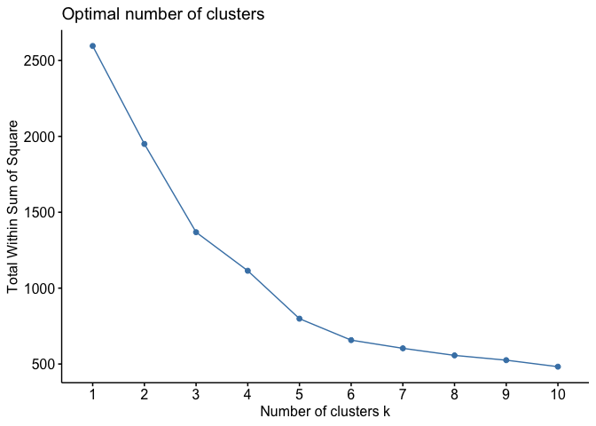
We’re looking for the portion of the plot where a kink or elbow appears or when the drop off from one k to the next is not as significant. If the rate of change of the slope is gradual, with no clear elbow, this is where the art comes in, and the interpretation is that 5-7 clusters balances a small sum of squares while not losing too much interpretability. The function fviz_nbclust() offers other statistics besides the wss for determining the optimal k.
If you’re not satisfied with the above exploratory method, you can employ the n_clusters() command found in the parameters package. The command tests ~30 indices for determining the number of clusters. All of these indices are similar to the wss or bss in that it is examining best fit across different values of k. As the package’s creators describe in their documentation, the function “enables the user to simultaneously evaluate several clustering schemes while varying the number of clusters, to help determining the most appropriate number of clusters for the data set of interest.” The function might take a long time to run because it’s computing many indices on a data set for a range of k values. I present the code below but do not run it. Run the code on your own time when you have the patience and time. The results of running the function will tell you the number of indices that show the best fit by k.
#don't run this unless you have some time on your hands
#you may need to install the packages easystats, NbClust, and mclust
library(parameters)
n_clust <- n_clusters(subset.data,
                      package = c("easystats", "NbClust", "mclust"),
                      standardize = FALSE)
Based on the wss plot, let’s run the k-means algorithm for k = 6. Testing the robustness of your findings is very important, so we choose k = 6 with the understanding that we’ll select other k values later to see how results change.
cluster_k <- kmeans(x=subset.data,
                    centers=6,
                    nstart=25,
                    iter.max = 1000000)
Let’s save the cluster assignment back ces.data. We have to make the cluster variable a character using the function as.character() because we are constructing a categorical (not numeric) classification of neighborhoods.
ces.data <- ces.data %>%
  mutate(cluster = as.character(cluster_k$cluster))
Evaluating a classification
Having selected the number of clusters for the k-means model, we want to examine or visualize the fit. If we see a poor fit, we may adjust the the number of clusters. One way of doing this is by examining a principal component or cluster plot. It plots each of the cases in our data against the first 2 principal components and colors them by their cluster group from our K-means model. You could also try rerunning the K-means again with different number of groups to see how well the models discriminate based on two principal components.
The cluster type is stored in the variable cluster within cluster_k. We can see the distribution of tracts by cluster
table(cluster_k$cluster)##
## 1 2 3 4 5 6
## 29 158 27 156 68 6We use ggplotly() from the plotly package to convert the scatterplot to a graphic with an interactive legend, allowing the analyst to turn cluster groups on and off.
cluster_plot <- ggplot(ces.data,
                       aes(x = PC1, y = PC2, color = cluster)) +
  geom_point() +
  scale_color_brewer(palette = "Set1") +
  theme_minimal()

ggplotly(cluster_plot) %>%
  layout(legend = list(orientation = "h", y = -0.15,
                       x = 0.2, title = "Cluster"))
When examining a cluster plot, see if you can find k identifiable groups. In other words, you should see a separation of color. We find in the above plot that this is mostly the case - can you identify 6 distinct colors? You might notice that although there are obvious clusters in the graphs, there are some points that overlap with other clusters. This is because the data we used is complex and includes several variables which may be exerting unique patterns.
Mapping the cluster types
You should also map the cluster to explore the data in geographic space. Let’s map the cluster variable cluster.
cap.map.k <- ces.data %>%
            tm_shape(unit = "mi") +
              tm_polygons(col = "cluster", style = "cat",
              border.alpha = 0, alpha = 0.75, title = "Cluster")

tmap_mode("view")

cap.map.k
Some notable geographic patterns in the clusters are evident from the map, even if the viewer does not have local knowledge of the California Capital region. For example, clusters 1 and 5 represent more rural communities on the edges of the area, whereas Clusters 3 and 4 tend to be located in Sacramento and other central city locations in the region.
Labelling the clusters
You should examine the means of the input variables by cluster. This will give you a sense of what these clusters look like. These means actually represent the centroids of each cluster. In other words, the cluster centers indicate the coordinates of the centroid for each cluster group once the k-means had reached its optimum solution. It, therefore, is a good indicator of the average characteristics of each group based on the variables that were included in the original model.
We inputted the first three principal components from the PCA into the model, therefore the cluster centers are represented as the means of these components. Zero represents the mean for each variable and values above or below indicate the number of standard deviations away from the average. The values can, therefore, be used to very easily understand how unique each group is relative to the whole sample.
The centers are saved as the object centers within cluster_k. Let’s extract it and save it as a data frame.
KmCenters <- as.data.frame(cluster_k$centers)

KmCenters
The rows represent the 6 clusters and the columns represent the variables (three components) used in the k-means model. Is it immediately clear what your groups represent? Probably not. It might be easier to create charts to visualize the characteristics of each cluster group. We can create radial plots to do this. The main idea behind a radial plot is to project the data as a distance from the center in a circular form. We create radial plots in R using the function radial.plot() which is a part of the plotrix package.
Let’s create a radial plot for cluster 1.
radial.plot(KmCenters[1,], labels = colnames(KmCenters),
            boxed.radial = FALSE, show.radial.grid = TRUE,
            line.col = "blue", radlab = TRUE, rp.type = "p")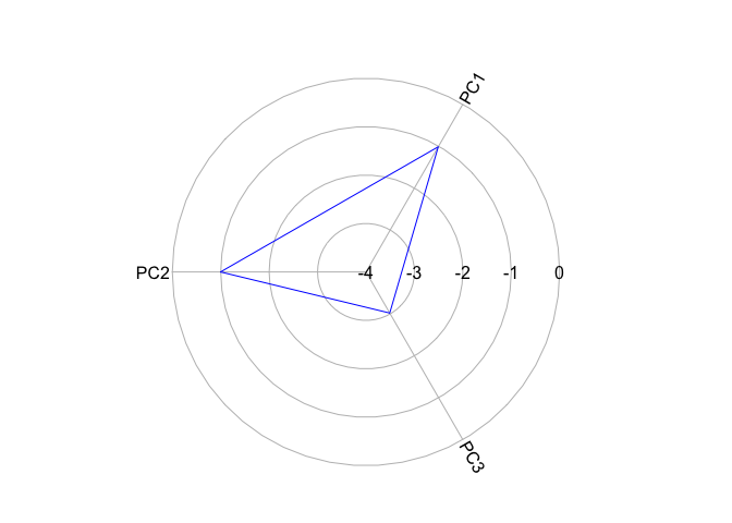
The closer the polygon vertex is to the edge of the circle, the higher the cluster mean for that variable. Now let’s plot a zero line to indicate the average for the whole region.
# creates a object of seven zeros (remember we have 6 groups)
KmCenters[7,]<- c(0)
# this reduces the size of grid and axis labels in upcoming plots
par(cex.axis = 0.8, cex.lab = 0.8)

radial.plot(KmCenters[c(1,7),], labels = colnames(KmCenters),
            boxed.radial = FALSE, show.radial.grid = TRUE,
            line.col = c("blue", "red"), radlab = TRUE, rp.type = "p",
            show.grid.labels = 3)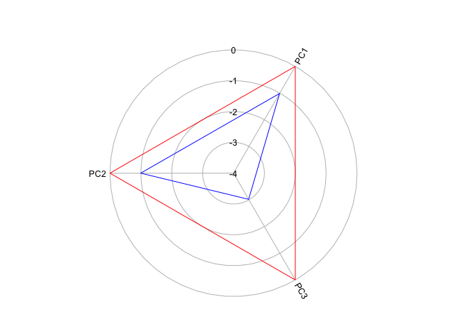
Remember that our variables are standardized - anything above 0 (the red circle) is above the mean and below 0 is below the mean. It looks like Cluster 1 is characterized as scoring low on all PCs, but especially so far PC3. Create radial plots for the other clusters by replacing the 1 in KmCenters[c(1,6),] with 2, 3, 4 and so on.
In this lab, we used the principal components from the PCA to create the clusters. We could have instead used the original variables directly, remembering to standardize them first before using them in the model. Furthermore, the CES also includes socioeconomic and demographic variables in its index, so we can run k-means on the full set of variables rather than just those measuring pollution burden (or run PCA on the full set, then run k-means on the principal components from that PCA).
The somewhat squishy way we made selections throughout this lab highlights the importance of human judgment on machine learning algorithms, and data science in general. Algorithms are very good at doing exactly as they are told. But if we feed them poor instructions or poor quality data, they will accurately calculate a useless result. This is particularly harmful in the context of vulnerability mapping, where we are trying to identify areas that are most in need of resources to help mitigate the deleterious effects of hazardous events.

This work is licensed under a Creative Commons Attribution-NonCommercial 4.0 International License.
Website created and maintained by Noli Brazil