Lab 7: Spatial Autocorrelation
CRD 230 - Spatial Methods in Community Research
Professor Noli Brazil
February 22, 2023
Tobler’s First Law of Geography states that “Everything is related to everything else, but near things are more related than distant things.” The law is capturing the concept of spatial autocorrelation. We will be covering the R functions and tools that measure spatial autocorrelation. The objectives of the guide are as follows
- Learn how to create a spatial weights matrix
- Learn how to create a Moran scatterplot
- Calculate global spatial autocorrelation
- Detect clusters using local spatial autocorrelation
To accomplish these objectives, we will examine the case of neighborhood housing eviction rates in the Sacramento metropolitan area. The methods covered in this lab follow those discussed in Handout 6.
Load necessary packages
We’ll be introducing one new package in this lab. Install it using install.packages().
install.packages("spdep")The other packages we need should be pretty familiar to you at this point in the class. Load these packages and our new package using library().
library(tidyverse)
library(sf)
library(tmap)
library(spdep)
Read in the data
Our goal is to determine whether eviction rates cluster in Sacramento. Let’s bring in our main dataset for the lab, a shapefile named sacmetrotracts.shp, which contains 2016 court-ordered housing eviction rates for census tracts in the Sacramento Metropolitan Area. If you would like to learn more about how these data were put together, check out the Eviction Lab’s Methodology Report. I zipped up the file and uploaded it onto Github. Set your working directory to an appropriate folder (setwd()) and use the following code to download and unzip the file. I’ve also uploaded this file on Canvas in the Week 7 Lab folder.
setwd("insert your pathway here")
download.file(url = "https://raw.githubusercontent.com/crd230/data/master/sacmetrotracts.zip", destfile = "sacmetrotracts.zip")
unzip(zipfile = "sacmetrotracts.zip")
You should see the sacmetrotracts files in your folder. Bring in the file using st_read().
sac.tracts <- st_read("sacmetrotracts.shp", stringsAsFactors = FALSE)We’ll need to reproject the file into a CRS that uses meters as the units of distance. Let’s use our good friend UTM Zone 10, whom we met back in Lab 4a.
sac.tracts <-st_transform(sac.tracts,
                             crs = "+proj=utm +zone=10 +datum=NAD83 +ellps=GRS80")
Exploratory mapping
Before calculating spatial autocorrelation, you should first map your variable to see if it looks like it clusters across space. Using the function tm_shape(), let’s make a choropleth map of eviction rates in the Sacramento metro area.
tm_shape(sac.tracts, unit = "mi") +
  tm_polygons(col = "evrate", style = "quantile",palette = "Reds",
              border.alpha = 0, title = "") +
  tm_scale_bar(breaks = c(0, 10, 20), text.size = 1) +
  tm_compass(type = "4star", position = c("left", "bottom")) +
  tm_layout(main.title = "Eviction Rates in Sacramento Metropolitan Area Tracts",
            main.title.size = 0.95, frame = FALSE)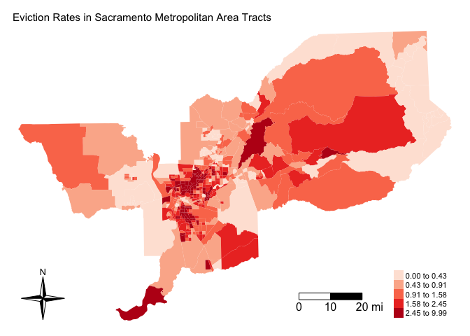
It does look like eviction rates cluster. In particular, there appears to be concentrations of high eviction rate neighborhoods in the Sacramento central city and northeast portions of the metro area.
Spatial weights matrix
Before we can formally model the dependency shown in the above map, we must first cover how neighborhoods are spatially connected to one another. That is, what does “near” and “related” mean when we say “near things are more related than distant things”? You need to define
- Neighbor connectivity (who is you neighbor?)
- Neighbor weights (how much does your neighbor matter?)
Defining these parameters means constructing a spatial weights matrix. Let’s first go through the various ways one can define a neighbor.
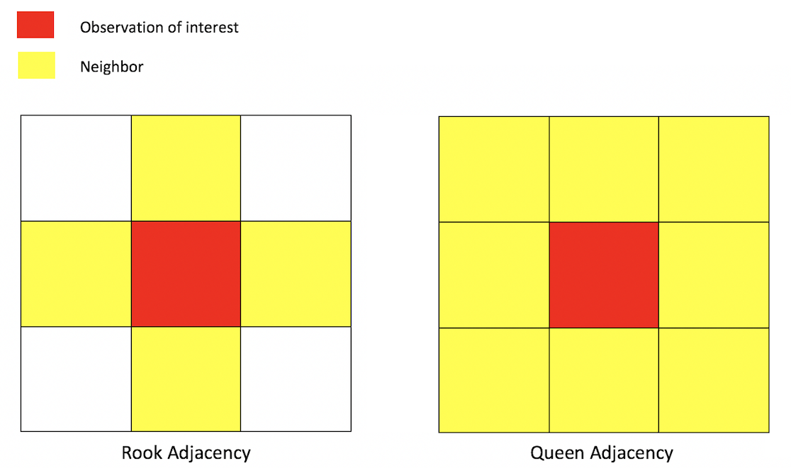
Neighbor connectivity: Contiguity
A common way of defining neighbors is contiguity or adjacency. The two most common ways of defining contiguity is Rook and Queen adjacency (Figure below). Rook adjacency refers to neighbors that share a line segment (or border). Queen adjacency refers to neighbors that share a line segment (or border) or a point (or vertex).
Geographic adjacency based neighbors
Neighbor relationships in R are represented by neighbor nb objects. An nb object identifies the neighbors for each geometric feature in the dataset. We use the command poly2nb() from the spdep package to create a contiguity-based neighbor object. Let’s specify Queen connectivity.
sac_neighbors<-poly2nb(sac.tracts, queen=T)You plug the object sac.tracts into the first argument of poly2nb() and then specify Queen contiguity using the argument queen=T. To specify Rook adjacency, change the argument to queen=F.
The function summary() tells us something about how much the neighborhoods are connected.
summary(sac_neighbors)## Neighbour list object:
## Number of regions: 486
## Number of nonzero links: 3070
## Percentage nonzero weights: 1.299768
## Average number of links: 6.316872
## Link number distribution:
##
## 1 2 3 4 5 6 7 8 9 10 11 12 13 15 16 18
## 1 3 25 50 99 96 98 60 28 13 5 2 2 2 1 1
## 1 least connected region:
## 481 with 1 link
## 1 most connected region:
## 279 with 18 linksThe average number of neighbors (adjacent polygons) is 6.3, 1 polygon has 1 neighbor and 1 has 18 neighbors.
For each neighborhood in the Sacramento metropolitan area, sac_neighbors lists all neighboring tracts based on their row index (not GEOID). For example, to see the neighbors for the first tract:
# Get the row indices of the neighbors of the Census tract at row index 1
sac_neighbors[[1]]
## [1] 92 386 387Tract 1 has 3 neighbors with row numbers 92, 386 and 387. But what are the Census IDs? Tract 1 has tract number
sac.tracts$NAME[1]## [1] "Census Tract 307.10, El Dorado County, California"and its neighboring tracts are
sac.tracts$NAME[c(92,386, 387)]## [1] "Census Tract 318, El Dorado County, California"
## [2] "Census Tract 307.06, El Dorado County, California"
## [3] "Census Tract 307.09, El Dorado County, California"Neighbor connectivity: Distance
In distance based connectivity, features within a given radius are considered to be neighbors. The length of the radius is left up to the researcher to decide. For example, Weisburd, Groff and Yang (2012) use a quarter mile (approximately 3-4 city blocks) in their study of crime clusters in Seattle. Often studies test different distances to test the robustness of the findings (e.g. Poulsen et al. 2010). When dealing with polygons, x and y are the coordinates of their centroids (the center of the polygon). You create a radius of distance d2 around the observation of interest - other polygons whose centroids fall inside this radius are tagged as neighbors.
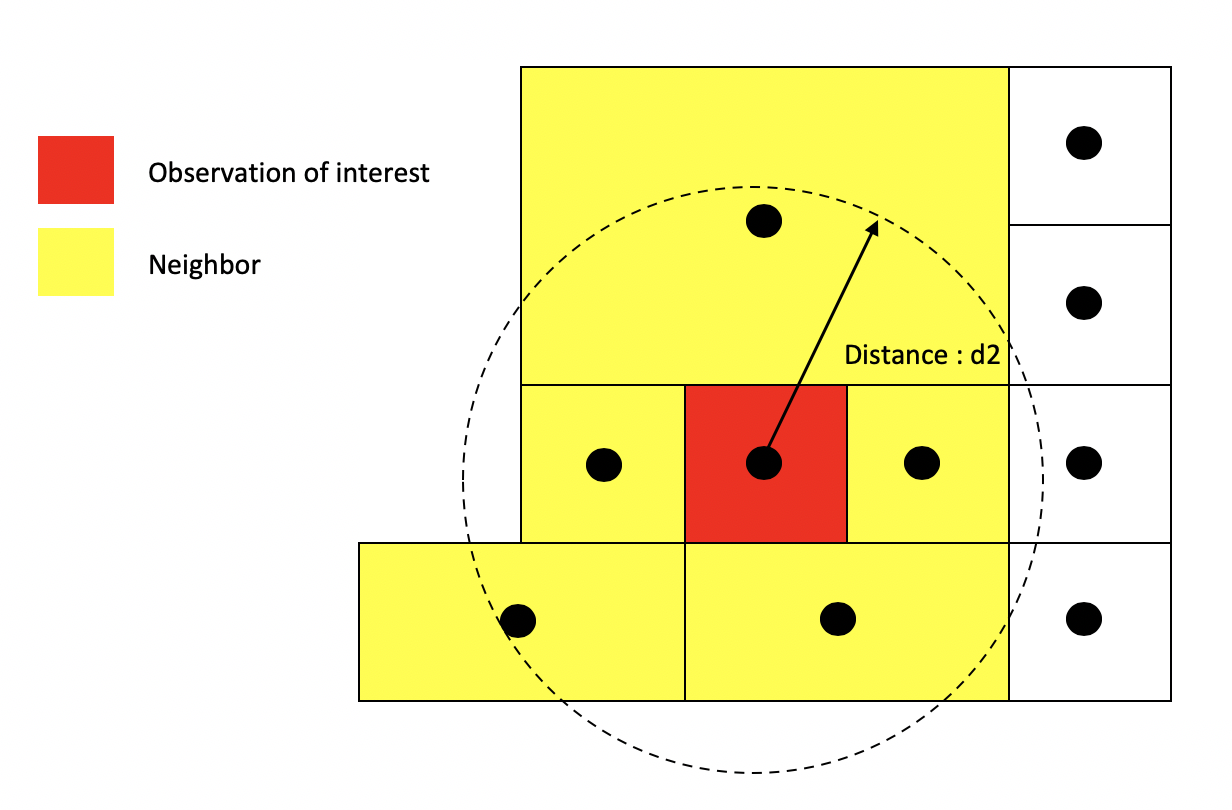
Distance based neighbors
Other distance metrics besides Euclidean are possible depending on the context and area of your subject. For example, Manhattan distance, which uses the road network rather than the straight line measure of Euclidean distance, is often used in city planning and transportation research.
You create a distance based neighbor object using using the function dnearneigh(), which is part of the spdep package. The dnearneigh() function tells R to designate as neighbors the units falling within the distance specified between d1 (lower distance bound) and d2 (upper distance bound). Note that d1 and d2 can be any distance value as long as they reflect the distance units that our shapefile is projected in (meters for UTM). The option x gives the geographic coordinates of each feature in your shapefile which allows R to calculate distances between each feature to every other feature in the dataset. We use the coordinates of neighborhood centroids to calculate distances from one neighborhood to another. First, let’s extract the centroids using st_centroid(), which we covered in Lab 5a.
sac.coords <- st_centroid(sac.tracts)Then using dnearneigh(), we create a distance based nearest neighbor object where d2 is 20 miles (32186.9 meters). d1 will equal 0. row.names = specifies the unique ID of each polygon.
Sacnb_dist1 <- dnearneigh(sac.coords, d1 = 0, d2 = 32186.9,
                          row.names = sac.tracts$GEOID)
For comparison’s sake, we’ll also create a distance based nearest neighbor object where d2 is 5 miles (8046.72 meters).
Sacnb_dist2 <- dnearneigh(sac.coords, d1 = 0, d2 = 8046.72,
                          row.names = sac.tracts$GEOID)
Neighbor connectivity: k-nearest neighbors
Another common method for defining neighbors is k-nearest neighbors. This method finds the k closest observations for each observation of interest, where k is some integer. For instance, if we define k=3, then each observation will have 3 neighbors, which are the 3 closest observations to it, regardless of the distance between them. Using the k-nearest neighbor rule, two observations could potentially be very far apart and still be considered neighbors.
k-nearest neighbors: k = 3
You create a k-nearest neighbor object using the commands knearneigh()and knn2nb(), which are part of the spdep package. First, create a k nearest neighbor object using knearneigh() by plugging in the tract (centroid) coordinates and specifying k. Then create an nb object by plugging in the object created by knearneigh() into knn2nb().
Neighbor weights
We’ve established who our neighbors are by creating an nb object. The next step is to assign weights to each neighbor relationship. The weight determines how much each neighbor counts. You will need to employ the nb2listw() command, which is a part of the spdep package. Let’s create weights for our Queen contiguity defined neighbor object sac_neighbors
sac_weights<-nb2listw(sac_neighbors, style="W")In the command, you first put in your neighbor nb object (sac_neighbors) and then define the weights style = "W". Here, style = "W" indicates that the weights for each spatial unit are standardized to sum to 1 (this is known as row standardization). For example, if census tract 1 has 3 neighbors, each of those neighbors will have weights of 1/3.
sac_weights$weights[[1]]## [1] 0.3333333 0.3333333 0.3333333This allows for comparability between areas with different numbers of neighbors. Let’s construct weights for the 20-mile distance based neighbor objects.
sac_weights_dist1<-nb2listw(Sacnb_dist1, style="W")We can visualize the neighbor connections between tracts using the weight matrix created from nb2listw(). We use the generic plot() function to create these visuals. Here are the connections for the Queen contiguity based definition of neighbor.
centroids <- st_centroid(st_geometry(sac.tracts))
plot(st_geometry(sac.tracts), border = "grey60", reset = FALSE)
plot(sac_neighbors, coords = centroids, add=T, col = "red")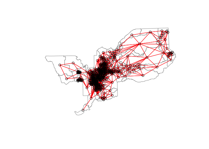
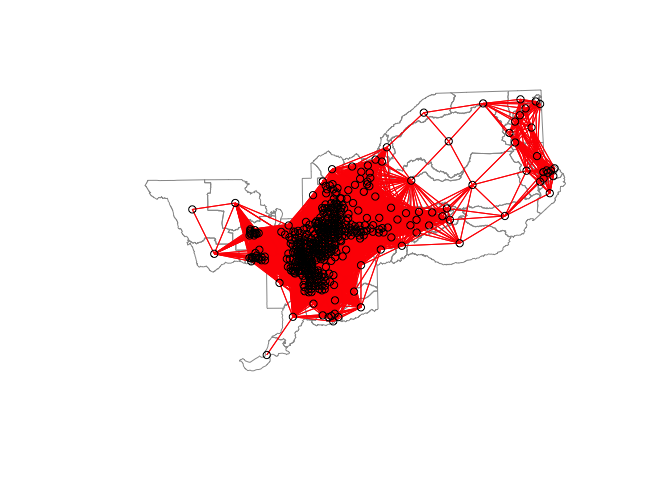
For the 20 mile distance based neighbor object and weights matrix, a plot of connections should look like
Creating the 5-mile distance based neighbor object will yield the following error
sac_weights_dist2<-nb2listw(Sacnb_dist2, style="W")## Error in nb2listw(Sacnb_dist2, style = "W"): Empty neighbour sets foundThe error tells you that there are census tracts without any neighbors. In this case, there are census tracts whose centroids are more than 5 miles away from the nearest tract centroid. The zero.policy option within nb2listw() lets you determine how you want to deal with polygons with no neighbors. The default is zero.policy=FALSE which means weights for the zero neighbor polygons are NA. This will lead to an error for many commands like nb2listw(). Setting the argument to TRUE allows for the creation of the spatial weights object with zero weights. You can also subset your data (using filter()) to remove incomplete cases.
If you use zero.policy=TRUE option for the 5 mile definition and plot the connections, you’ll get the the following plot
sac_weights_dist2<-nb2listw(Sacnb_dist2, style="W", zero.policy = TRUE)
plot(st_geometry(sac.tracts), border = "grey60", reset = FALSE)
plot(sac_weights_dist2, coords = centroids, add=T, col = "red")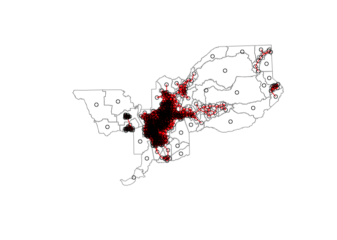
You can see a number of census tracts without a neighbor.
You can create your own specialized weights by specifying them in the glist option in the nb2listw() command. For example, rather than equal weights, what if you wanted to specify distance decay weights (i.e. 1 / distance from neighbor) for the 5 mile distance based weights matrix? The first thing to do is get the distance between each tract and its neighbors by using the nbdists() command.
Next, you want to get the inverse of these distances. nbdists() yields an object that is a list (see pages 302-307 in RDS for an explanation of list objects), so you can use the command lapply() to go through each element of the object, which is a vector containing distances to neighbors, and take the inverse. Save your result in an object and specify it in the glist option of nb2listw(). We can still specify style="W" to make the weights row standardized.
Moran Scatterplot
We’ve now defined what we mean by neighbor by creating an nb object and the influence of each neighbor by creating a spatial weights matrix. The choropleth map we created showed that neighborhood eviction rates appear to be clustered in Sacramento. We can visually explore this a little more by plotting standardized eviction rates on the x-axis and the standardized average eviction rate of one’s neighbors (also known as the spatial lag) on the y-axis. This plot is known as a Moran scatterplot. Let’s create a Moran scatterplot using the Queen based spatial weights matrix. We use the scale() function to plot the standardized values.
moran.plot(as.numeric(scale(sac.tracts$evrate)), listw=sac_weights,
           xlab="Standardized Eviction Rate",
           ylab="Standardized Lagged Eviction Rate",
           main=c("Moran Scatterplot for Eviction Rate", "in Sacramento") )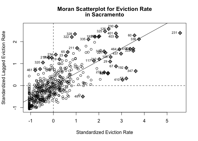
Looks like a fairly strong positive association - the higher your neighbors’ eviction rate, the higher your eviction rate.
Global spatial autocorrelation
The map and Moran scatterplot provide descriptive visualizations of clustering (autocorrelation) in eviction rates. But, rather than eyeballing the correlation, we need a quantitative and objective approach to quantifying the degree to which similar features cluster. This is where global measures of spatial autocorrelation step in. A global index of spatial autocorrelation provides a summary over the entire study area of the level of spatial similarity observed among neighboring observations.
Moran’s I
The most popular test of spatial autocorrelation is the Global Moran’s I test. Use the command moran.test() in the spdep package to calculate the Moran’s I. You specify the sf object and the spatial weights matrix. The function moran.test() is not tidyverse friendly, so we have to use the dollar sign to designate the variable.
moran.test(sac.tracts$evrate, sac_weights) ##
## Moran I test under randomisation
##
## data: sac.tracts$evrate
## weights: sac_weights
##
## Moran I statistic standard deviate = 21.952, p-value < 2.2e-16
## alternative hypothesis: greater
## sample estimates:
## Moran I statistic Expectation Variance
## 0.5677628263 -0.0020618557 0.0006737946We find that the Moran’s I is positive (0.57) and statistically significant (p-value < 0.01). Remember from lecture that the Moran’s I is simply a correlation, and correlations go from -1 to 1. A rule of thumb is a spatial autocorrelation higher than 0.3 and lower than -0.3 is meaningful. A 0.54 correlation is fairly high indicating strong positive clustering. Moreover, we find that this correlation is statistically significant (p-value basically at 0).
We can compute a p-value from a Monte Carlo simulation using the moran.mc() function. Here, we run 999 simulations by specifying nsim = 999
moran.mc(sac.tracts$evrate, sac_weights, nsim = 999)##
## Monte-Carlo simulation of Moran I
##
## data: sac.tracts$evrate
## weights: sac_weights
## number of simulations + 1: 1000
##
## statistic = 0.56776, observed rank = 1000, p-value = 0.001
## alternative hypothesis: greaterThe only difference between moran.test() and moran.mc() is that we need to set nsim= in the latter, which specifies the number of random simulations to run. We end up with a p-value of 0.001. The Moran’s I of 0.57 represents the highest Moran’s I value out of the 999 simulations (1/(999 simulations + 1 observed) = 0.001).
Practice Question: What are the Moran’s I for the 20 and 5-mile based definitions of neighbor?
Geary’s c
Another popular index of global spatial autocorrelation is Geary’s c which is a cousin to the Moran’s I. Similar to Moran’s I, it is best to test the statistical significance of Geary’s c using a Monte Carlo simulation. Let’s calculate c for Sacramento metro eviction rates for queen contiguity using the functions geary.test(), which relies on the assumptions of the distribution, and geary.mc(), which uses Monte Carlo estimation to evaluate statistical significance.
geary.test(sac.tracts$evrate, sac_weights)##
## Geary C test under randomisation
##
## data: sac.tracts$evrate
## weights: sac_weights
##
## Geary C statistic standard deviate = 17.457, p-value < 2.2e-16
## alternative hypothesis: Expectation greater than statistic
## sample estimates:
## Geary C statistic Expectation Variance
## 0.4211866 1.0000000 0.0010994geary.mc(sac.tracts$evrate, sac_weights, nsim=999)##
## Monte-Carlo simulation of Geary C
##
## data: sac.tracts$evrate
## weights: sac_weights
## number of simulations + 1: 1000
##
## statistic = 0.42119, observed rank = 1, p-value = 0.001
## alternative hypothesis: greaterGeary’s c ranges from 0 to 2, with 0 indicating perfect positive correlation
Practice Question: What are the Geary’s c for the 20 and 5-mile based definitions of neighbor?
Local spatial autocorrelation
The Moran’s I tells us whether clustering exists in the area. It does not tell us, however, where clusters are located. These issues led spatial scholars to consider local forms of the global indices, known as Local Indicators of Spatial Association (LISAs).
LISAs have the primary goal of providing a local measure of similarity between each unit’s value (in our case, eviction rates) and those of nearby cases. That is, rather than one single summary measure of spatial association (Moran’s I), we have a measure for every single unit in the study area. We can then map each tract’s LISA value to provide insight into the location of neighborhoods with comparatively high or low associations with neighboring values (i.e. hot or cold spots).
Getis-Ord
A popular local measure of spatial autocorrelation is Getis-Ord. There are two versions of the Getis-Ord, Gi and Gi*. Let’s go through each.
We calculate Gi for each tract using the function localG() which is part of the spdep package.
localg <-localG(sac.tracts$evrate, sac_weights)The command returns a localG object containing the Z-scores for the Gi statistic. The interpretation of the Z-score is straightforward: a large positive value suggests a cluster of high eviction rates (hot spot) and a large negative value indicates a cluster of low eviction rates (cold spot).
In order to plot the results, you’ll need to coerce the object localg to be numeric. Let’s do that and save this numeric vector into our sf object sac.tracts.
sac.tracts <- sac.tracts %>%
                mutate(localg = as.numeric(localg))
Given that the returned results are Z-scores, an analyst can choose hot spot thresholds in the statistic, calculate them with case_when(). Below we categorize hot and cold spots based on different significance levels (1% (or 99%), 5% (or 95%), and 10% (or 90%)) using the appropriate Z-scores. We then set the categorical variable as a factor, ordering the levels from cold to not significant to hot.
sac.tracts <- sac.tracts %>%
                mutate(hotspotsg = case_when(
                  localg <= -2.58 ~ "Cold spot 99%",
                  localg > -2.58 & localg <=-1.96 ~ "Cold spot 95%",
                  localg > -1.96 & localg <= -1.65 ~ "Cold spot 90%",
                  localg >= 1.65 & localg < 1.96 ~ "Hot spot 90%",
                  localg >= 1.96 & localg <= 2.58 ~ "Hot spot 95%",
                  localg >= 2.58 ~ "Hot spot 99%",
                  TRUE ~ "Not Significant"))

#coerce into a factor, and sort levels from cold to not significant to hot
sac.tracts <- sac.tracts %>%
              mutate(hotspotsg = factor(hotspotsg,
                                  levels = c("Cold spot 99%", "Cold spot 95%",
                                             "Cold spot 90%", "Not Significant",
                                            "Hot spot 90%", "Hot spot 95%",
                                            "Hot spot 99%")))
Then map the clusters using tm_shape() using a blue, white and red color palette.
tm_shape(sac.tracts, unit = "mi") +
  tm_polygons(col = "hotspotsg", title = "Gi value", palette = c("blue","white", "red")) +
  tm_compass(type = "4star", position = c("left", "bottom")) +
  tm_layout(frame = F, main.title = "Sacramento eviction clusters",
legend.outside = T) 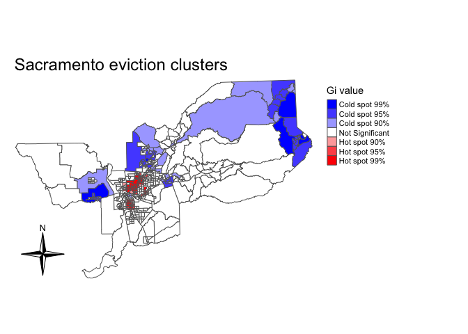
Gi only uses neighbors to calculate hot and cold spots. To incorporate the location itself in the calculation, we need to calculate Gi*. To do this, we need to use the include.self() function. We use this function on sac_neighbors to create an nb object that includes the location itself as one of the neighbors.
sac_neighbors.self <- include.self(sac_neighbors)We then plug this new self-included nb object into nb2listw() to create a self-included spatial weights object
sac.w.self <- nb2listw(sac_neighbors.self, style="W")We then rerun localG() using sac.w.self()
localgstar<-localG(sac.tracts$evrate,sac.w.self)Save the result in sac.tracts as a numeric.
sac.tracts <- sac.tracts %>%
              mutate(localgstar = as.numeric(localgstar))
And create a hot and cold spot map of Gi* like we did above for Gi
sac.tracts <- sac.tracts %>%
                mutate(hotspotsgs = case_when(
                  localgstar <= -2.58 ~ "Cold spot 99%",
                  localgstar > -2.58 & localgstar <=-1.96 ~ "Cold spot 95%",
                  localg > -1.96 & localgstar <= -1.65 ~ "Cold spot 90%",
                  localgstar >= 1.65 & localgstar < 1.96 ~ "Hot spot 90%",
                  localgstar >= 1.96 & localgstar <= 2.58 ~ "Hot spot 95%",
                  localgstar >= 2.58 ~ "Hot spot 99%",
                  TRUE ~ "Not Significant"),
                  hotspotsgs = factor(hotspotsgs,
                                  levels = c("Cold spot 99%", "Cold spot 95%",
                                             "Cold spot 90%", "Not Significant",
                                            "Hot spot 90%", "Hot spot 95%",
                                            "Hot spot 99%")))

tm_shape(sac.tracts, unit = "mi") +
  tm_polygons(col = "hotspotsgs", title = "Gi* value", palette = c("blue","white", "red")) +
  tm_compass(type = "4star", position = c("left", "bottom")) +
  tm_layout(frame = F, main.title = "Sacramento eviction clusters",
legend.outside = T) 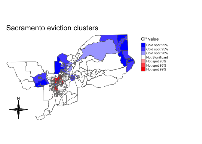
We can also eliminate the different significance levels and simply designate hot and cold spots as tracts with Z-scores above 1.96 and below -1.96 (5% significance level).
sac.tracts <- sac.tracts %>%
                mutate(hotspotsgs95 = case_when(
                  localgstar <=-1.96 ~ "Cold spot",
                  localgstar >= 1.96  ~ "Hot spot",
                  TRUE ~ "Not Significant"),
                  hotspotsgs95 = factor(hotspotsgs95,
                                  levels = c("Cold spot",
                                             "Not Significant",
                                             "Hot spot")))
And mapify (I save into an object named sac.ev.map.g)
sac.ev.map.g <- tm_shape(sac.tracts, unit = "mi") +
  tm_polygons(col = "hotspotsgs95", title = "Gi* value", palette = c("blue","white", "red"))
sac.ev.map.g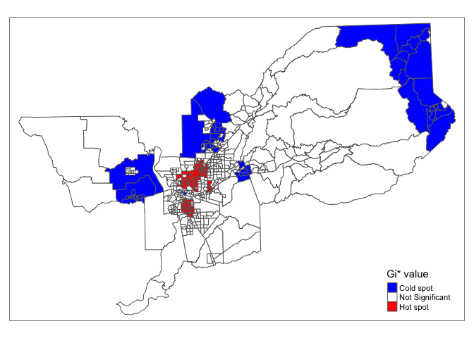
By designating a hard cutoff for hot spots, we can then characterize these hot spots by using tract-level demographic and socioeconomic variables.
Let’s put the map into an interactive format. Where do high eviction rate neighborhoods cluster in the Sacramento Metropolitan area? Zoom in and find out.
tmap_mode("view")
sac.ev.map.g + tm_basemap("OpenStreetMap")
Local Moran’s I
Another popular measure of local spatial autocorrelation is the local Moran’s I. We can calculate the local Moran’s I using the command localmoran_perm() found in the spdep package. First, a random number seed is set given that we are using the conditional permutation approach to calculating statistical significance. This will ensure reproducibility of results when the process is re-run.
set.seed(1918)

locali<-localmoran_perm(sac.tracts$evrate, sac_weights,
                        nsim = 999) %>%
  as_tibble() %>%
  set_names(c("local_i", "exp_i", "var_i", "z_i", "p_i",
              "p_i_sim", "pi_sim_folded", "skewness", "kurtosis"))
The resulting object is a matrix with the local statistic, the expectation of the local statistic, the variance, the Z score (deviation of the local statistic from the expectation divided by the standard deviation), and the p-value. I transformed the matrix into a tibble using as_tibble(), and added appropriate variable names to each column. Let’s save these variables back into sac.tracts by column binding them.
sac.tracts <- sac.tracts %>%
              bind_cols(locali)
Rather than a map of hot and cold spots, we can use the Local Moran’s I to distinguish between High-High, Low-Low, High-Low, and Low-High clusters. Let’s produce a LISA quadrant plot to visualize these four categories - the plot is similar to a Moran scatterplot, but also identifies “quadrants” of observations with respect to the spatial relationships identified by LISA. The code below does the following (1) standardizes the eviction rate (2) calculates the spatial lag of the standardized eviction rate using the function lag.listw(). The variables evratez and evratezlag are needed in order to determine which values fall under each quadrant. Then use case_when() to recode the data into appropriate categories, using a significance level of p = 0.05.
sac.tracts <- sac.tracts %>%
  mutate(evratez =  as.numeric(scale(evrate)),
    evratezlag = lag.listw(sac_weights, evratez),
    lisa_cluster = case_when(
    p_i >= 0.05 ~ "Not significant",
    evratez > 0 & local_i > 0 ~ "High-high",
    evratez > 0 & local_i < 0 ~ "High-low",
    evratez < 0 & local_i > 0 ~ "Low-low",
    evratez < 0 & local_i < 0 ~ "Low-high"
  ))
The LISA quadrant plot then appears as follow:
color_values <- c(`High-high` = "red",
                  `High-low` = "pink",
                  `Low-low` = "blue",
                  `Low-high` = "lightblue",
                  `Not significant` = "white")

ggplot(sac.tracts, aes(x = evratez,
                              y = evratezlag,
                              fill = lisa_cluster)) +
  geom_point(color = "black", shape = 21, size = 2) +
  theme_minimal() +
  geom_hline(yintercept = 0, linetype = "dashed") +
  geom_vline(xintercept = 0, linetype = "dashed") +
  scale_fill_manual(values = color_values) +
  labs(x = "Eviction rate (z-score)",
       y = "Spatial lag of eviction rate (z-score)",
       fill = "Cluster type")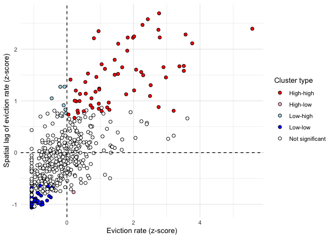
Tracts falling in the top-right quadrant represent “high-high” clusters, where neighborhoods with higher eviction rates are also surrounded by neighborhoods with high eviction rates. Statistically significant clusters - those with a p-value less than or equal to 0.05 - are colored red on the chart. The bottom-left quadrant also represents spatial clusters, but instead includes lower-eviction-rate tracts that are also surrounded by tracts with similarly low eviction rates The top-left and bottom-right quadrants are home to the spatial outliers, where values are dissimilar from their neighbors.
Let’s map tracts based on their Local Moran’s I categories.
tmap_mode("plot")

tm_shape(sac.tracts, unit = "mi") +
  tm_polygons(col = "lisa_cluster", title = "Local Moran's I", palette = color_values) +
  tm_compass(type = "4star", position = c("left", "bottom")) +
    tm_scale_bar(breaks = c(0, 10, 20), text.size = 1) +
  tm_layout(frame = F, main.title = "Sacramento eviction clusters",
legend.outside = T) 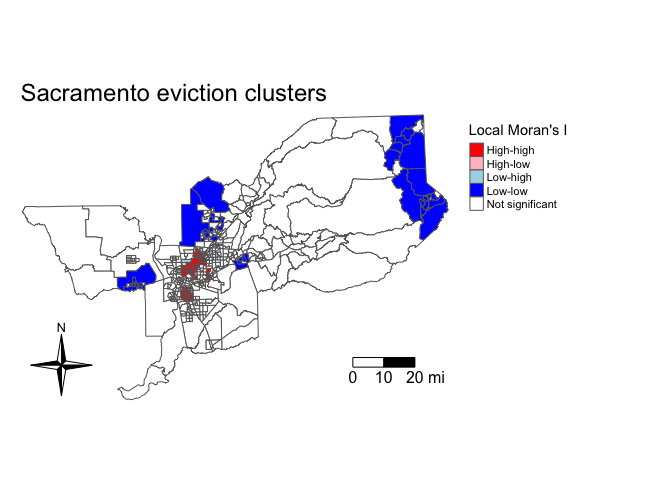
The map illustrates distinctive patterns of spatial clustering. We see clusters of high eviction neighborhoods in central Sacramento, and low eviction clusters in the suburban areas of the metropolitan areas.

This work is licensed under a Creative Commons Attribution-NonCommercial 4.0 International License.
Website created and maintained by Noli Brazil